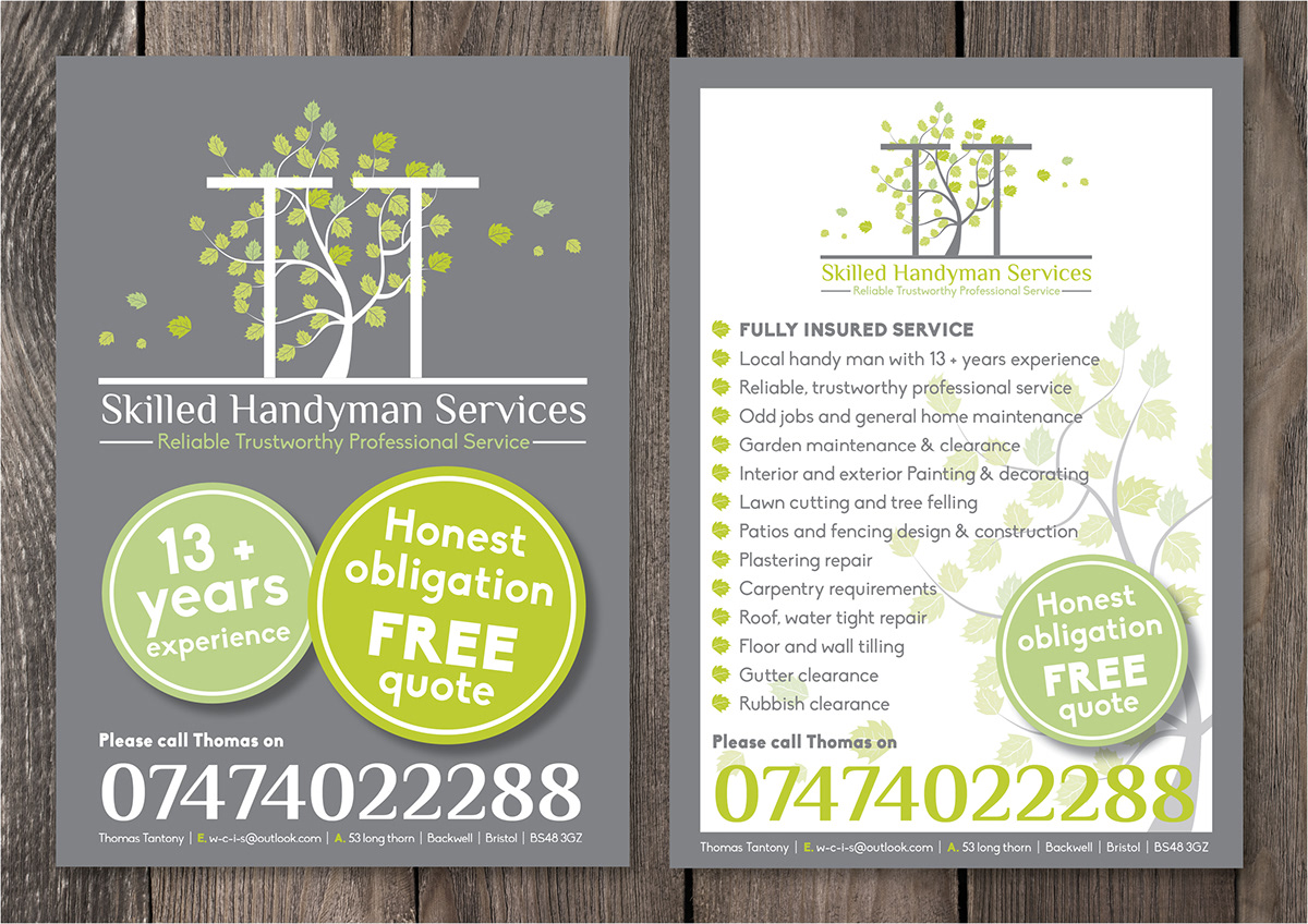
Thomas Tantony is a skilled handy man around garden design and maintenance.
He wanted a clean cut contemporary look, he liked greens and wanted to include a tree.
Using greens and a cool grey I created a tree illustration within the T's of his name, I used a condensed typeface to reflect the strengh and height of trees. The leaves on either side soften it up.
Another aspect of his business is that he works all year round so to highlight this I demonstrated how the logo, like trees change throughout the year. This way he can bring out a spring, summer, autumn and winter flyer with each logo featuring.
I also designed stationary to go alongside.