intro
So, I've been thinking for a little while now that it's about time I designed myself a logo to represent my brand as I grow as an artist and designer. Conveniently, my latest assignment for my Design Process course asked me to do just that. Because I am trying to head in the direction of medical illustration, my goal was to create a logo that conveyed both aspects of the industry: namely, art and science. After pages and pages of brainstorming, doodling, and thumbnails without a design that I really connected with, this idea came to me suddenly while I was nodding off on the train. Typical.
Most of us have seen or heard of the psychological exams that were popularized in the 60s (called "Rorscach tests"), in which patients were diagnosed based on their perception of a seemingly random inkblot pattern. While these inkblot paintings have chiefly been used in the scientific realm, to me they always looked like works of art more than anything else. So, I thought that an Rorscach inkblot might be the perfect way to combine my two worlds of art and science into one, unified image that represents who I am as an artist, and as a person. And with that, I set out to make the perfect blot for my personal branding logo.
prep

I started with all (well, most) of the materials any artsy gal needs to make some pretty simple inkblot paintings:
(1) scissors
(2) acrylic paint (in this case, I really splurged and went for Dollarama's finest)
(3) metal cork-backed ruler
(4) box cutter
(5) Bounty chocolate bar (everyone knows that inkblotting is really tough work... could get hungry)
(6) square pieces of white plastic (in this case, cut from a white garbage bag using scissors)
(7) watercolour paper (cut into squares using the ruler and box-cutter)

Before laying any paint down, I took a Sharpie permanent marker and drew a dotted line on the plastic to serve as a guide for folding (however, if I'm being honest, I only did this prep work for the first inkblot painting; I quickly realized that it wasn't really necessary).
experimentation

The first step was to experiment with different volumes and patterns of paint on the plastic. My first attempt is pictured above. I simply let the black acrylic paint drop from the spout in a random pattern, attempting to create a pattern with varied shape and size of paint droplets.

Then, folding time.

Once the plastic was folded, I used my fingers to press the two folded sides together, and, in some areas, to spread the paint around in the plastic in order to produce a shape that I liked.


After carefully peeling open the folded sheet of plastic, this was my inkblot stamp (not bad, I thought, for a first try!). Next step was (attempting) to transfer the inkblot to the paper.


My first inkblot, which looked pretty good on the plastic, turned out a bit wonky on paper. But no worries... learning experience. I realized my mistakes pretty quickly:
a) I was adding too much paint to the plastic
b) I was pressing too hard in both the plastic-folding stage and the image transfer stage
c) I wasn't peeling the paper off of the plastic slowly or carefully enough in the image transfer stage
All of these mistakes were causing the paint droplets to smear into each other, forming pretty an unimpressive inkblot. After fixing these issues, it became pretty easy to make pretty wicked-looking blots...

Once I started getting more refined images, it occurred to me that maybe I could take the blots to a different level by adding a watercolour effect around some of the edges. And so, I started experimenting with water. While the paint was still slightly wet on the paper, I added water using a paintbrush, and painted around the edges of the painted areas as if I was using watercolours.
Loved the result.

As shown above, I also experimented with a couple of different colours, branching away from pure black inkblots.

Turned out I still liked black best.

In the end, these were the four inkblots that I liked the best. I took each one and looked at it on its own, turned it upside down, trying to determine which one "fit" best with my intended goal. Finally, I had an "ah ha!" moment when I realized that the top left image kind of looks like a set of ribs, a spine, and a pelvis. Right?
I thought that since medical illustrators are artists of the body, it was a pretty appropriate choice.
I thought that since medical illustrators are artists of the body, it was a pretty appropriate choice.
final product
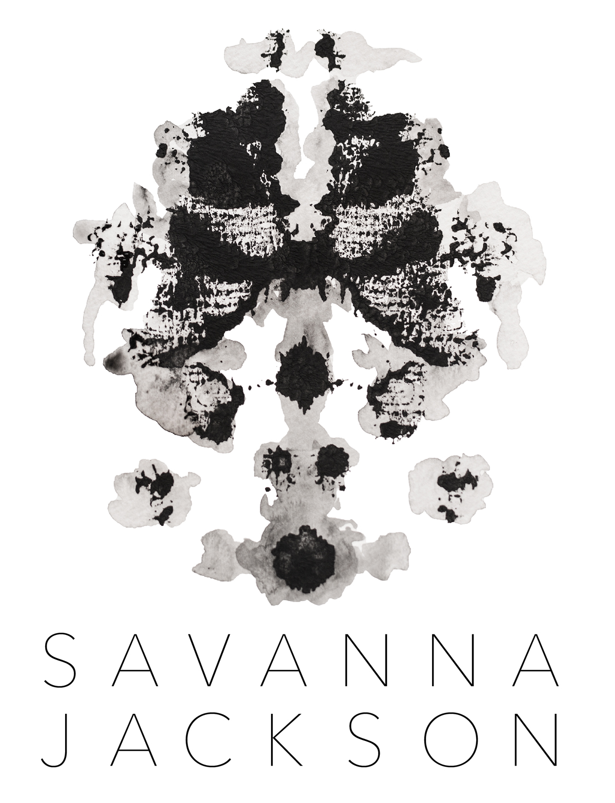
And after some playing with fonts, I decided on Avenir Next Ultra Light for my name. I thought the way that the "handmade" look of the image contrasted nicely with the super modern clean lines of the typeface.
last thoughts
Really happy with the result. As per my assignment, I've been working the logo into business card, letterhead, and envelope designs for a couple of weeks and am still not sick of the image (pretty rare for me), so I think that's a good sign.
Ultimately, I really like the idea of the inkblot because, while I may see a partial skeleton, any individual looking at my logo might see something completely different, and that's totally fine with me. I think that, as much as the logo represents my own personal art/science dichotomy, it also conveys my appreciation of the fact that art (and often, science, for that matter) is complex, open to interpretation, and a different experience for every individual.
Ultimately, I really like the idea of the inkblot because, while I may see a partial skeleton, any individual looking at my logo might see something completely different, and that's totally fine with me. I think that, as much as the logo represents my own personal art/science dichotomy, it also conveys my appreciation of the fact that art (and often, science, for that matter) is complex, open to interpretation, and a different experience for every individual.


