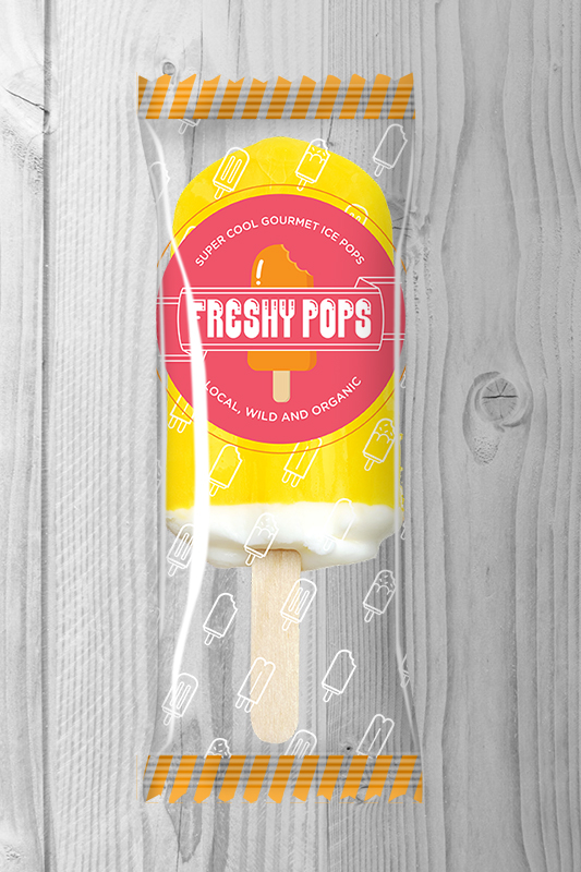
freshy pops // packaging design so good you could lick it
Freshy Pops approached me to handle the brand refresh of their tasty ice pops. Given I love tasty design and food packaging projects, it took about as much time to say yes as the flavour burst experience of a Freshy ice pop when it hits your tongue.
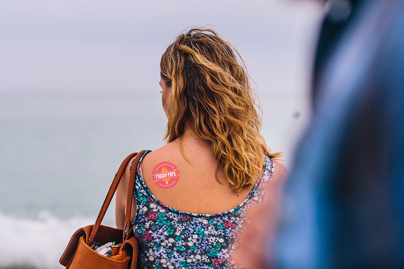
Freshy Pops are handmade with fresh, local, organic ingredients. No crap, Period. Only goodness that actually heals your body and moves you closer to health. The fun graphic elements, font selection and natural yet vibrant colour palette support the brand message while also transferring well to temporary tattoos and car wraps!
It’s logo and packaging design are clean and refreshing with a vibrant yet limited colour palette, letting them fall into a supporting role of showcasing the brilliant colours of Freshy’s ice pops.
Tasty Ice Pops + Brand Refresh = Tasty Design