client: Staropolska (2013-2015)
team: Jan Bielak - art direction/graphic design, Amadeusz Wróbel - graphic design/DTP, Sonia Mastalerz - graphic design/DTP/project management, Anna Brzozowska - typography
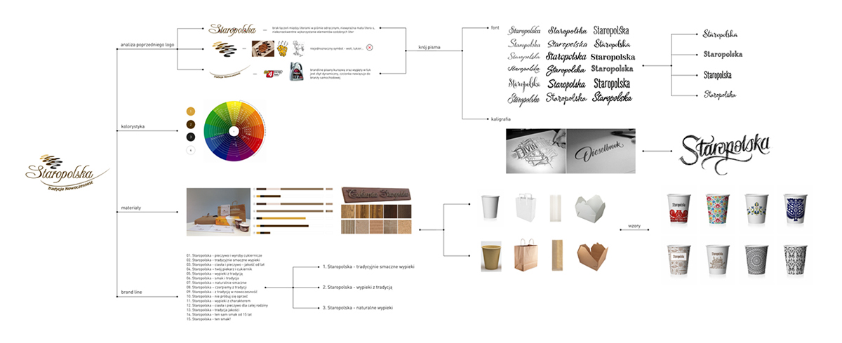
brief: Redesigning of the current brand image, creating a modern corporate identity, moving away from rustic connotations (suggested by the company's name „Staropolska” – „Old-Polish”).
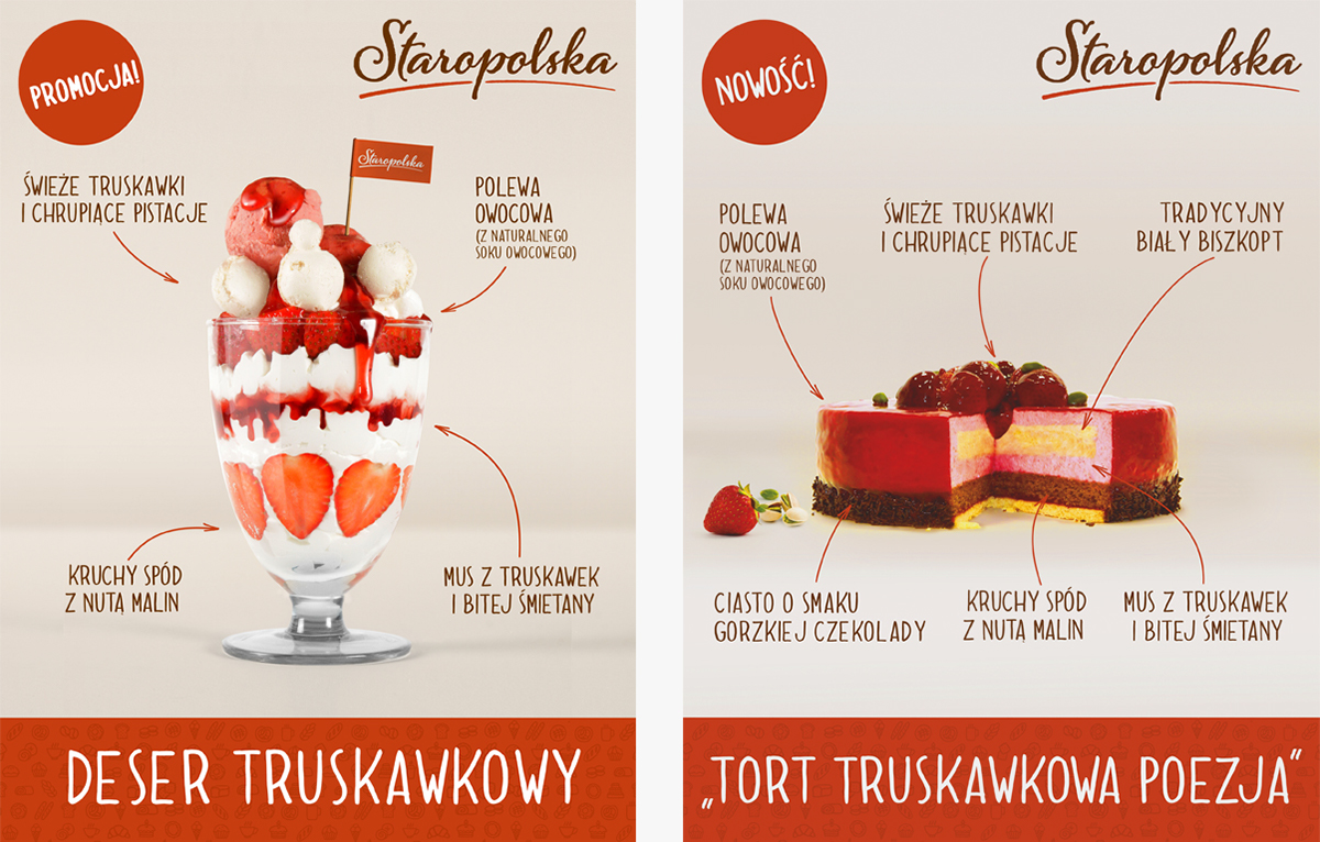
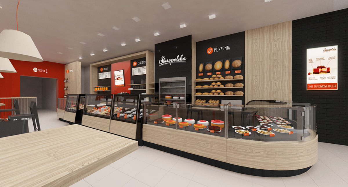
info: Starpolska is a one of the leading companies in the bakery and confectionary sector. The company possesses state of the art production lines. The previous brand image did not reflect the innovative and modern approach of the company management. The leading colour scheme was chosen to make the company stand out against the competitors who most often opt for toned colours typical for the industry. The new image strategy was elaborated to reflect the leading position on the market and to set new trends, rather than follow the competitors solutions.