client: Calavera (2015)
team: Jan Bielak - art direction, Amadeusz Wróbel - graphic design, Sonia Mastalerz - graphic design, Anna-Maria Suchodolska - copywriting
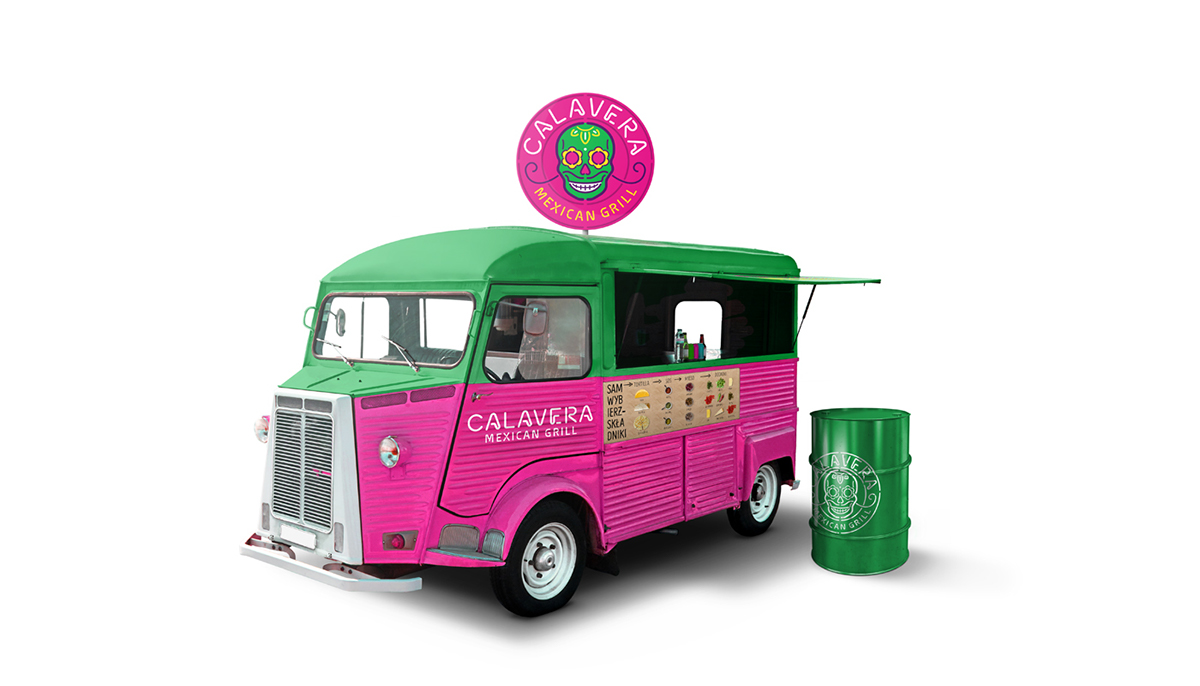
brief: Creating a brand for a chain of restaurants serving top quality, Mexican street food.
info: The name Calavera (skull in Spanish) is inspired by the image of Mexico in the pop culture. The Mexicans are known for their joyous and colourful celebrations of the All Saint’s Day (Dia de los Muertos) where multi-coloured and ornamented skulls are the most popular symbols. Calavera logotype illustrates the name, whereas the selected typography refers to a lettering from old neon signs and stencils enabling minimalist identification of the elements composing the company’s image. Following the pop culture inspiration, the graphic identification is emphasized by strong, vivid colours.
team: Jan Bielak - art direction, Amadeusz Wróbel - graphic design, Sonia Mastalerz - graphic design, Anna-Maria Suchodolska - copywriting
brief: Creating a brand for a chain of restaurants serving top quality, Mexican street food.
info: The name Calavera (skull in Spanish) is inspired by the image of Mexico in the pop culture. The Mexicans are known for their joyous and colourful celebrations of the All Saint’s Day (Dia de los Muertos) where multi-coloured and ornamented skulls are the most popular symbols. Calavera logotype illustrates the name, whereas the selected typography refers to a lettering from old neon signs and stencils enabling minimalist identification of the elements composing the company’s image. Following the pop culture inspiration, the graphic identification is emphasized by strong, vivid colours.