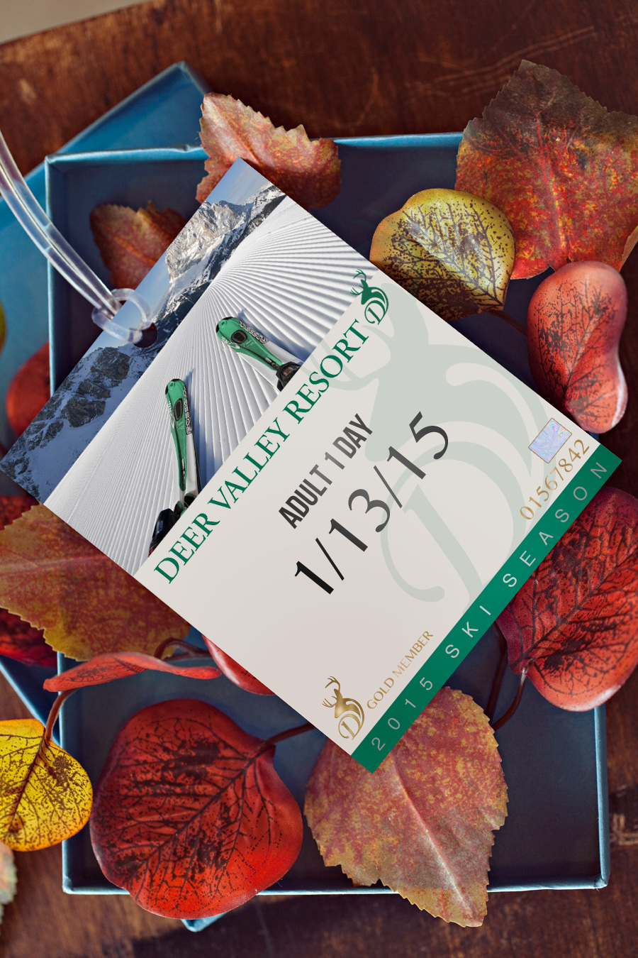
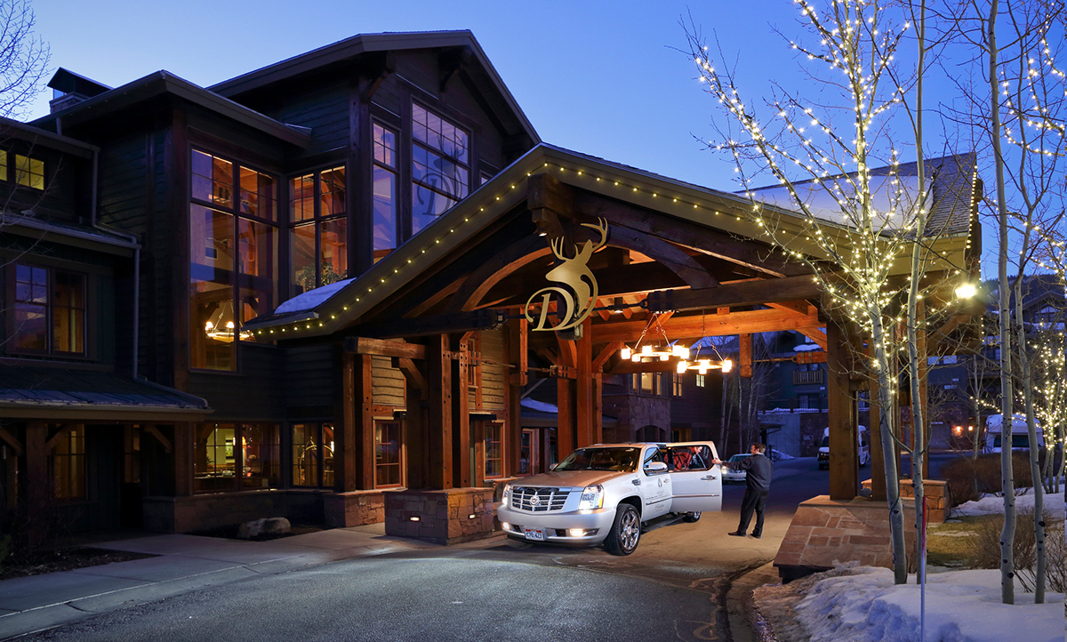
Deer Valley Resort
Concept Identity Rebrand
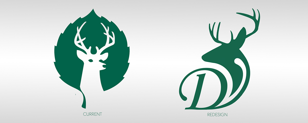
This was a project taken on to refresh the brand of Deer Valley Resort, a top ski community located just outside of Park City, Utah. I had always felt their logo was relatively outdated comparable to the neighboring ski resorts, such as Park City Mountain Resort, Snowbird Ski and Summer Resort as well as Canyons Resort, whose logo and brand recently received a major refurbishing.
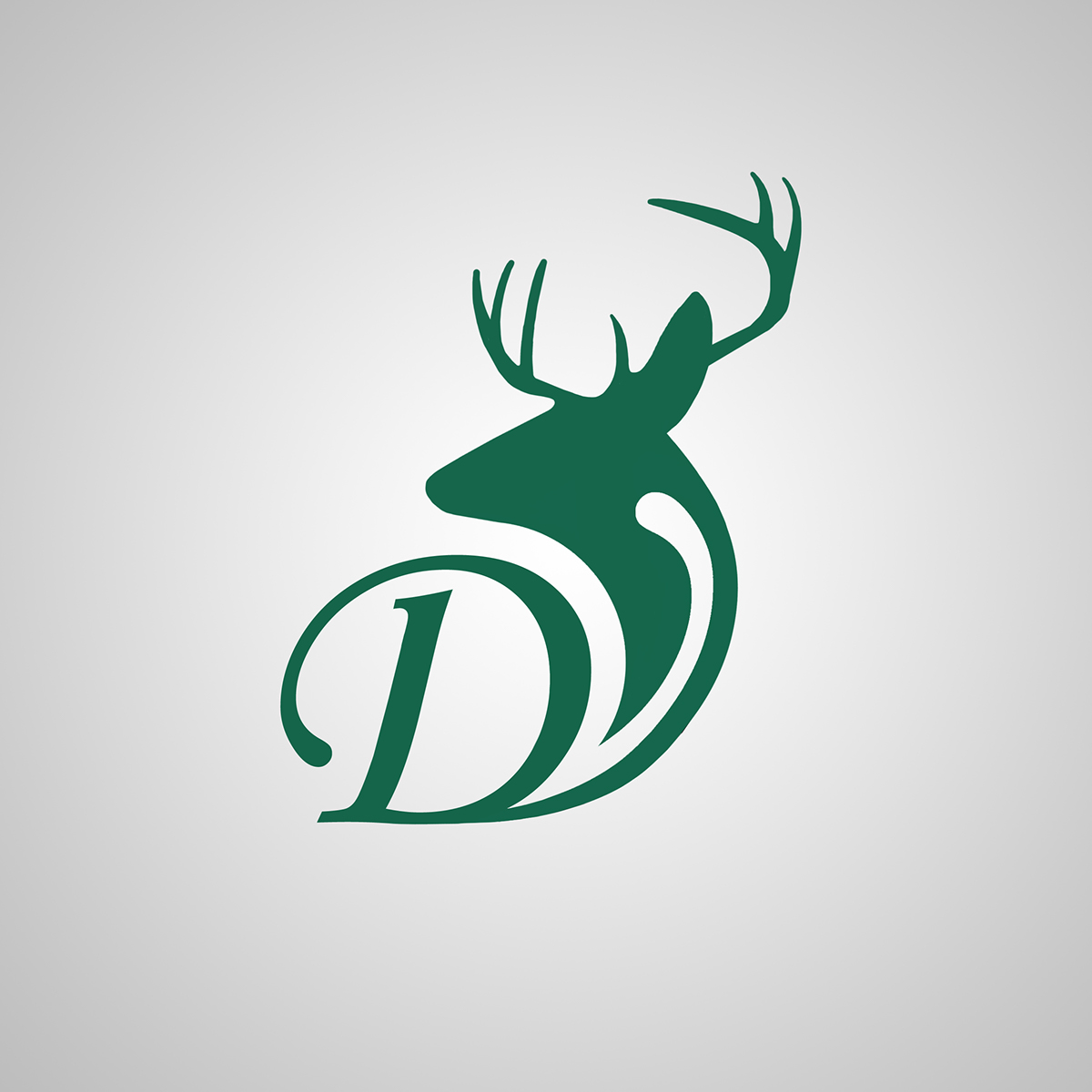
The idea behind the new Deer Valley Resort logo was kickstarted by two main initiatives: Create a fresh take on their current logo of course, but also make the logo more able to stand on its own, minus any text. I used a reverse silhouette of a deer disregarding the facial features and used the negative space from the contour lines to begin to construct the V, following the D. The color I came to the conclusion could remain the same as I believed it was suitable for a contemporary logo. Another reason was because Deer Valley's lifts are recognizable fully painted in the green.


Thanks for viewing! Feel free to leave an appreciation!


