


IR is a tech company with a product called Prognosis. It’s designed to make IT systems simpler, but the thing is, the product and the problems it solves are pretty complicated.
In a nutshell, Prognosis is a piece of software that improves the systems that underpin our enterprises, workplaces and everyday lives. It helps call centres maintain good voice quality, payment technology (like PayPass) run smoothly and can even prevent hackers from accessing your details.
It’s a great product, but the benefits were getting lost in a sea of jargon and category clichés.
IR were having trouble explaining the benefits to their customers, so they called us to help them humanise these complex digital problems, communicate what they do, and tell some great stories about Prognosis coming to the rescue.
The IT sector struggles to find suitable imagery, because there isn’t anything to photograph. We steered clear of photography, because stock shots of people smiling in front of a server don’t really tell you much about a business. Instead, we used metaphor to explain this complex, multifaceted business in an accessible, interesting way.
Seeing as communication was at the heart of IR’s problem, we helped them define their voice and make the way they communicate simpler and easier to understand – without dumbing the product down.
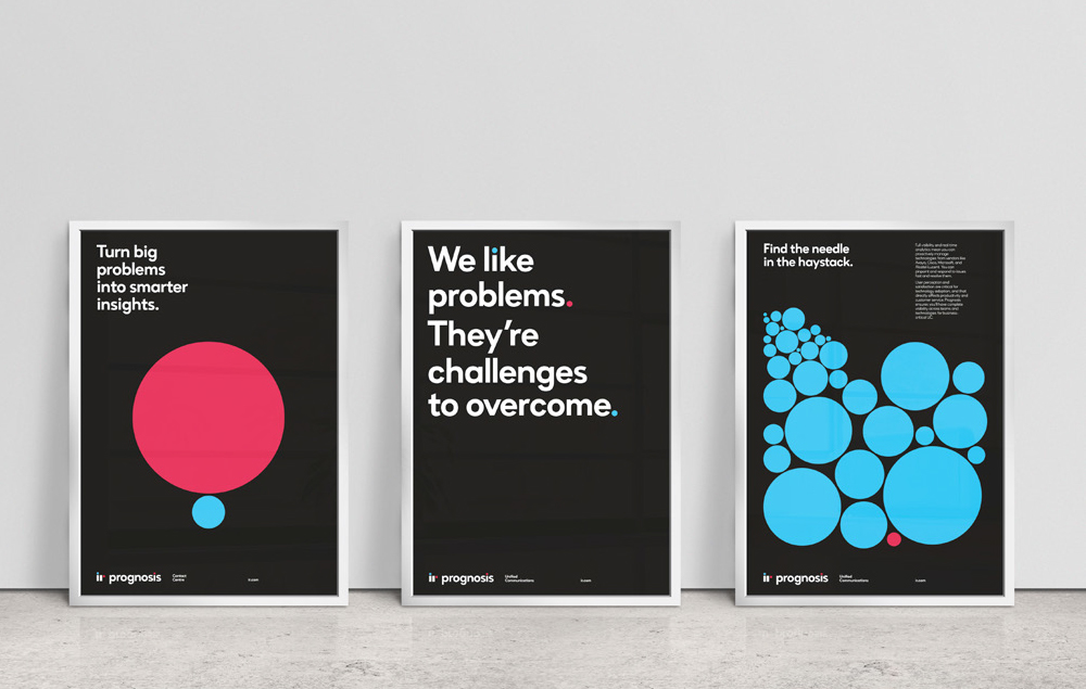
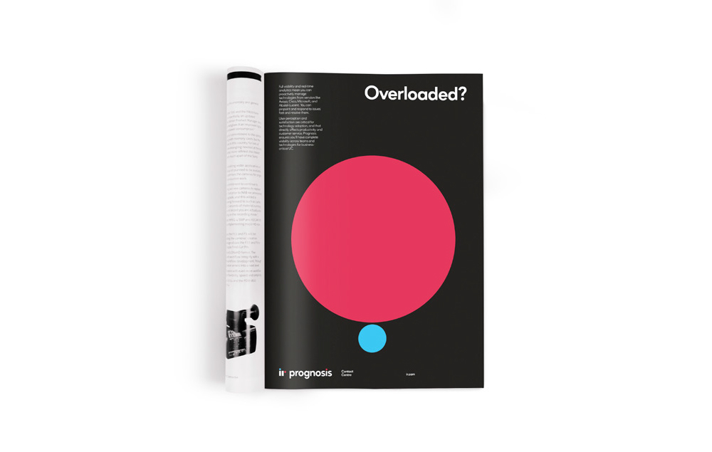
Case studies were a great place for us to start. We listened to stories that explained how Prognosis had saved the day in a number of situations, and re-told them using simple metaphors and little bit of humour.
After conducting research and holding workshops with IR, we began to understand their role, and the role of Prognosis, is to optimise complex systems. This idea of optimisation became our brand idea and influenced everything we did for IR.
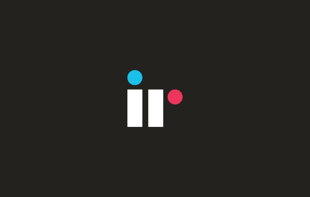
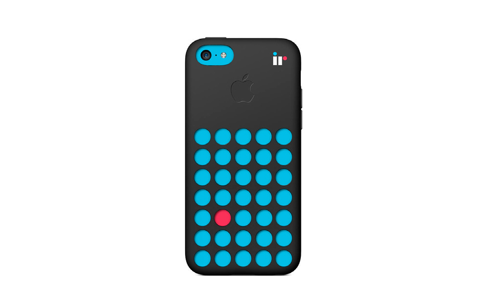
We illustrated these stories with dots and dashes, which became our illustration style. These dots and dashes are punctuated with colour to help tell these stories of optimisation – blue represents ‘optimal’, while red represents ‘sub-optimal’ to illustrate the complex problems IR solve in a fun, accessible way.
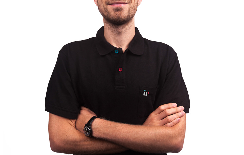
These simple illustration elements helped us create an optimised logo. White dashes are paired with red and blue dots to form the i and the r of the company’s name.
The design elements are influenced by Swiss style. An emphasis on cleanliness, readability, objectivity, strong grid, sans serif typefaces, asymmetric layouts, minimalism.
With their new, optimised identity, IR can explain what they do more easily, so more people can benefit from everything they offer.


