
B-THERE FESTIVAL
IDENTITY & BRANDING
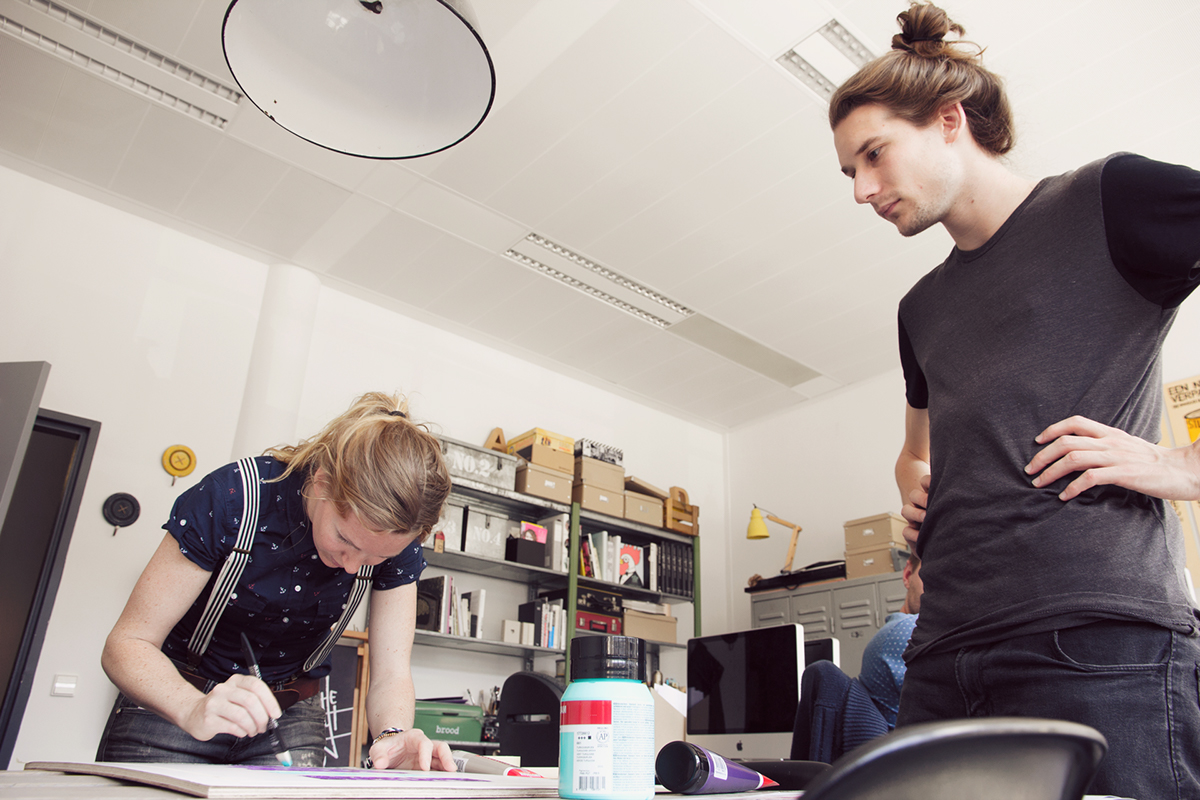
In co-operation with Studio Turbo!
The city of Den Bosch is full of history, places of interest and wonderful traditions. But the city can be livelier. To make that possible, once a year B*THERE build a city within the city. A bursting city where anything can happen, a city where culture, art and music come together. From Jazz to Deep house, from theater to street art. B*THERE Festival sets standards and experiments, is curious and outspoken, friendly and challenging. Full of fresh energy and young people, people who want to build something new, something exciting. The city they’re building isn't finished yet and will never be finished. Even during the festival, the city is still under construction. There is space where people can contribute ideas and are invited to build together.
The city of Den Bosch is full of history, places of interest and wonderful traditions. But the city can be livelier. To make that possible, once a year B*THERE build a city within the city. A bursting city where anything can happen, a city where culture, art and music come together. From Jazz to Deep house, from theater to street art. B*THERE Festival sets standards and experiments, is curious and outspoken, friendly and challenging. Full of fresh energy and young people, people who want to build something new, something exciting. The city they’re building isn't finished yet and will never be finished. Even during the festival, the city is still under construction. There is space where people can contribute ideas and are invited to build together.
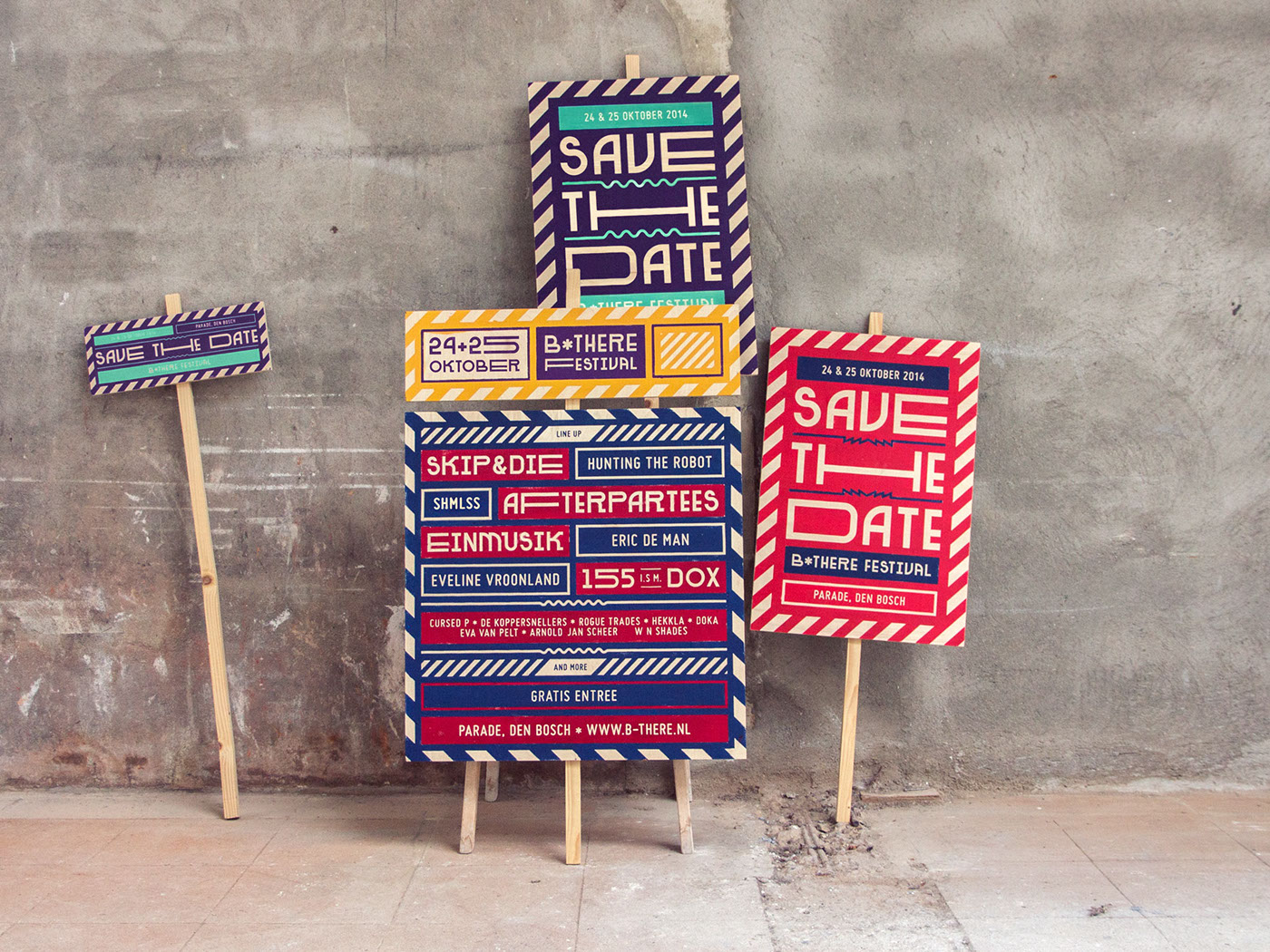
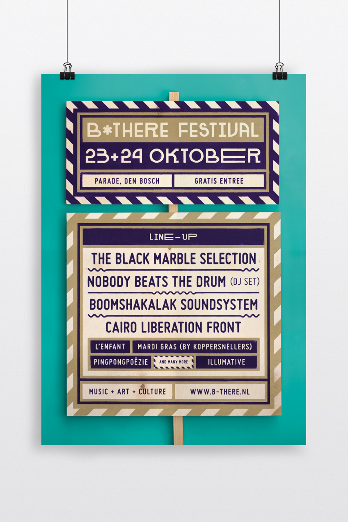
To indicate the festival as a construction site and to show what is going to happen, the visual identity is formed like construction signs. Construction signs announce what is being built and who the partners are. The identity of the billboards is inspired by patterns that we've found on the building area: striped barrier tape and raw materials. The striped pattern gives a mark, but also a warning: there’s something about to happen, be careful, here is a construction site. It must have a pure and Do It Yourself feeling. Real and handmade. Designed with materials like wood, painting. Raw, not perfect, but with a clearly designed graphic line.
2014


2015


2016


