Linked In background banner
I love to play with graphics and had a bit of a struggle creating this one as I wanted it to say everything relevant about me without being too crowded or going off-message.

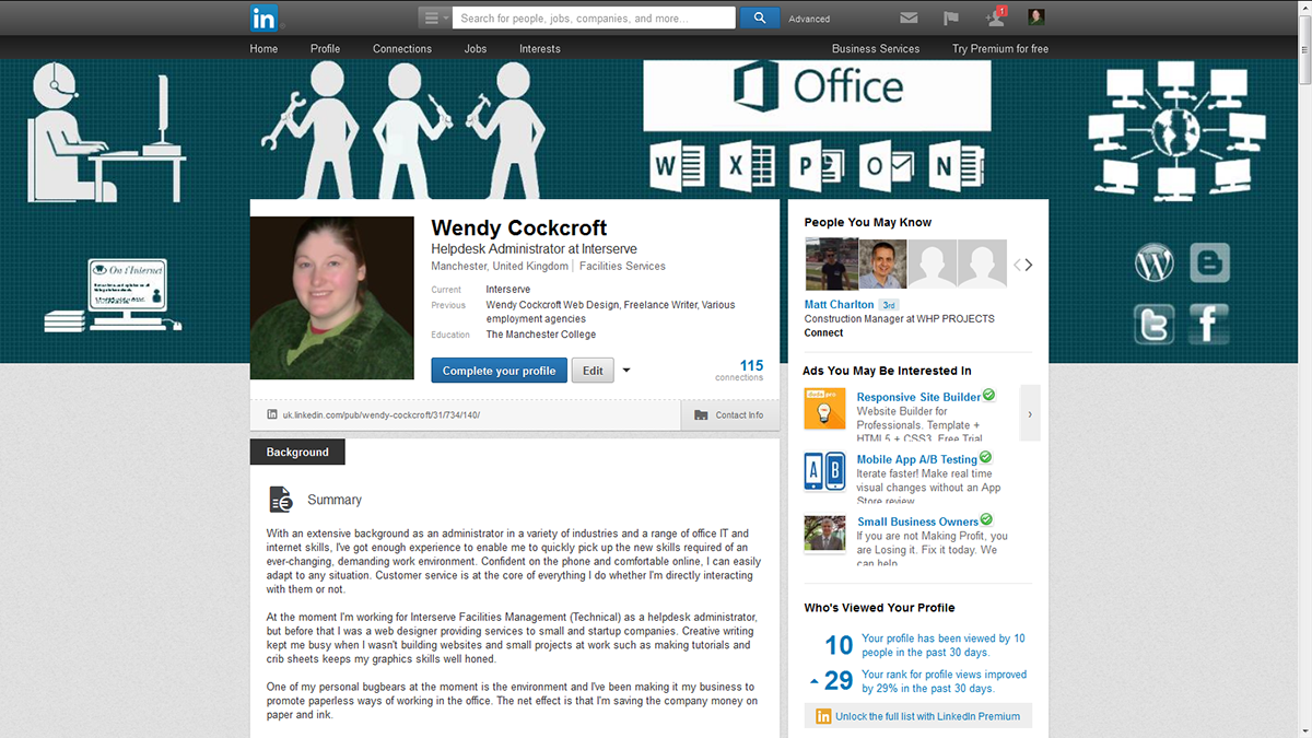
This is the one I use now. It's got my current occupation (call centre advisor for a facilities maintenance company - see those guys in the middle? That's what they represent), my competencies, and my other activities (blogging, writing, and social media) up there too. I'm using my On t'Internet background here.
The idea was to remind people of road signs and government health leaflets and to keep the message pure and simple; we read from left to right so I wanted to get and keep the information in order.
This was effort #1

Yes, it's got all of my interests in there but a) it's a bit too busy and b) my focus has shifted from web design to blogging. When you add my profile pic you'll find that it obscures some of the images which really doesn't help my case. Since Linked In is a happy hunting ground for employers looking for new staff you really need to look your best at all times and this just sent the wrong message to anyone looking for an administrative professional with internet-based skills.
This was effort #2

Okay, up hands if you think this means I'm a web/graphic designer. As I said, my focus has moved away from that these days. It doesn't tell potential employers what I do these days and therefore gives a somewhat false impression. My profile pic sits nicely over it, though.
This was effort #3

Though I wanted to let people know what I do now, I wanted to show off my competencies and achievements, too, so I went for a half-and-half approach. It's a bit too busy, isn't it?
This was effort #4
I decided to keep the stylised figures and strip the rest right down. I "bleached" MS Office's logo, and those of WordPress, Blogger, Twitter, and Facebook, then added the other flourishes. This is how my profile appears to my connections.
Twitter background and banners
To me, a canas is a challenge. The idea of using someone else's work to represent me is anathema. It says I'm not creative enough to come up with my own. Here are a few of the ones I've used.
Wendy Cockcroft Web Design

I used a crisp white background and dark teal links for this while running my web design business. I think it's important to stay on brand in social media, particularly when promoting your business. Use the same colours and backgrounds, and if possible, the same font. Remember that side panels like the ones I've got on the left here can be hidden on mobile phones.
Twitter account #2
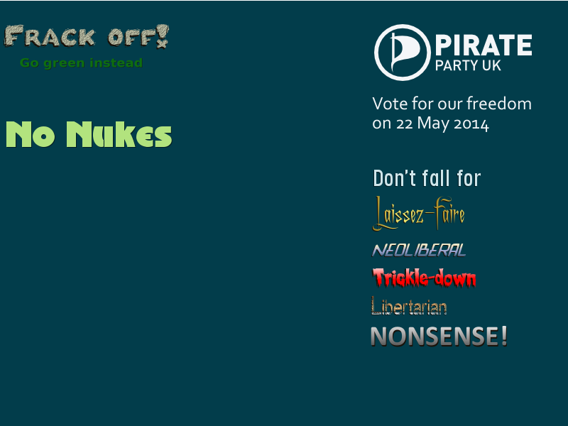
When I shuttered my web design business I wanted to wear my political convictions on my sleeve, as well as playing with fonts and styles. I've not left design behind completely, I'm still in the game.
Twitter #3: current

I decided to keep it simple this time, stripping down the background to show my interests and achievements.
Twitter: Current header banner

This says everything about me as a blogger and writer. I've dropped the "Think outside of the box" motif and am focusing more on my writing.
Facebook: Current

This is the only one I've ever been really happy with. I'm going to continue with the "On t'Internet" image of me at my PC for a while but I've been using it in various ways for years. Here are a few I've done for clients during my time as a web designer.
Guitar Masters Euro Tour 2012

The idea was to make a Facebook banner that the profile picture would sit over without spoiling or hiding the rest of the banner. Here's the version I gave the client for use elsewhere.

I'm particularly proud of that one. I really am glad that Linked In, etc., give us the opportunity to personalise our profiles. It gives me the opportunity to get a bit creative.
