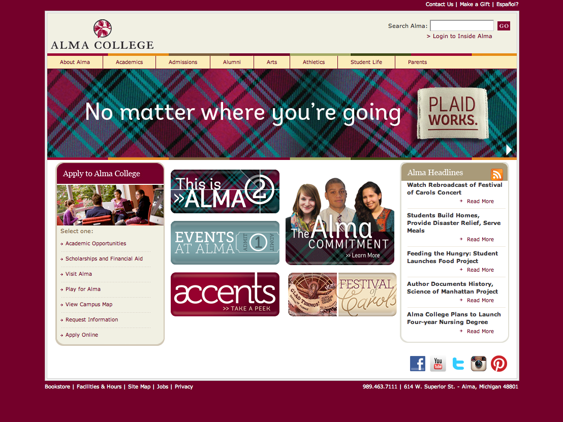
This site is now obsolete but I wanted to illustrate the evolution of the design of our web buttons.

We'll begin with a screen cap of what the landing page looked like originally.

There was a desire to explore the creation of smaller graphics at the center of our landing page that would draw attention to special events or videos.


At the same time, we were preparing for a much needed site redesign and were doing what we could to make do with the current CMS by altering the flash banner to include new images and updated messaging.

Eventually the small graphics evolved into buttons that helped to bring order to the middle section of the landing page. Our Web Editor added photo banners to the flash carousel to balance out the now illustration-heavy middle. These photos also served as links to social media sites like YouTube and Instagram.

The design of the button changed as we learned our audience was failing to read them as buttons and therefore failing to engage with them. By adding some simple graphic effects to create the illusion of three-dimensionality we were able to convey that these were more than graphics — they were clickable!

On certain buttons we also found the addition of a call to action to be quite effective.

Before switching over to our newly designed site, we were able to manipulate the old site well enough to include our new brand elements and a selection of continuously evolving button graphics that could be traded out depending on the needs of the institution.
