


Our Admissions team came to me with a desire to redesign the process of announcing a student had been accepted to MSU. With prospective students interacting with the university through an online portal, most of them learned about their acceptance through a digital message before the official letter made it to their mailbox. They'd hoped to improve that experience via a hype video that revealed their acceptance but they also wanted to make the mailed piece into something that students would get excited about and possibly post on social media.

The team had already been testing a flag vendor to see if using flags as envelopes was a worthy first step. They were excited about the responses they were getting and wished to design a piece that raised the experience of the letter reveal up to the same level as the flag envelope.


We knew the piece needed to be some sort of a folder but the task of stuffing thousands of acceptance letters into certain styles of folders made it an interesting design challenge.
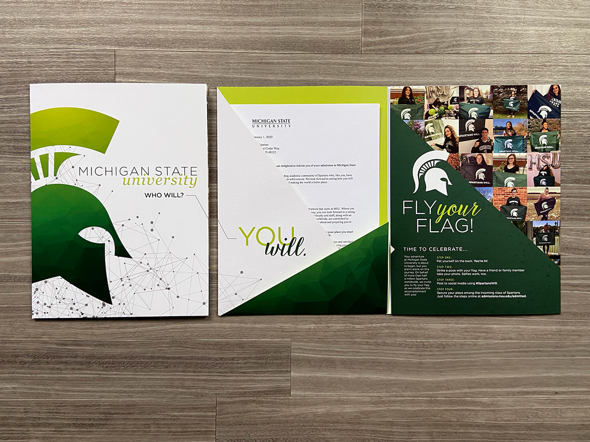
The introductory message is a play on the Spartans Will tagline, making the folder feel at once on-brand but also personal. I really wanted this student to see themselves as a part of something bigger. We all did. So I kept that in mind as we moved through the rest of the layout. With one of the goals for the piece being a shared experience in the excitement of celebration, we opened immediately to the letter on the left and a call to action on the right. We also sprinkled reminders about finishing the process by visiting campus and becoming an officially admitted student through deposit.

The folder challenge was solved through two overlapped angular folds that secured the letter in place without using glue tabs. This made assembling the mailing far easier. The right side folded out to reveal a playfully illustrated campus map that included some information about MSU traditions and locations of interest.

The kiss-cut sticker sheet on the far right offered us a chance to give them some additional celebratory swag (they love their laptop and water bottle stickers!) and was attached to the folder using fugitive glue. We chose to go with a repositionable adhesive on the sticker back to make it easier for them to reuse their favorites.

A close-up of the illustrated map reveals shadow footprints of the various campus buildings to offer some location context without including every street name. The illustrations have a slight outline as a nod to the sticker sheet and the style kept the map from feeling too heavy since the goal was to make campus feel approachable. This place is BIG. We wanted accepted students to know it was still "home."

Above, you can see a flat lay of the folder design followed by a flat lay illustrating coating placement. The outside of the folder is coated in a spot UV gloss (shown in the lower illustration in red) and aqueous soft touch (shown in aqua). The contrast of finishes between the matte soft touch and glossy UV added both visual interest to the design as well as a tactile experience.
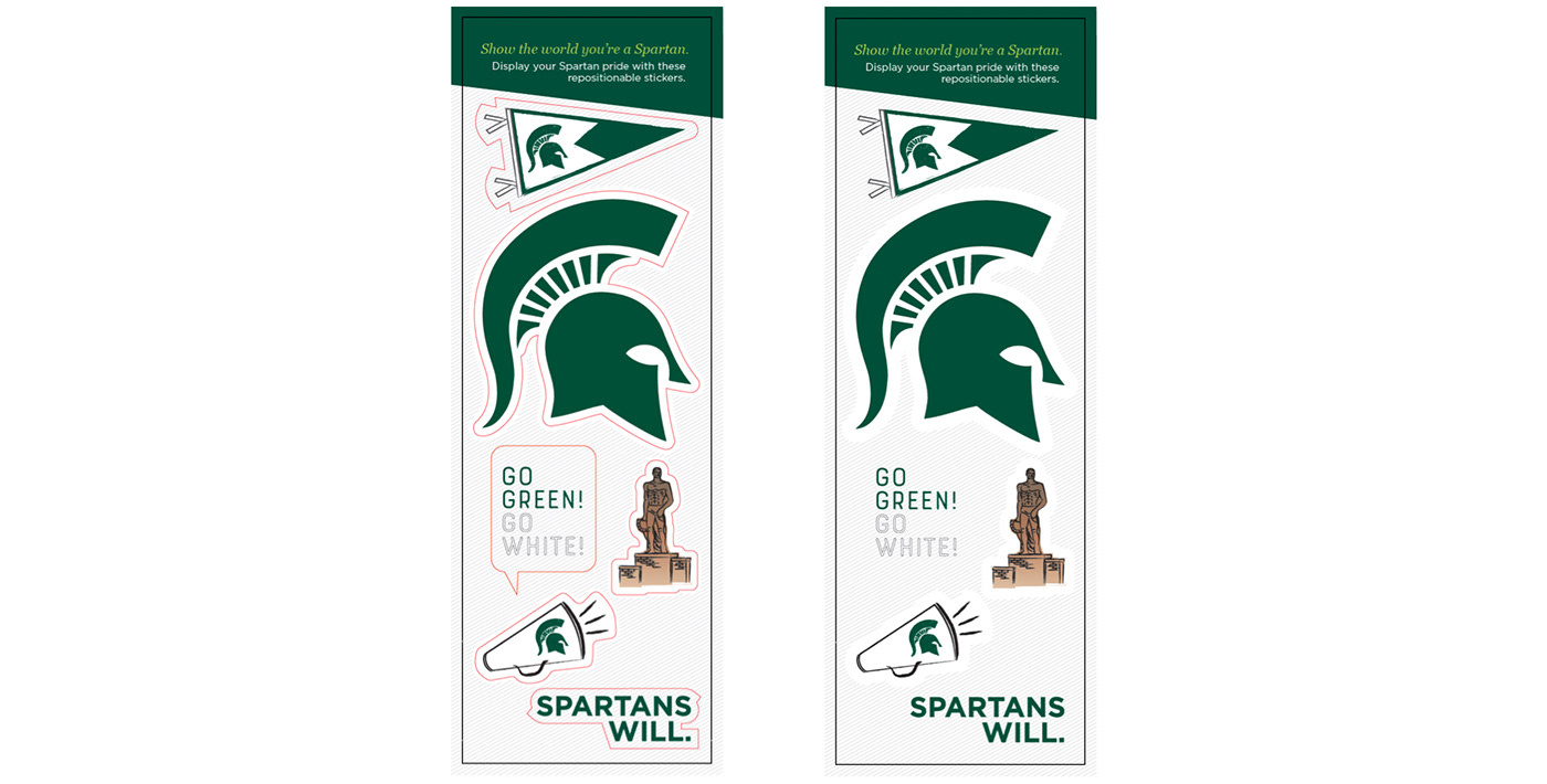
On the left, the red lines mark where the intended locations were for the kiss-cut die. On the right, you can see I included a white border for some of the stickers but allowed others to take the striped background with them.


— You know you've hit your mark when they include the folder in the shot! —


The call to action was a success and it was a rewarding experience to see the results. We were able to genuinely celebrate with every post.
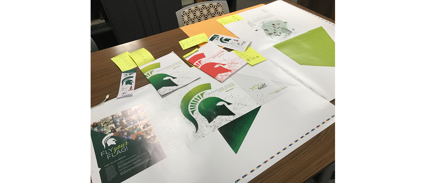
The press-proof table spread on this one was a designer's delight.
Awards:
2020 Gold Addy
2020 CASE District V Silver


