

GRANEMANN ADVOGADOS ASSOCIADOS
The equilibrium between right and wrong, good and evil. Unique mediations witch passes through the lawyers seal are represent by a symbol that transmits force, elegance and sophistication. In Granemann Advogados Associados, balance of justice already knew, was deconstructed and built again more modern and innovator. Symmetric and reflective lines represents the opposite, making an icon of easy absorption, remarkable.
“…from discord, find the equilibrium...”
O equilíbrio entre o certo e o errado, bem e o mal. Mediações únicas que passam pela chancela de um advogado e são representadas através de um símbolo que transmite força, elegância e sofisticação. Em Granemann Advogados Associados a figura da balança da justiça já conhecida por muitos, foi desconstruída, ganhando um aspecto mais moderno e inovador. Linhas simétricas e traços espelhados representando os opostos, formam um ícone de fácil absorção, marcante.
"...a partir da discórdia, encontre o equilíbrio..."


Visualization and reading are basics rules for application. To visualize it is necessary contrast, which is the difference in visuals proprieties and what make the object or graphic discernible compared to others objects or backgrounds. There are many kinds of contrasts. The Luminosity Contrast (bright and dark), Value Contrast (inverse), Saturation Contrast (purity and color intensity).
A visualização e leitura são os critérios básicos para aplicação. Para visualizar é preciso contraste, que é a diferença nas propriedades visuais que faz com que um objeto ou gráfico seja distinguível de outros objetos ou plano de fundo. Existem diversos tipos de contrastes. O Contraste de Luminosidade (claro e escuro) , Contraste de Valor (inverso), Contraste de Saturação (pureza e intensidade da cor).

Granemann is a flexible brand, so has alternatives signatures that can be use in limited cases, when the principal or complete signature can not be possible. The applications should be individually analyzed and then choose the best signature in each case. Is important to know the brand characteristics, using all elements that compose Granemann identity in a coherence way.
Granemann é uma marca flexível e por isso tem assinaturas alternativas, que podem ser utilizadas em casos de limitações, em que a assinatura principal ou completa não for possível. As aplicações devem ser analisadas individualmente e assim escolhida a melhor assinatura para cada caso. É importante manter sempre as características da marca, utilizando todos elementos que compõem a identidade Granemann de maneira coerente.

The typography is essential in visual identity system: it brings personality, legibility and invigorate the brand because the style. Therefore, choosing typography family should be align to strategic questions and brand position. Typography family defined for a system of visual identity can’t, no matter what, be changed, because it deprive the characteristics of the brand.
Undermentioned, composition in different weights, using typographic system of the brand.
Observe that Georgio Sans is useful for titles, while Gotham is applicate in the text.
For creating contrast and subtle differentiation of text in phrases or words that needs more attention is use variations in both.
*This example is just a guide; every work should be analyze individually.
A tipografia é essencial no sistema de identidade visual: é ela quem dá personalidade, legibilidade e permite fortalecer o reconhecimento da marca por seu estilo. Portanto, a escolha da família tipográfica deve estar alinhada às questões estratégicas e de posicionamento da marca. A família tipográfica definida para um sistema de identidade visual não pode, sob nenhuma circunstância, ser alterada, pois isso descaracteriza a marca.
Abaixo, a composição em diferentes pesos, utilizando o sistema tipográfico da marca. Observe que a Georgio Sans é utilizada para títulos e chamadas, enquanto a Gotham é aplicada no corpo do texto. Para criar contraste e sutil diferenciação do texto em frases ou palavras em que se quer mais destaque utilizam-se as variações de ambas.
*O exemplo é apenas um guia, cada trabalho deve ser analisado individualmente.

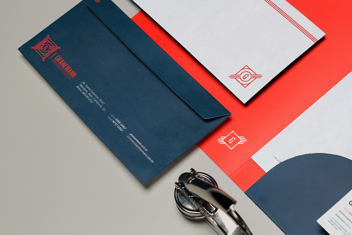
For Granemann Advogados Associados was developed all office objects and includes cardboard, letterhead, envelopes and pastes. The result you can check on photos below:
Para Granemann Advogados Associados foi desenvolvida a papelaria contendo cartões, timbrado, envelopes e pastas. O resultado final você pode conferir nas fotos abaixo:


CrEdits
Designer: Alex Reuter.
Print: MarauGraf.
Photo: Alex Reuter, Guilherme Rosa e Juliano Jover.
Designer: Alex Reuter.
Print: MarauGraf.
Photo: Alex Reuter, Guilherme Rosa e Juliano Jover.
Translator: Marina Roncelli.


