Time Travelling in Switzerland Typeface
The Brief
The Design brief for this project was to create a typeface based on an instance. The instance I chose was "Time Travelling in Switzerland", where I researched into and used mathematical shapes and the formulas behind time travelling.

Swiss Typography Research

I decided to use the mathematical side to timetravelling within my typeface

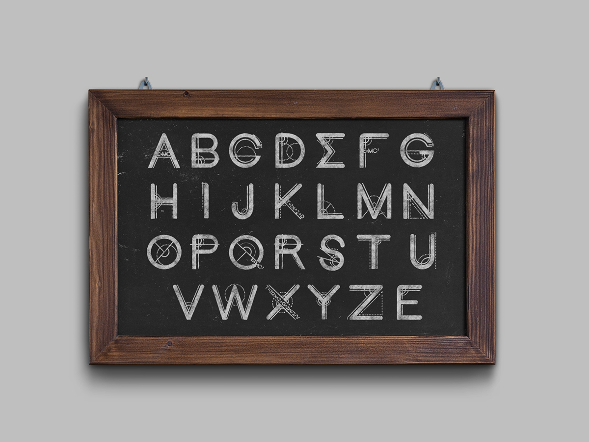
I used the mathematical symbol of sigma as the letter E which is also part of the greek alpabet. This helped to tie my typeface more into the mathematical side of my chosen phrase.


The promotion of my Typeface.
I chose to promote my typeface by making it look like it has been written on a blackboard. The reason behind this was, years ago educational material and especially mathematics was all written on a blackboard, which also reflects the time travel area of the phrase.

My Final typeface design
My Final Design
My base type was based on the consistent equal thickness and neutral helvetica which evolved from my research into the swiss typefaces.. However I decided to curve the tops of letters to make it seem more futuristic and keep the bases flat. I have used three elements within all of my letters in the alphabet, however I have used them in different ways on each individual letter. The elements I have used throughout are: cerated circle, solid-lne circle and solid straight lines. This makes each letter individual and unique however bound together as a full set by using these same elements.