


A Typography Project Inspired by Hoefler Text.
This is a handcrafted 16 paged book about the typeface – Hoefler Text. A tribute for readers who know that type can be wild and imaginative.

A Modern Classic
Hoefler Text is more than just a family with prevalent typefaces, but a multipurpose font demonstrated its virtues and potentials in both print and digital media.

Behind the Typeface
Despite the fact of being an Old-style serif font, Hoefler Text is a comprehensive family of typefaces designed in 1991 for Apple Computer in performing as a modern classic in expression of advanced type technologies. The creation of Hoefler Text was granted as a confession to support composition of complex typography through hints and inspiration from range of classic fonts, as if it was travelled through time machine and landed during infancy of digital age.

Small to Large
When it is viewed from further distance, one would realized it has a humble x-height that captivates naturally with the readers in terms of readability not only in a sentence, but also as a paragraph. Yet, it is rather fascinating to discover the arched base on the serifs that compliments the essence of Hoefler Text as a modern classic typeface that supports print at small sizes while also maintaining it’s high legibility on the web at large sizes.


Character and Texture
One of the most fascinating practices about Hoefler Text is to observe the letterform structure in bigger point sizes in order to explore its characteristics and texture. Not only it helps to bring out a harmonious sense through its curved and smooth serifs, but also has interesting contrast between the hairlines and strokes that stimulates the experience of viewer with its remarkably balanced thickness and thinness. Almost like a form of silent symphony as it leads the readers into the context where they could fully engage with the message effortlessly while unconsciously drowning within this opus.

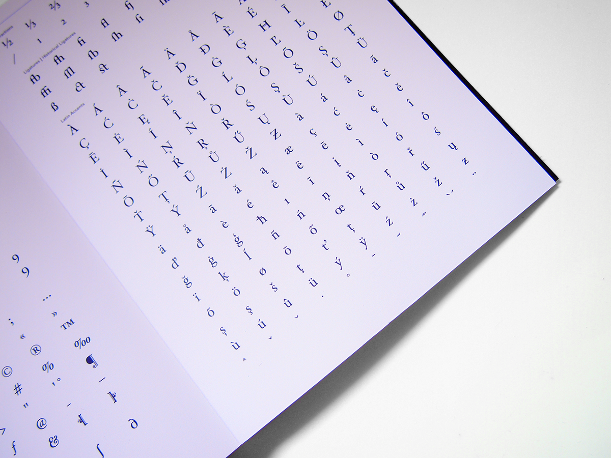
The Features
To articulate a font, is to study its legibility through analysis of own essential structures, characteristics and recognition of potentials. Of course, when it comes to Hoefler Text, it first stood out with its elegant and sophisticated letterforms that exhibit both consistency as well as tranquillity through the shapes within and space engaged across the upper and lower cases, not to mention the softness of its strokes that offers serenity to the eyes of viewers.

To Inspire
the existence of Hoelfler Text itself is to inspire the future in purpose to become a use for every individual in exploiting all its possibilities in generating own experiences and accomplishments. As long as there is a practice, a new story is told.


