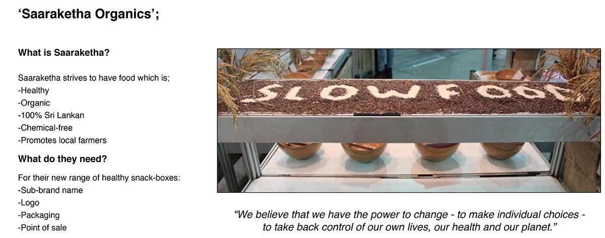
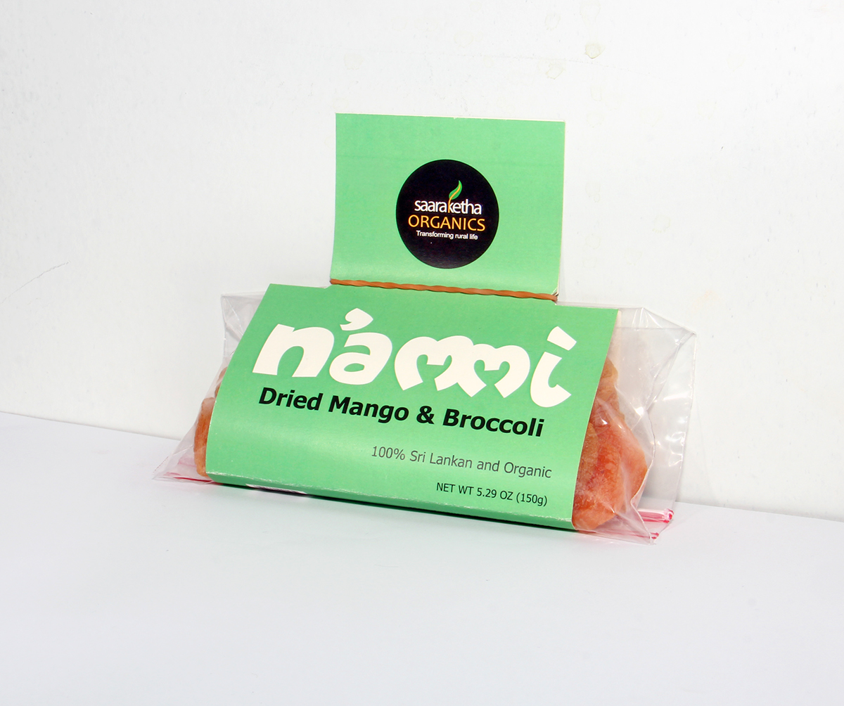
I chose to go with the Branding brief set for a company named ‘Saaraketha Organics.’ I discovered that this would be a greater venture thanthat of the publishing project; having to work and apply my design-concepts to a real clients’ needs. ‘Saaraketha Organics’ needed a sub-brand name, logo and packaging for their new line of healthy snack-products.
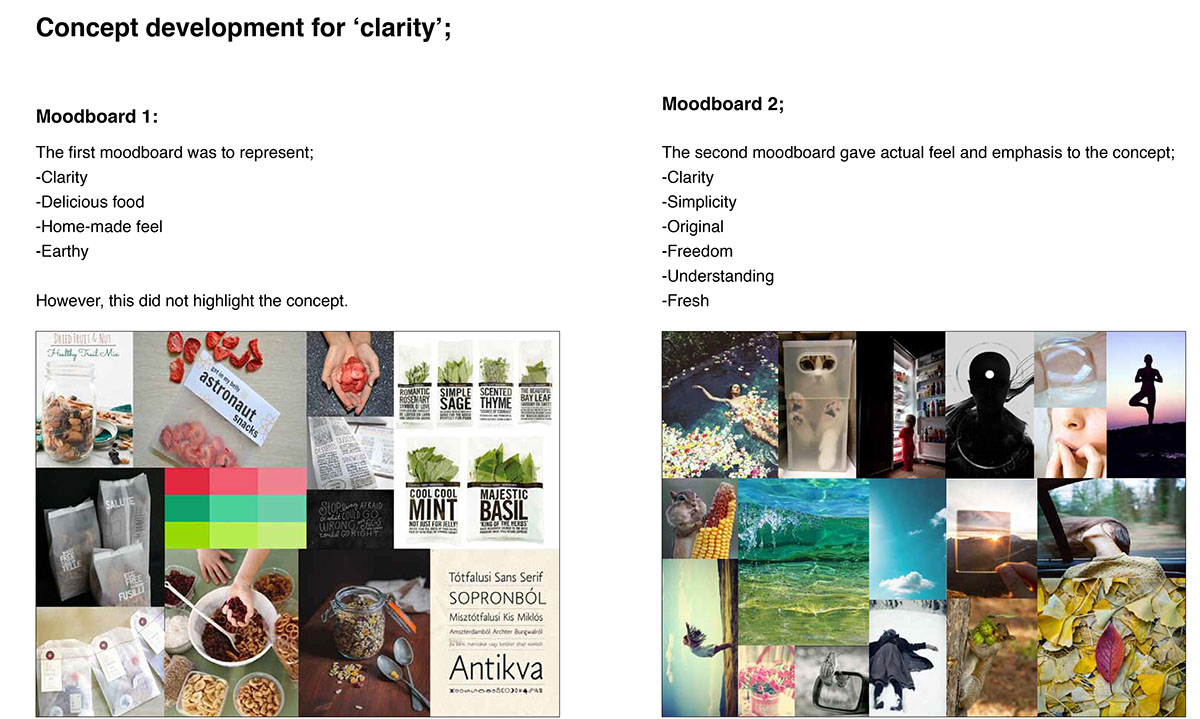
My concept was ‘clarity.’ This was to communicate the message of how ‘Saaraketha,’ is honest, trustworthy and reliable, as the consumer would physically be able to see what he or she is buying. This would work well for busy young couples, who could easily recognise what they are buying, or for young children, who would be excited to be able to see the nourishing food within.
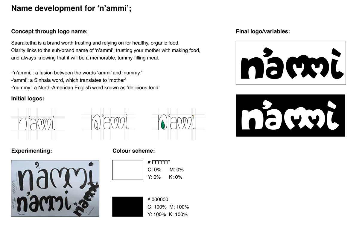
My idea was to incorporate that feeling of trust, with a suitable name; n’ammi. This “n’ammi” would stand for ‘and ammi,’ which translates to ‘and mother’ or ‘and mummy,’ in English. It is also onomatopoeia for ‘nummy,’ meaning ‘yummy food. This gave a Sri Lankan feel to it (‘ammi’) and tied in my concept of clarity. Who better to trust than your own mother? Both children and adults alike tend to compare their mothers’ food to everything else they would eat, or at least one special dish their mother would make. Don’t you?