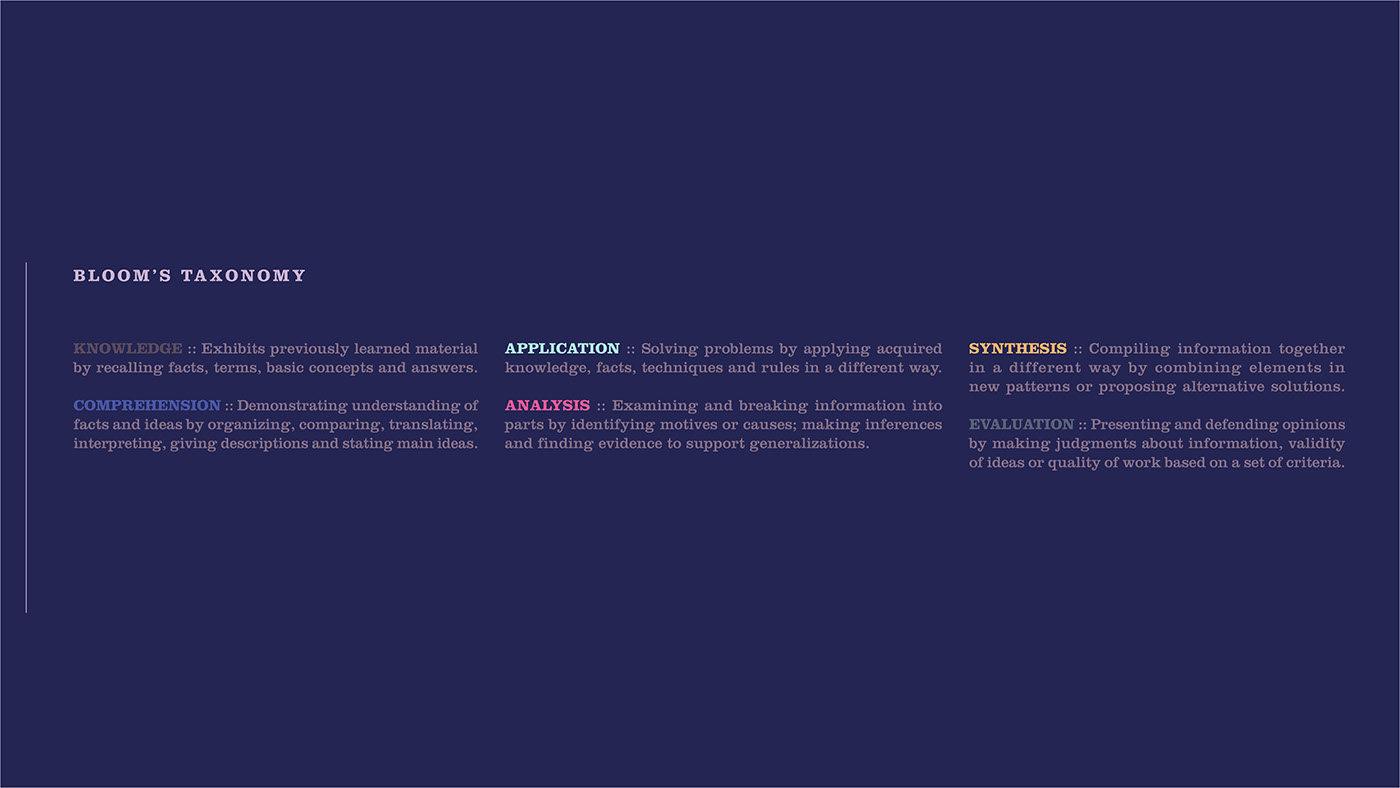
Bloom’s is an infographic based on data from previous design projects. It is organized by perceived levels of happiness, Bloom’s Taxonomy, and AIGA/NASAD competencies.
Problem: How can the complex content be organized and displayed in a compelling way?
Solution: Through a circular, organic system using shapes and colors. The “petals” represent a design project. The more happiness I had towards each project, the more pink and orange rings are shown. On the petal edges are the three most relevant levels of Bloom’s Taxonomy per project. The most relevant levels of AIGA / NASAD competencies are marked by the interior set of blue rings.