


Zero Point is the first film created exclusively for the Oculus Rift. I worked together with Jeremy
Wabiszczewicz (needfire.la) to create a branded identity for the film consisting of a logo, key art, advertising campaign as well as the main title, lower thirds and credits in the film itself. Our goal was to create something that felt both unique but also fit across the mediums of movies, games and tech.


MAIN TITLE
The main title of the film was designed so that different elements from the logo are layered on seperate planes. This creates a level of depth and interactivity when moving your head to look around in the Rift.


example of how the graphic elements can lay out in a 3d environment.

MAIN TITLE
The key art consists of an existing photo composite provided by the client. We added the logo treatment and provided color correction and retouching.


LOWER THIRDS AND CREDITS
For the lower thirds we wanted to provide a similar level of immersiveness and interactivity as the main title. The lower third is contained in a graphic ring that encircles the viewer. As the viewer moves his or her head, the typography shifts left or right along the ring so that the information is visible no matter where you look on the 360 degree axis.


credits

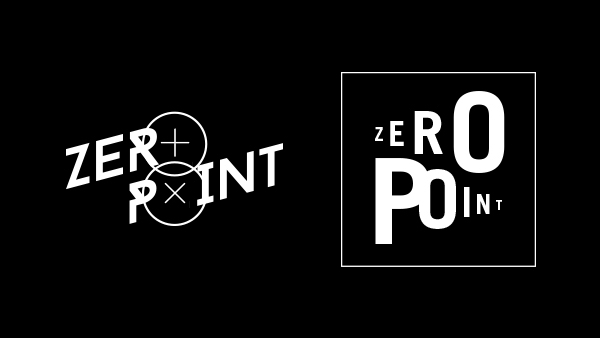
ALTERNATE LOGO EXPLORATIONS
While we are quite happy with the bold simplicity of the final logo, we had a lot of fun working on this project and thought it would be a shame not to show some of the other ideas we had floating around in our heads for this one. Here are some of the highlights from our exploration. Thanks!


3d planes creating a depth of field within the logo.


