Final Mock-Up

The Problem
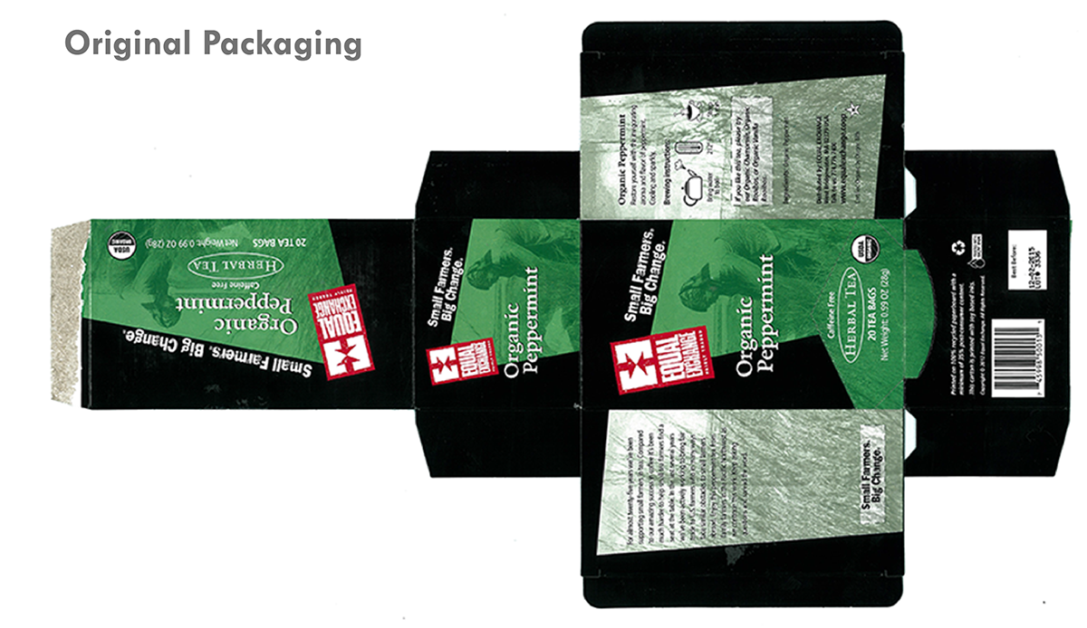
Faced with the choice of redesigning a package, I chose one off the shelf that I felt could be better. The design on the package looked unfriendly, dated, and militaristic. I had to come up with a design that appealed to the target market while encompassing what the product was about.

The Solution
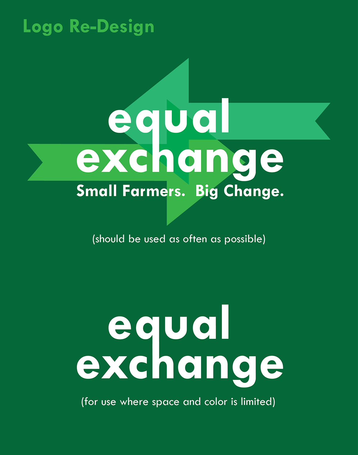
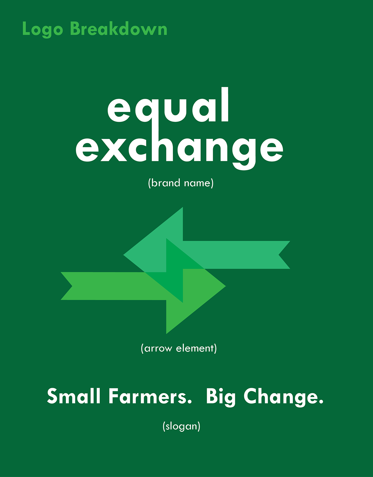
I wanted to base the packaging design around the peppermint plant and its colors. I re-designed the logo to look more friendly but still retain the arrow elements of the original logo. The re-designed package uses greens and curved lines as compared to harsh edges and aggressive reds. I wanted the package to overtly express how the tea makes you feel: refreshing and cool.