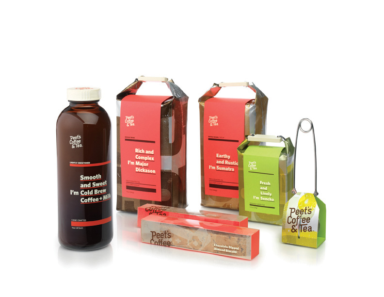
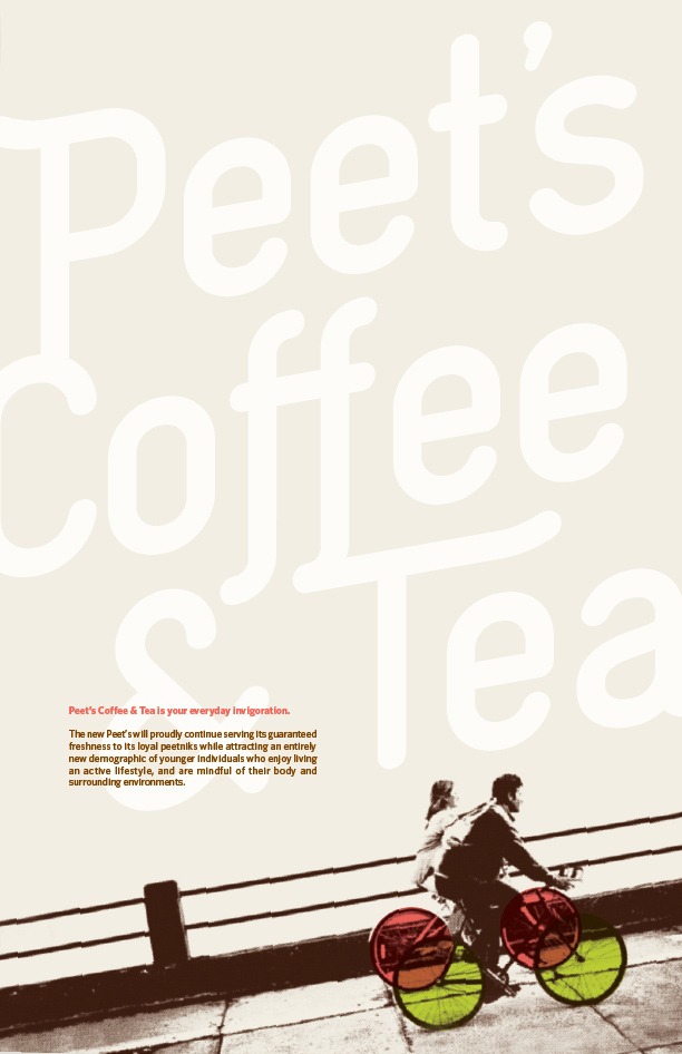
Peets Coffee & Tea is the everyday invigoration for the many who love its smooth, rich blends and delicious snacks. But Peet’s believed there were more potential peetniks out there and hoped to attract an additional demographic—a younger group of folks with active lifestyles. So how would Peet’s continue serving loyal customers its signature cup while reaching out to an entirely new demographic? Simple. With design that communicates “new and fresh” while still maintaining Peet’s approachable and grounded personality.
Here, letterpressed pattern design gives the brand a welcoming, rustic feel that echoes hand-pressed craftsmanship, while fun, energetic colors add life and brightness without coming across as hipster. Product handles are designed to be easily grasped, so much so that customers may inclined to purchase several at a time. And finally, the product introduces itself clearly through package copy, in a friendly, conversational tone that further echoes Peet’s very human and down-to-earth brand personality.
Course: Package Design 2
Instructor: Ania Borysiewicz
Prototypes: Julie Yeow
Photographed by: Jason Ware