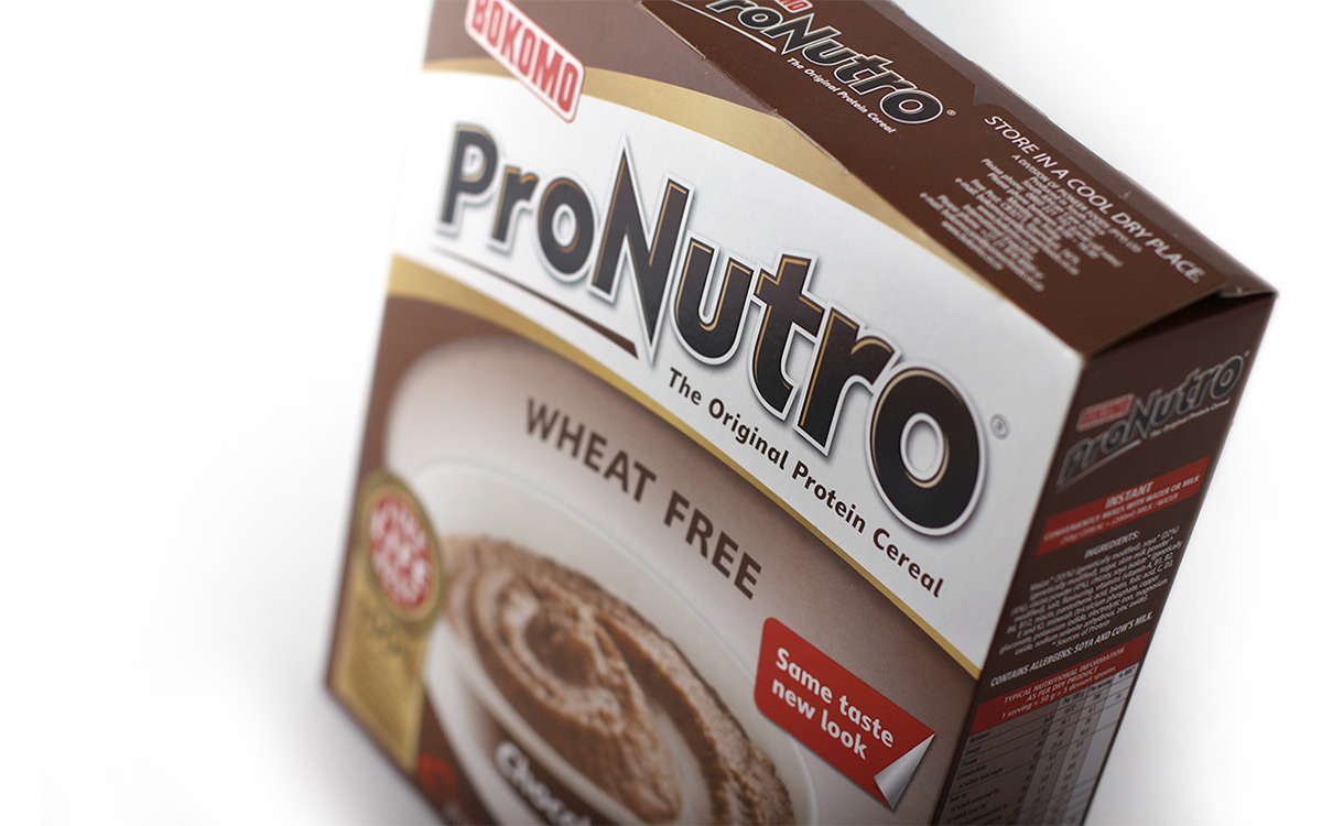
When big brands require a packaging update, it’s a critical balance between modernisation and remaining true to the existing visual identity. For cereal mega-brand, ProNutro, it went beyond cosmetics to giving brand love back to consumers. As category custodian, ProNutro requires gravitas.
In the re-design, a considered architecture has achieved brand consistency across the different variants. Simpler and more structured, with a punchy white holding device, revised logo and energetic gold swoosh; the brand is not only powerful and confident, but visually wholesome, relevant and accessible for the whole family. The addition of the Live Life Best call-to-action conveys the functional health benefits and inspires a healthy, happy, balanced lifestyle. The trusted favourite in SA was long overdue an upgrade. Having just gone to shelf, the hard results aren’t in yet, but the spontaneous response has been overwhelmingly positive.