Trident media
Brand identity, design system, website design
A media buying agency specializing in advertising procurement. Experts who are not afraid to enjoy themselves and appear simple, not old-fashioned. The updated identity should primarily target potential employees of the company, conveying its coolness and forward-looking nature.
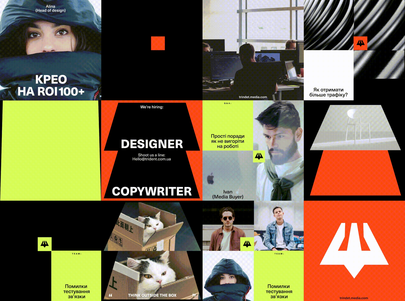
We developed an identity, a social media branding design system, and a website design for Trident.
The trident is an attribute of Poseidon, which combines the metaphor of “pouring traffic” with the Ukrainian origin of the company. Also, perspective is one of the consistent methods of visually representing any information.
It is present in everything: in the logo, typography, graphic elements, etc.
Perspective is what a potential employee of the company Trident should feel.


Triangle and path
This visualizes the endless flow of traffic that Trident expertly manages.
The perspective continues in other graphic elements. Path, transformation, and flow are the foundation of the design system.
Bright colors as energy, enthusiasm, and a modern approach.
Geometry
We took the path of geometry and translated the principle of central design into visual representation. We added an auxiliary figure to the system, which allowed balancing the elements among themselves.
From one user to global traffic.
This is Trident.


