
Client & Year: Student Project - 2012
The Fassade family was designed as part of an Introduction Type Design project in my third year of University.
Brief: Design a family of Display typefaces based on1930s Art Deco, railway poster type.
Deliverables: Open-type Typeface File, Additional Promotional Material
Focus: Typeface Design, Typography, Art Direction
-
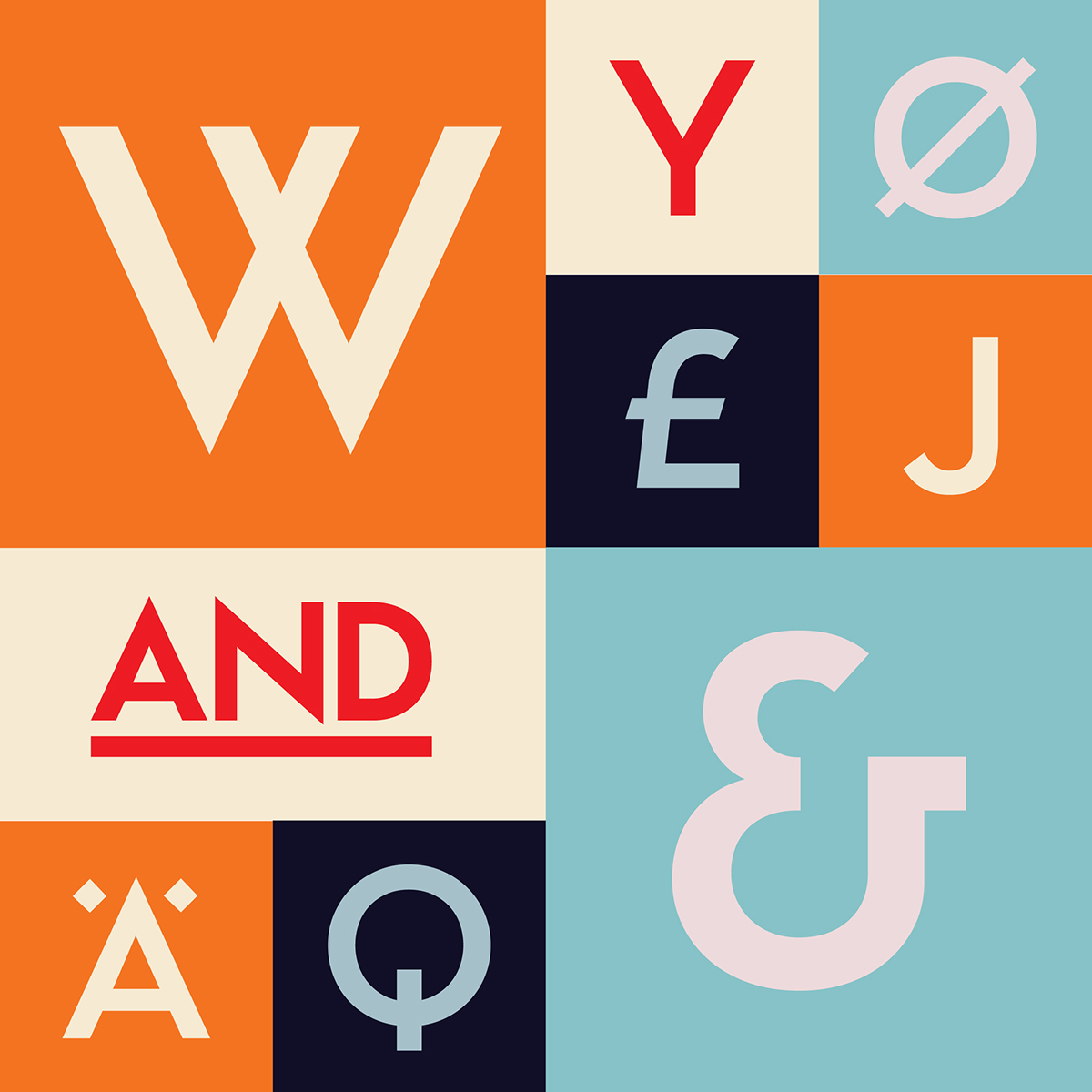
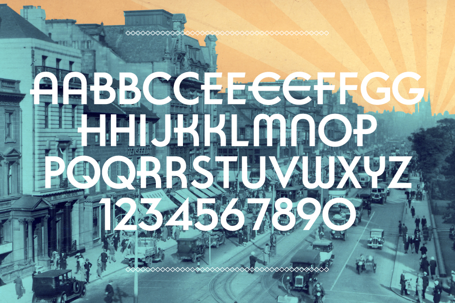
Fassade (Façade in German) is a family of 5 display typefaces, linked by an underlying structure, that is based on the lettering found on a 1930s railway poster by S.C.Allen & Brown, P. Irwin for London Midland & Scottish Railway. The type on this poster is a geometric sans-serif which clearly takes inspiration from early modernist type designs such as Paul Renner's Futura. Unlike Futura however these letters are stylised to give the letters a 'sense of speed' but also a persuasive elegance, and this was typical of the typefaces used in this period. These stylisations include: lowered 'crossbars' or 'waists' on letters such as E, F, P, Y etc, and 'Rally-Stripes', which are the expressive horizontal strokes that cut through the vertical strokes on letters such as A, E, H, R etc. This lettering became the first typeface in the family and was called Fassade Display.
Taking Fassade Display as a basis I then developed a range of variants all with a unique personality and flavour.
Firstly there was a 'stripped down' variant which has all of the stylised elements removed leaving a clean geometric sans-serif. This of course was given the title Fassade Sans.
I was then inspired by another Art Deco display typeface by Harold Holland Day, called Novelty Gothic (1930). It feature even more stylised letterforms such as 'hybrid' letters of A, E, N, M, W, X, Y. These letters fuse the characteristics of upper and lower-case letters together into one 'hybrid glyph'. This version was called Fassade Novelty in homage to Novelty Gothic.
I then took Fassade Display and applied an unorthodox system of stencil cuts. This system brake each letter up into blocks and curves, which give the typeface a constructed, playful quality. Whilst experimenting with stencil cuts I came up with a more converntional Stencil Typeface which has a aggressive industrial appearance.
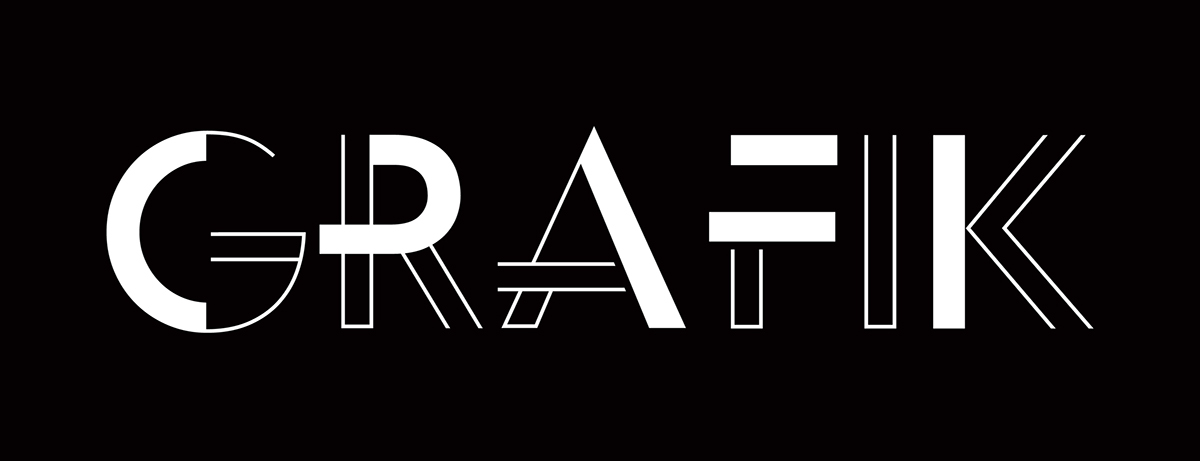
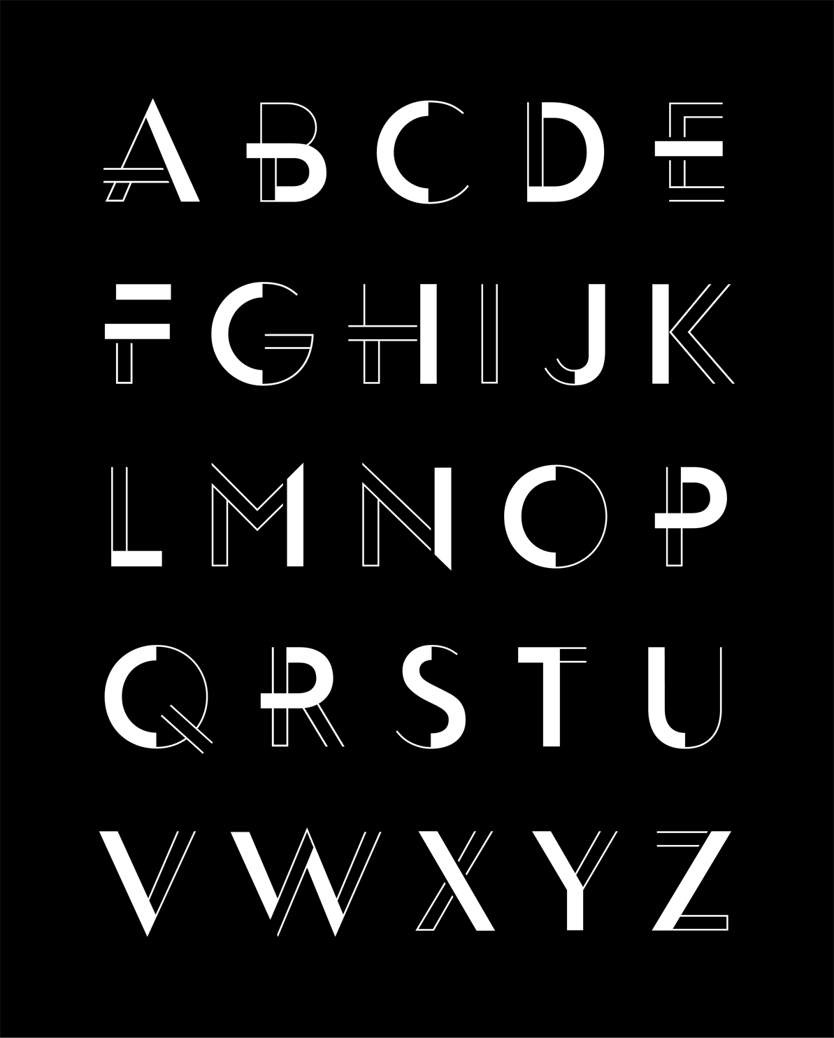
The next varient developed when I was playing with 'full' and 'outlined' strokes. I started by reducing the letterforms down to basic graphic elements and shapes which have a constantly varying weight and colour. I named this version Fassade Grafik (Graphic in German) as each letter was less like a conventional glyph in a typeface and more like a logo or graphical device.


Fassade Display


Fictional poster campaign for www.thetrainline.com promoting fast train times which features a
'slanted' Fassade Display.
Poster Designed by Jonathan Martin

Fassade Sans


Fassade Novelty


Fassade Display Stencil


Fassade Grafik

Fassade Stencil


