


Orion
_
Orion is a clinic offering laser eye surgery that opened in 2023 in the Sherbrooke region. Co-founded by Dr. Choulakian and Dr. Faucher, the clinic employs a team of dedicated specialists and has the latest technology equipment to offer a personalized, distinctive, and completely transformative clinical experience to its clients.
In the winter of 2023, I was commissioned to create a brand identity for the clinic that would distinguish it from competitors and reflect its values and ambitions. The goal was to increase awareness of the clinic and establish it as the leading authority in laser vision correction in Quebec.
In the winter of 2023, I was commissioned to create a brand identity for the clinic that would distinguish it from competitors and reflect its values and ambitions. The goal was to increase awareness of the clinic and establish it as the leading authority in laser vision correction in Quebec.
Orion est un centre d’excellence en chirurgie de correction de la vue au laser qui a vu le jour en 2023 dans la région de Sherbrooke. Co-fondée par le Dr Choulakian et la Dre Faucher, la clinique emploie une équipe de spécialistes dévoués et dispose d’équipements de dernière technologie pour offrir une expérience clinique personnalisée, distinctive et intégralement transformatrice à chacun de ses clients.
Dans un souci de se distinguer de la concurrence, non seulement par son offre distinctive, mais aussi par une identité de marque singulière, j’ai été mandaté à l’hiver 2023 pour offrir à la clinique une identité de marque à l’image de ses valeurs et ambitions : faire connaître la clinique et l’établir comme la référence en correction de la vue au laser au Québec.
Dans un souci de se distinguer de la concurrence, non seulement par son offre distinctive, mais aussi par une identité de marque singulière, j’ai été mandaté à l’hiver 2023 pour offrir à la clinique une identité de marque à l’image de ses valeurs et ambitions : faire connaître la clinique et l’établir comme la référence en correction de la vue au laser au Québec.
Branding : Vanessa Pepin
Naming and copywriting : Élise Guillemette & Isabelle Lamarre (Ié.)
Photography : Marie H Rainville
Photography : Marie H Rainville

Inspired by the space
The design of the clinic being already underway when I was tasked with creating its brand identity, I took it as a starting point to the design. Eager to ensure alignment between the brand and its physical environment, I drew inspiration from specific aesthetic elements already present in the clinic's layout. Elements such as tapestries featuring crosshatching lines and curves reminiscent of the art deco style served as the foundation for the visual language of the clinic.


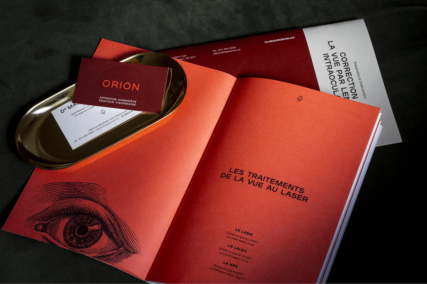
The monogram draws its inspiration from Greek mythology, where Orion is depicted as a hunter. This reference not only pays homage to the clinic's name but also, the arrow subtly suggests the precision and meticulousness of the work performed by the clinic's professionals.


I collaborated with Orion to create numerous pieces designed to support their clients throughout their journey, from their initial visit to the clinic, through consultations and procedures in the operating room, and finally, to their return home and convalescence.


In order to tell the story of the unique experience offered by the clinic, a series of photographs was produced to capture the essence of the customer journey at Orion, from the beauty of its facilities to the expertise of its team, as well as its cutting-edge equipments.


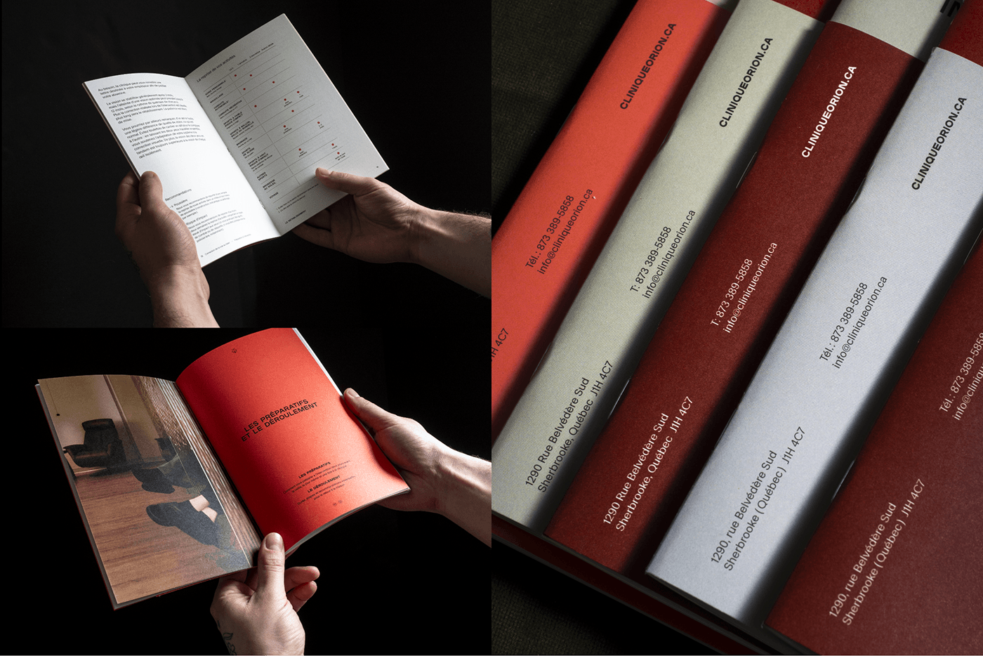
The guides were designed to provide clients with all the information they will need in preparation for their first consultation with our team or in anticipation of their upcoming intervention. A leaflet in one of the brand's two flagship colors identifies the document, while a different color has been selected for each of the three types of interventions so the clinic staff can easily differentiate between the guides.


Thank you - Merci
PEPINVANESSA.COM
Facebook Instagram
Thank you - Merci
PEPINVANESSA.COM
Facebook Instagram


