


Cadence™ is a luxury brand founded in Los Angeles (2024) by Ross MacKay and George Heaton, embodying the pursuit of greatness through the translation of performance into physical products and experiences.
Our team was approached with a brief to envision what a premium hydration solution looks like. We designed the brand identity and product packaging, reflecting both the advanced science behind the product formula, and the philosophy of harmony within mind and body.
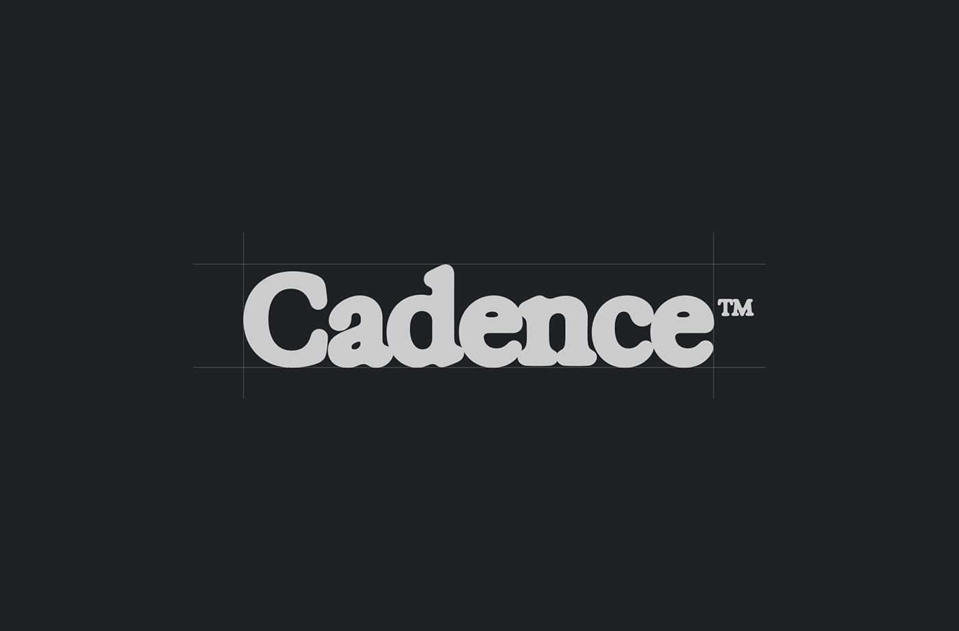
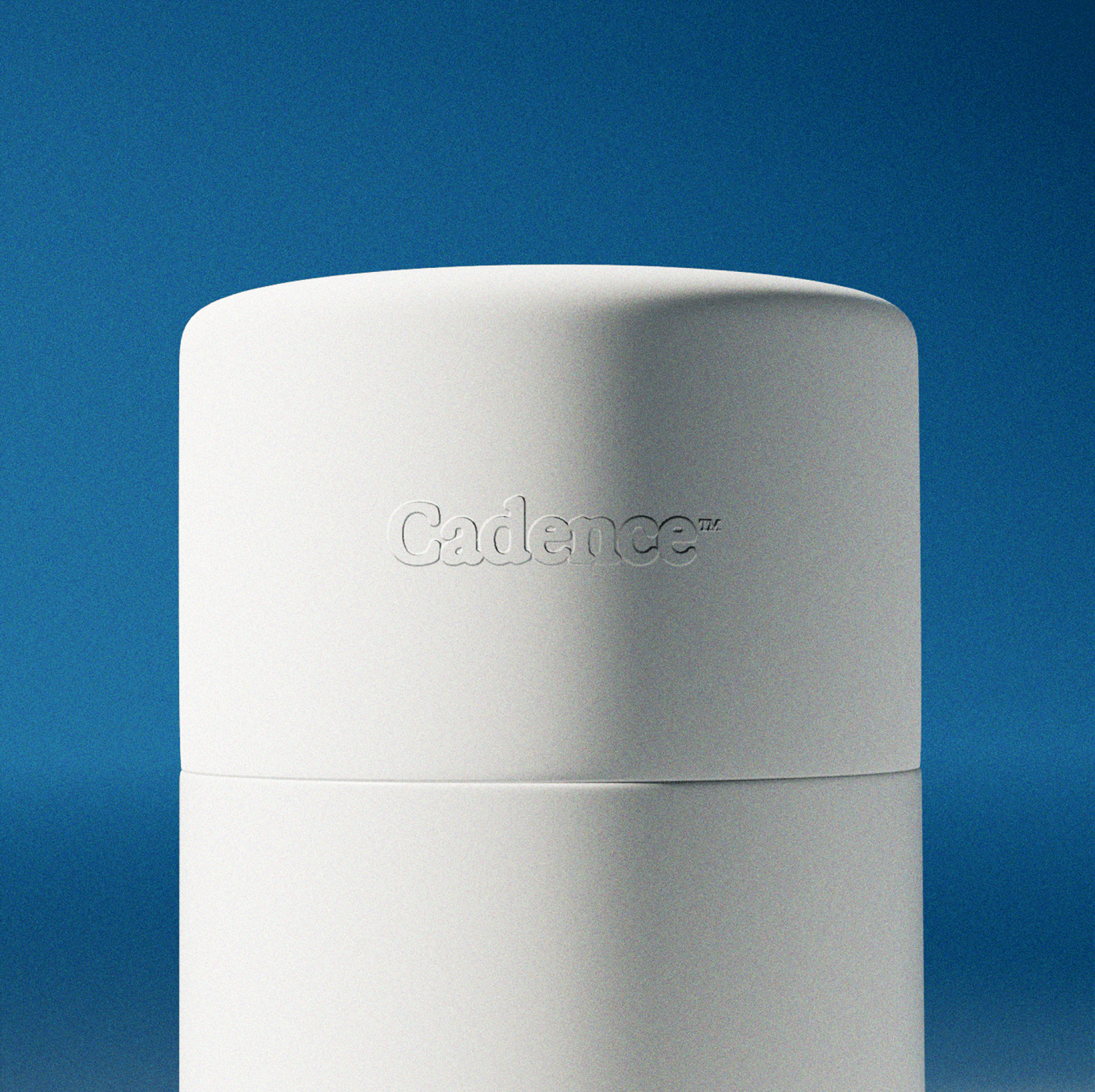
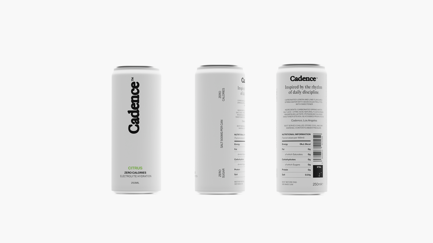
We directed our attention towards the brand typography with the logo being the primary visual point. Cadence™ is more than a product, it's where physical performance meets mental clarity, so we designed the logo that can communicate multiple brand expressions - daily routine, physical performance, mind and body optimization, focus and productivity, and the pursuit of greatness.
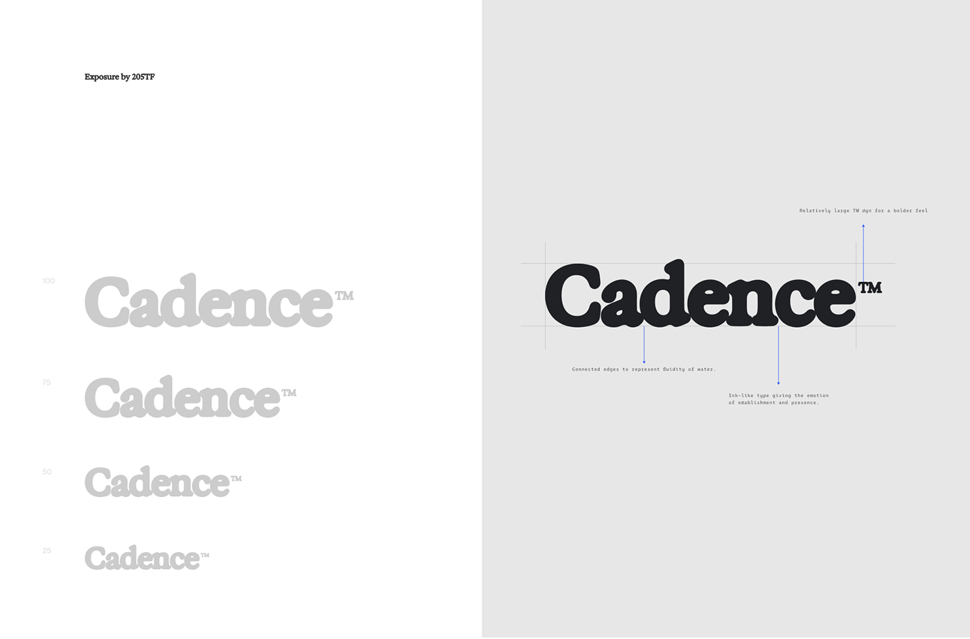
The ink-like logotype gives the emotion of establishment and presence. Connected edges represent fluidity of water. For the brand’s logo we’ve chosen Exposure by 205TF type foundry, while the rest of the brand’s typefaces are from PangramPangram type foundry. We decided to go for Editorial New as our primary type, that is used in the majority of brand’s messaging, and Neue Montreal being our accent font.


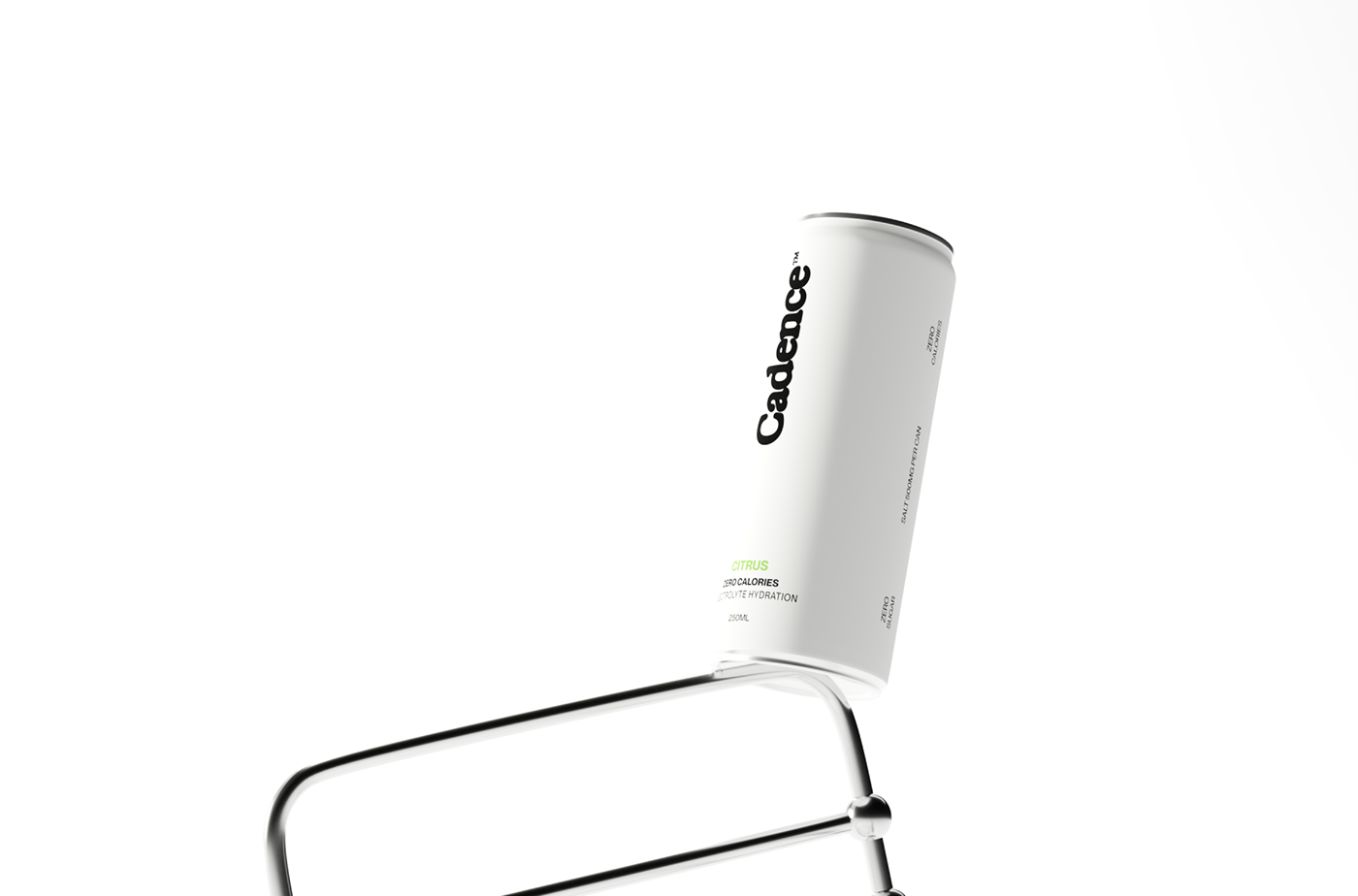
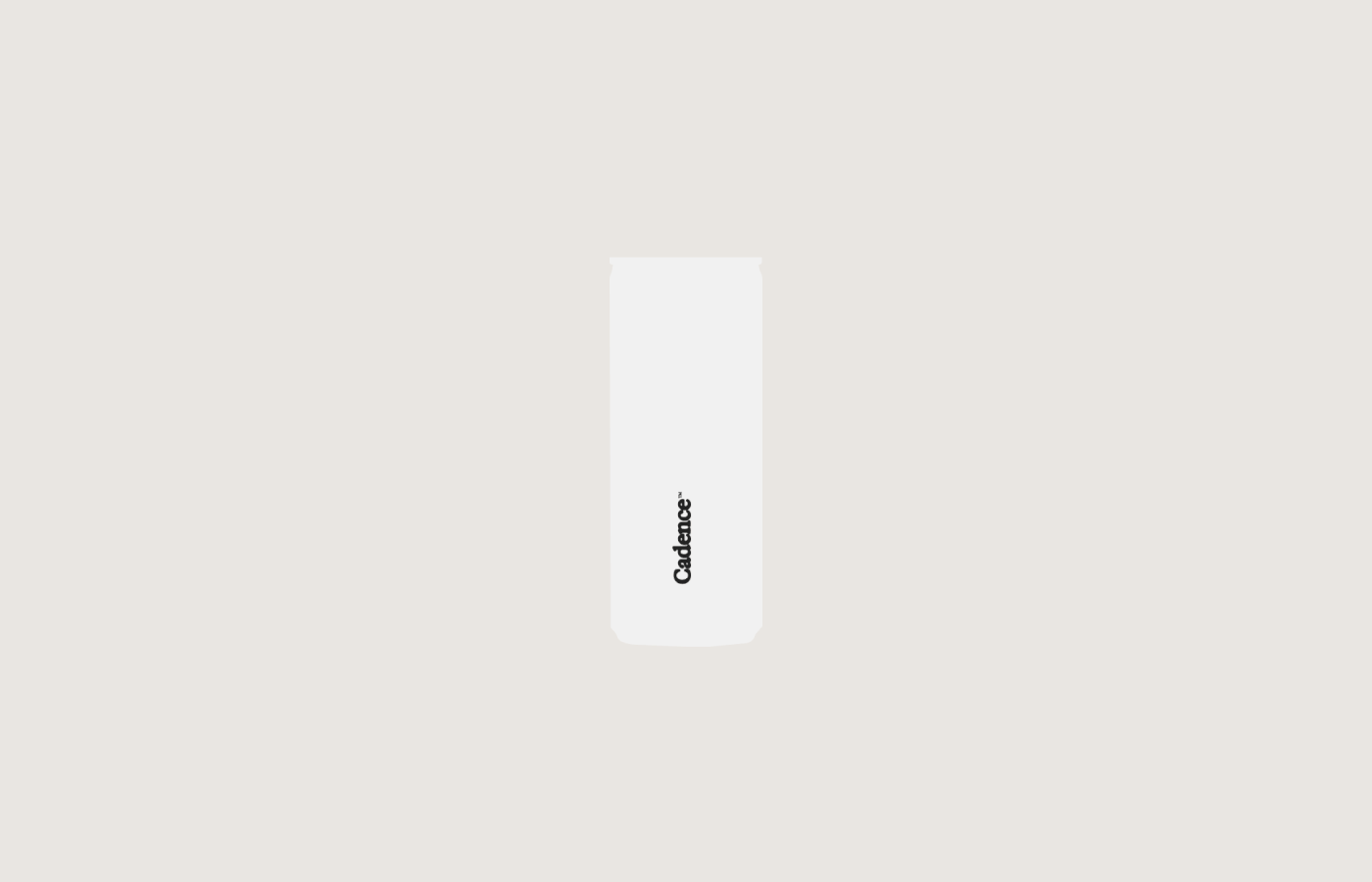


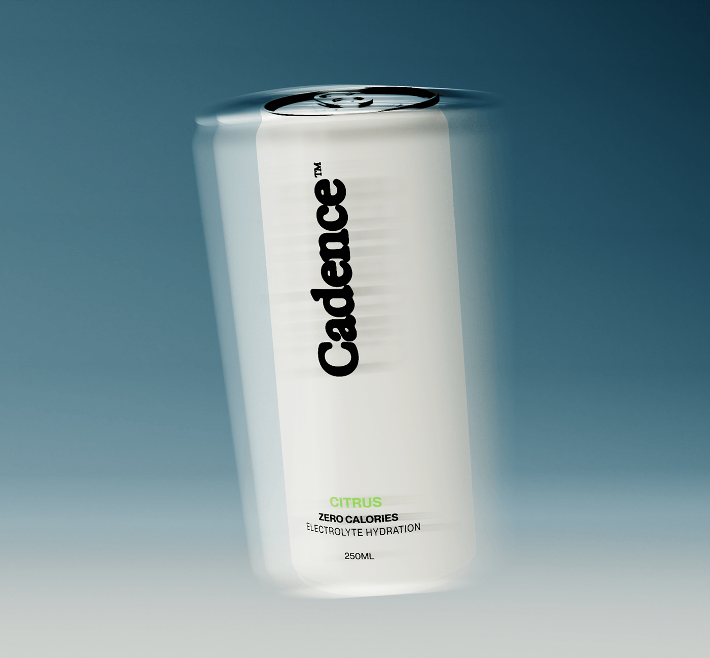
Implementing CGI and renders into our process was the next step towards developing the brand's identity system. Hyper realistic visuals helped us focus on designing an experience of what it feels like, to hold a Cadence™ can in your hand. We wanted to imagine how it feels like, seeing Cadence™ can on a table while working or while getting ready for a run. From product design layout to light and texture details, this approach has given us full creative freedom to visualize the brand's full potential.
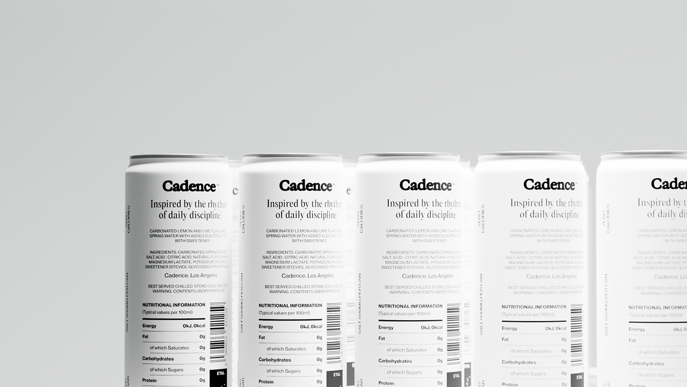
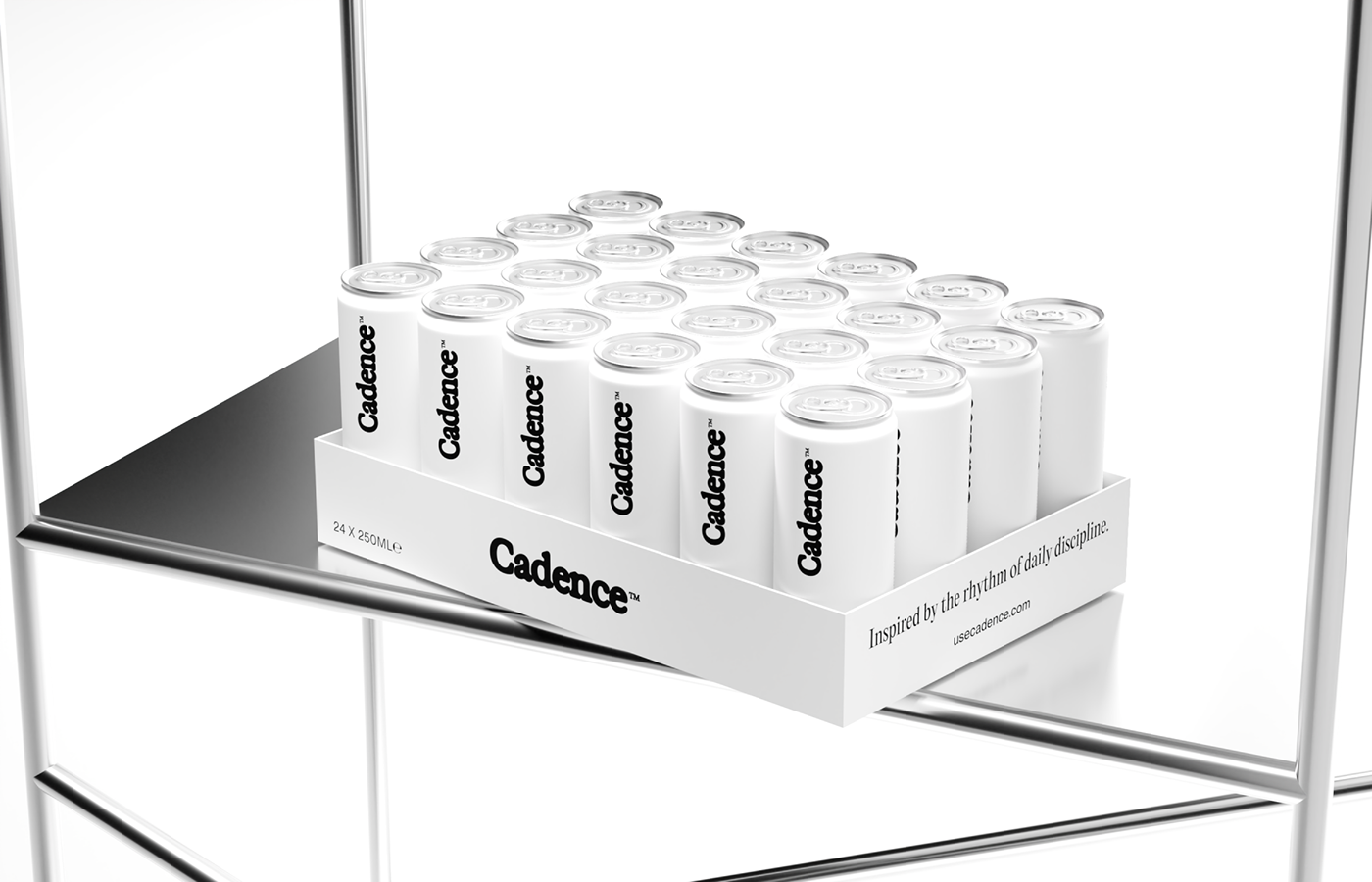

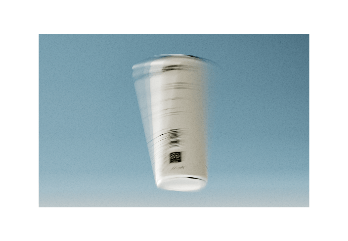


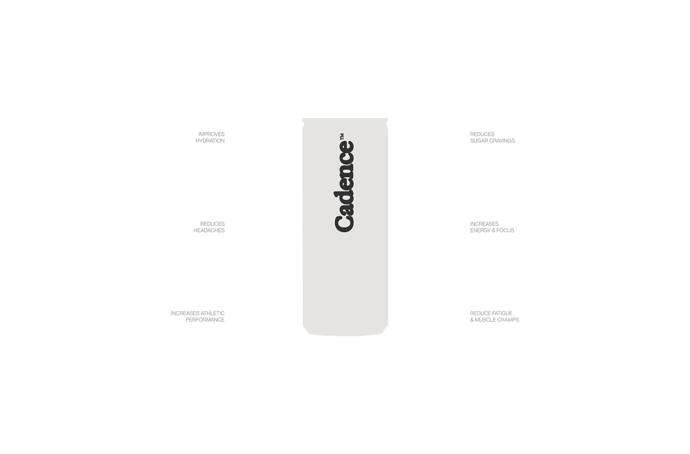
Cadence™ packaging design is bold yet minimal at the same time. Despite the size and boldness of the logo, the can design looks clean and minimal. Black and white palette dominance allows for the fresh and pure feel, which perfectly aligns with the product’s all natural formula. Looking at the can, we can feel the science-backed ingredients blend without getting bored or overwhelmed.


Cadence™ is setting new standards within the electrolyte drinks industry. With a brand vision that spans across multiple areas of performance, the visual experience continues to evolve as the brand grows bigger. We are extremely proud to be part of creating Cadence™ and can’t wait to see what lies ahead.
Services: Brand Identity, Strategy, Packaging, Art Direction, CGI
Behind the scenes.


