Mezcal 28
MEXICO
Mezcal 28 is a series of achievements, a mix of energies and symbolism. Born as a tribute to the great family of regions producing agave distillates in Mexico, it preserves the tradition and history of mezcal and its significance throughout Oaxaca and the world.
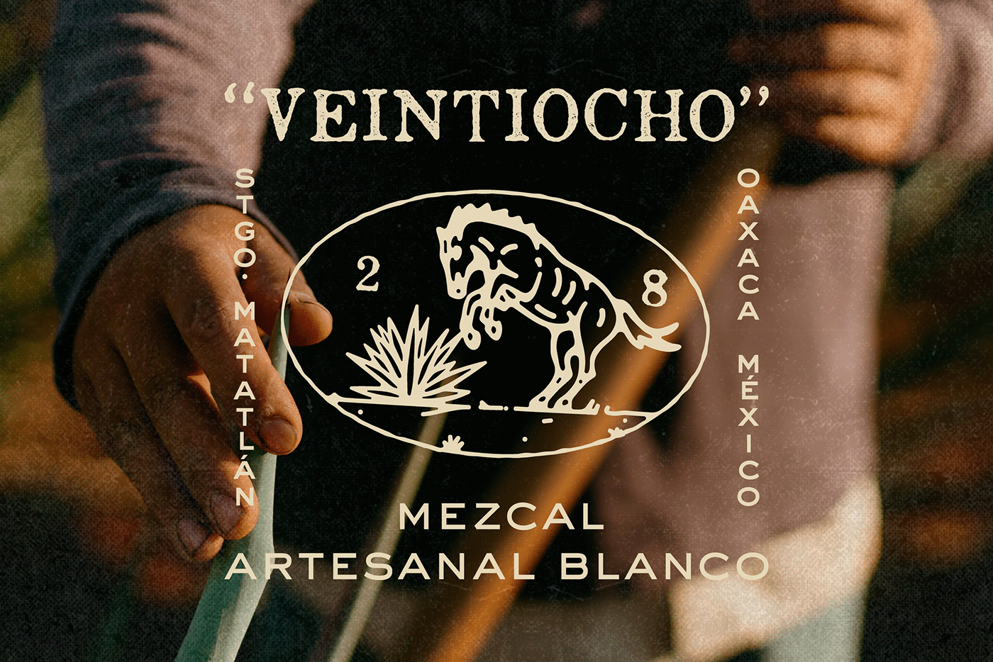
We crafted a modern and recognizable visual identity for this brand, rooted in a symbolic communication strategy and an engaging message tailored to those intrigued by the mezcal market. We emphasize essential aspects that celebrate the sacredness of the process and product, elevating its distinctive characteristics: its origin (28 Mexican mezcal/agave distillate production states), its tradition (which spans three generations), its artisanal process (each part of the traditional production process is crucial), its history (honoring the regions of Mexico that recognized the value of the distillate), its legacy (thanks to the families of the Mexican agave factories/distillers who decided to preserve the traditions), its name (“veintiocho,” twenty-eight in Spanish, a tribute to the states of Mexico), and the family (a sacred pillar for Mexicans and driving force behind their customs).
When redesigning the logo and label, we focused on familiar symbols and references deeply rooted in stories and traditions. Departing from the idea of a “traditional, old-time” label, we incorporated diverse finishing touches, elements, and an old-style paper texture. Using lettering reminiscent of calligraphy from old photographs, and postage stamps, we aimed to evoke a sense of nostalgia. The agave and horse on the label symbolize respect for the land and its resources. The stopper, sealed with a horse emblem made of wax, is destroyed upon opening, marking the precise moment of enjoyment.
Each bottle of Mezcal 28 now embodies its roots and history through its revamped visual identity, depicting its heritage clearly.


