Flat 77 was inspired by the two founders’ London home, which became a social hub for their friends, where they would host, cook, watch movies and play games. And now they are moving to Qatar.
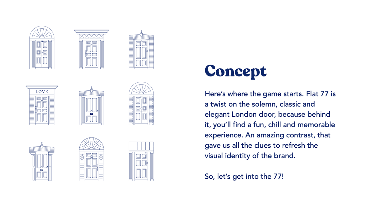
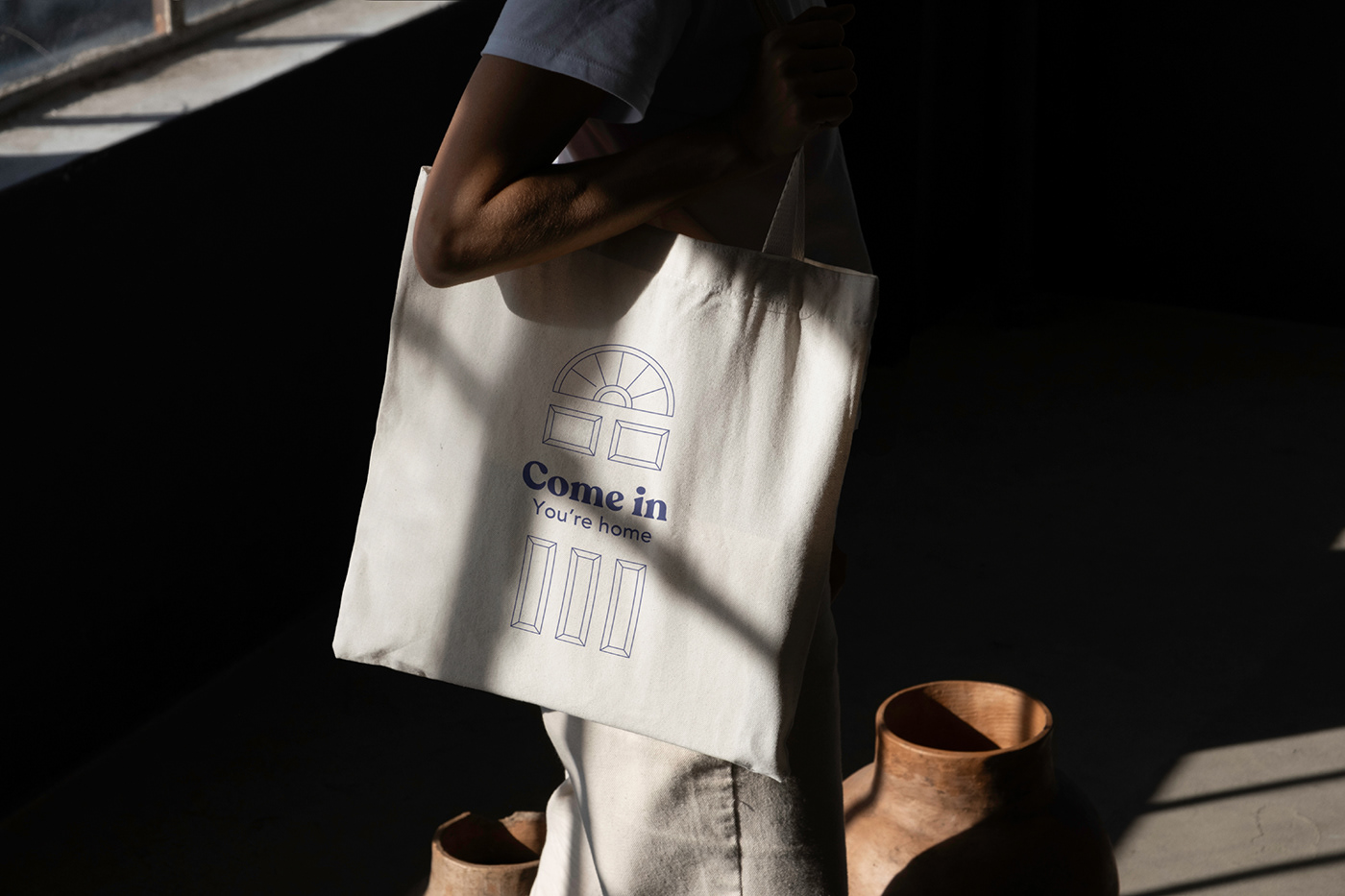
Here’s where the game starts. Flat 77 is a twist on the solemn, classic and elegant London door, because behind it, you’ll find a fun, chill and memorable experience. An amazing contrast, that gave us all the clues to refresh the visual identity of the brand. So, let’s get into the 77!
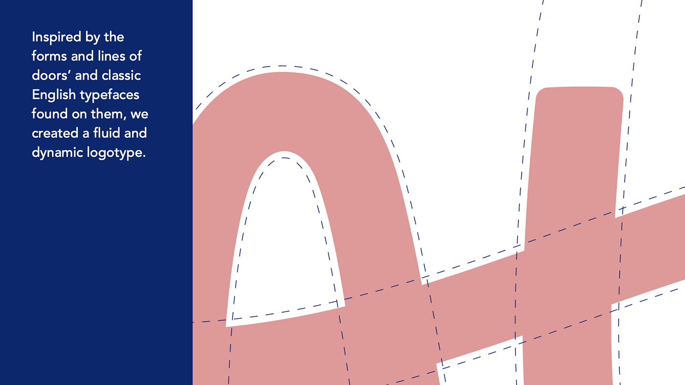
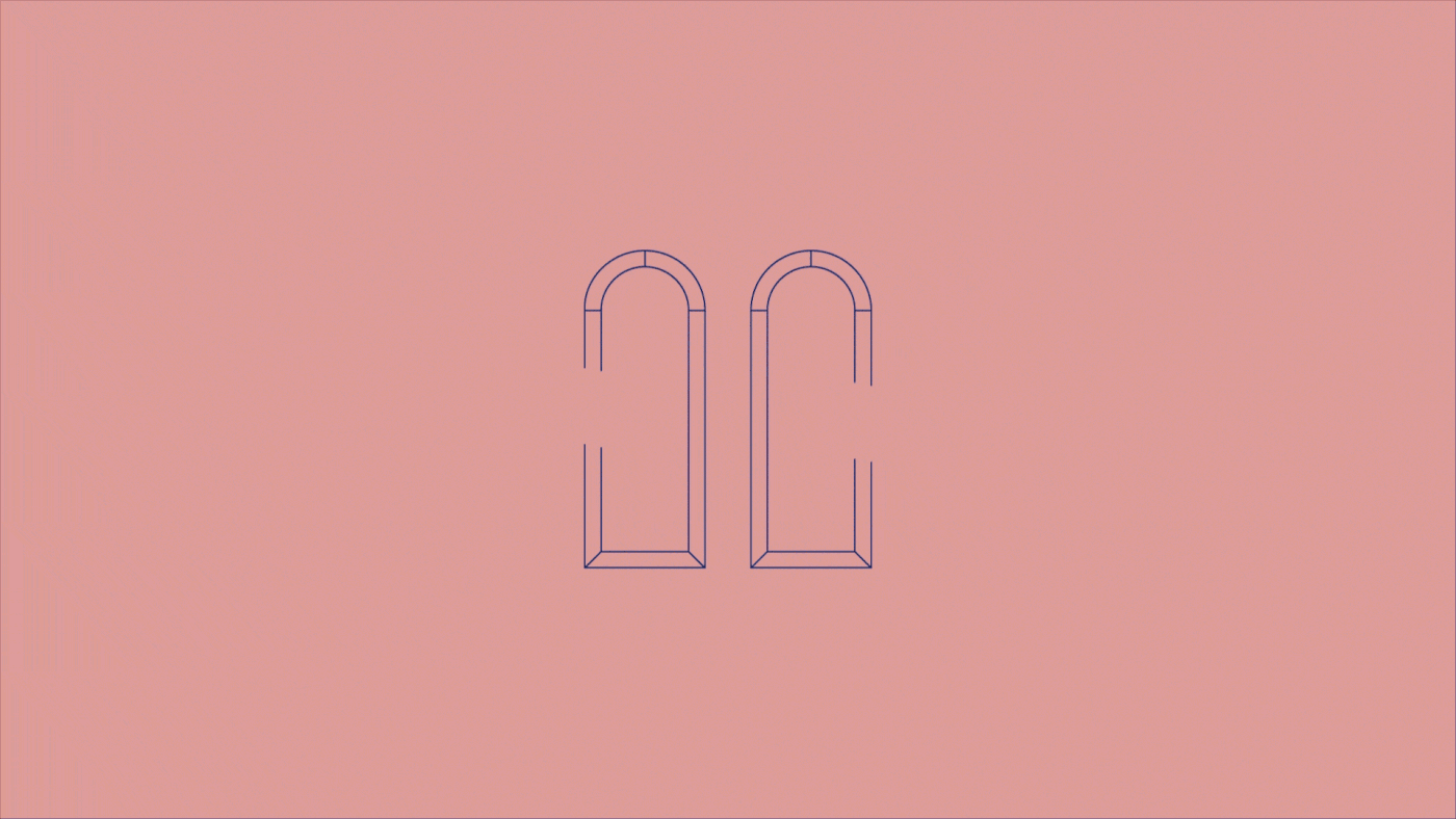
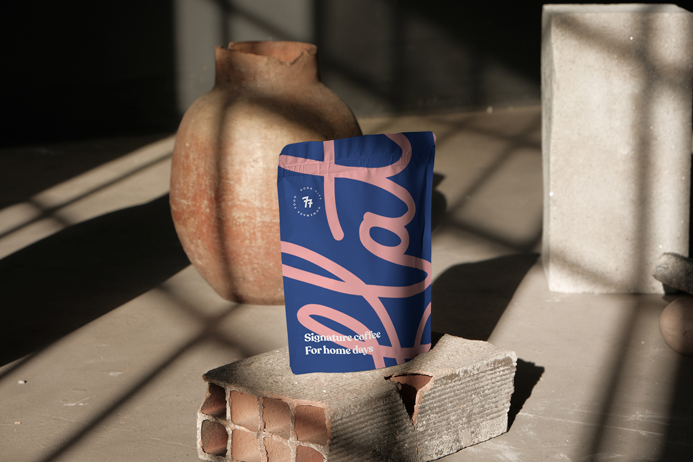
Inspired by the forms and lines of doors’ and classic English typefaces found on them, we created a fluid and dynamic logotype. Together with a fresh and easy-to-read typography, Recoleta. Along with colors in perfect harmony between strength and modernity.
Because a fun brand can’t just have one way of doing things, we created a lettering as an extra resource which can be used on multiple assets. A neon sign... maybe?