Momolato is a trendy gelateria and ice cream supplier in Singapore established in 2013. They've helped many local businesses stand out with their delicious treats as a "brand behind brands." In 2021, they established their own gelato ice cream cafe, swiftly gaining popularity as a premier destination for gelato enthusiasts. To date, they have over 300 gelato ice cream flavors.
Our task was to craft a brand that would resonate with a diverse audience, targeting not only cafe clients but also establishments ranging from the island's finest restaurants to its cozy cafes and luxurious hotels.
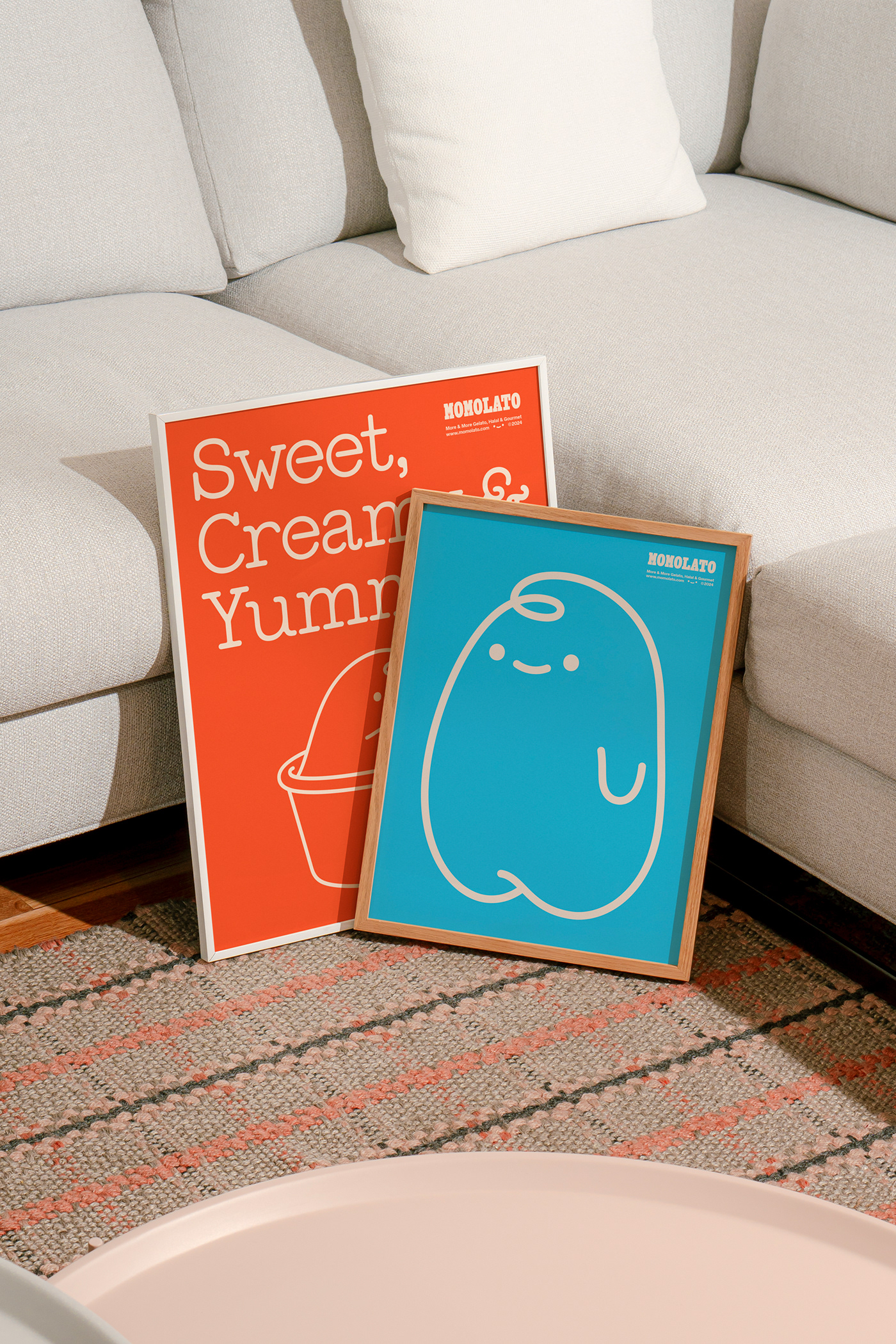
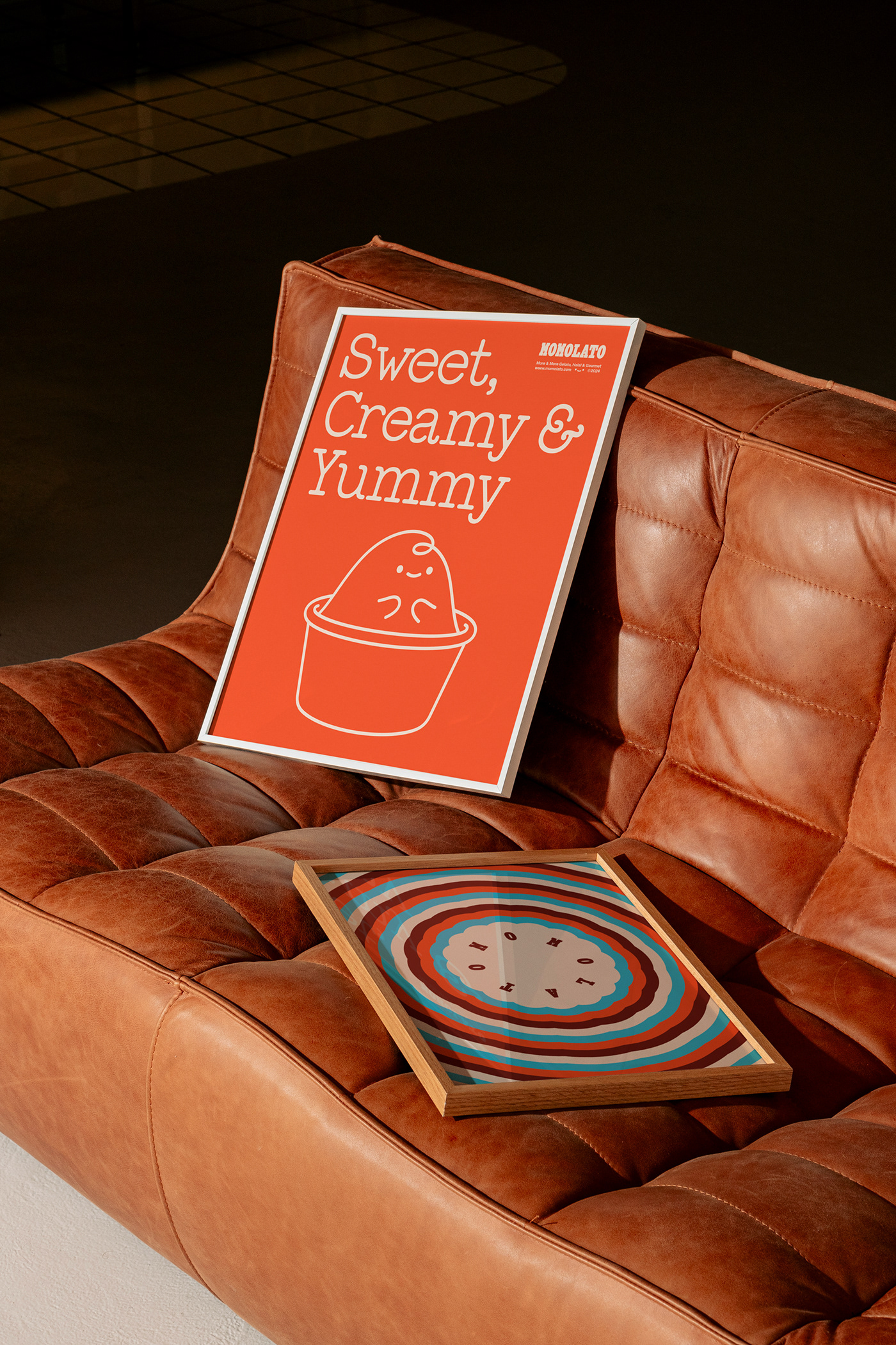
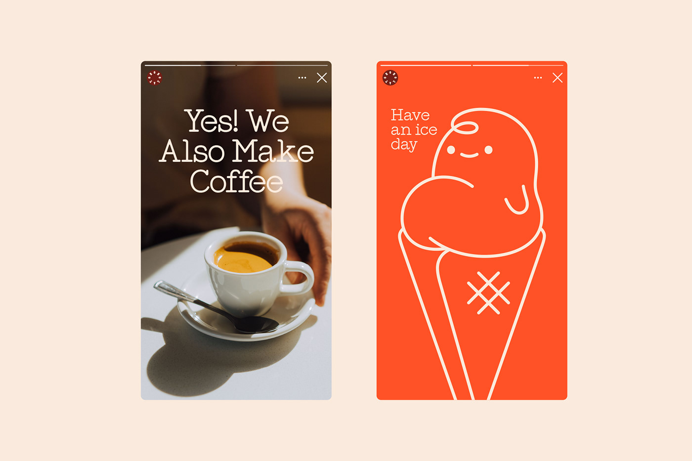
The name "Momolato" itself signifies "more and more gelato," serving as both a descriptor and the inspiration behind the character of "Lil Momo" – a delightful addition to the brand's visual universe, adding an irresistible charm and boldness. Through various scenarios, Lil Momo captures joyful moments with different Momolato products, all infused with a playful, humorous, and youthful spirit.
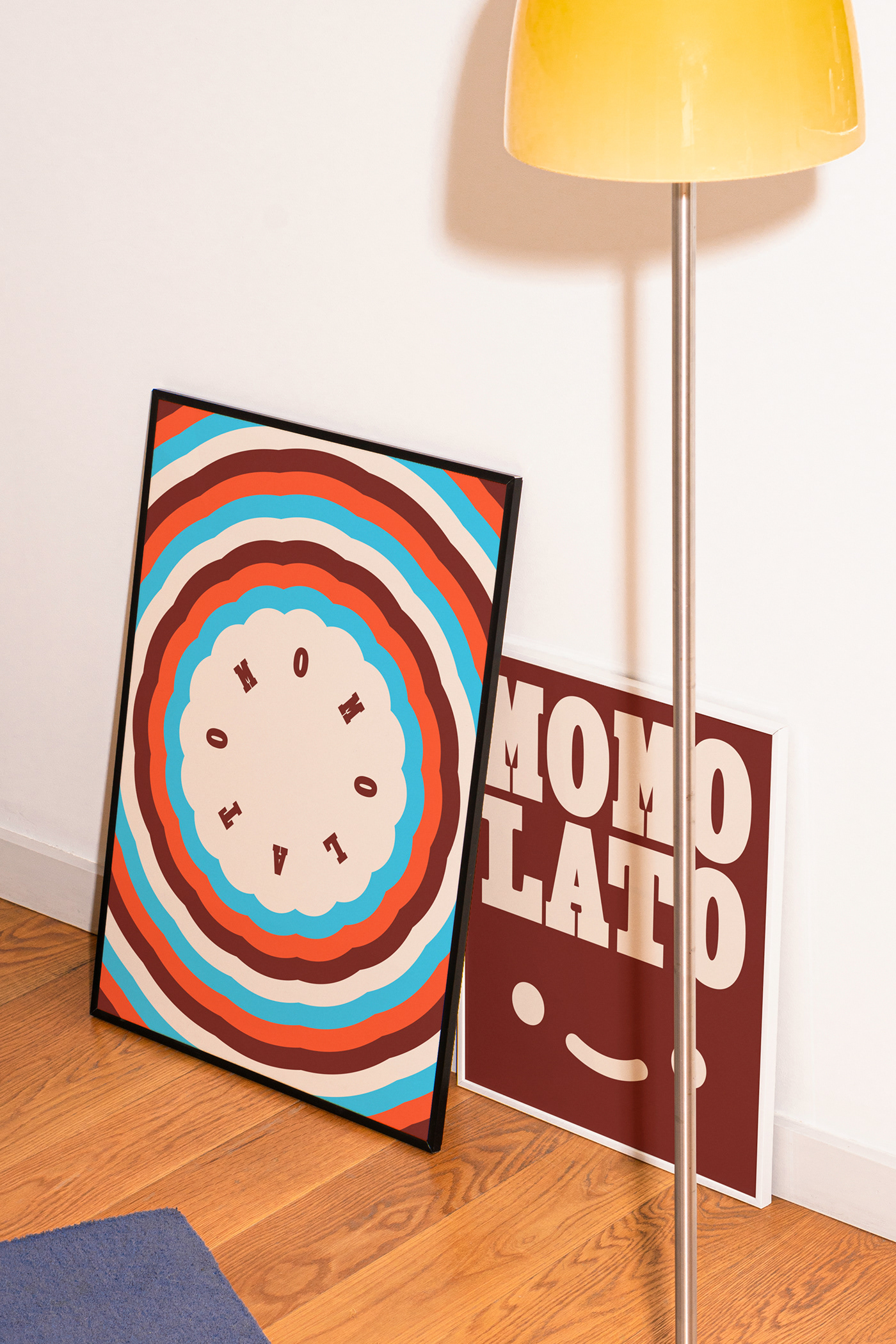
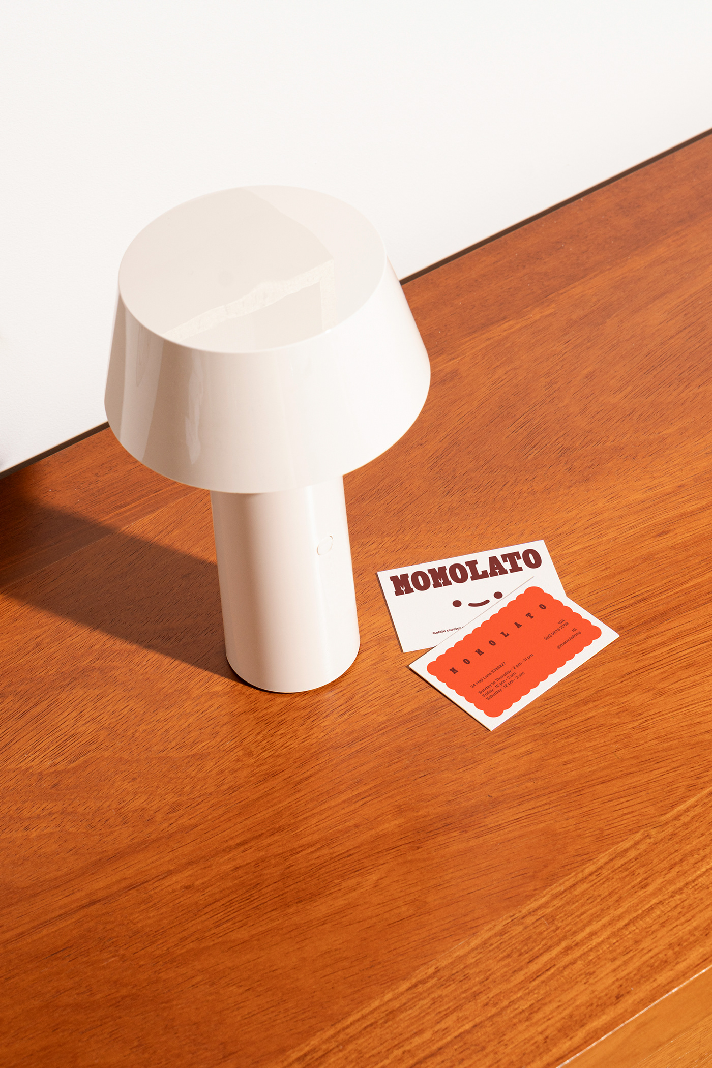
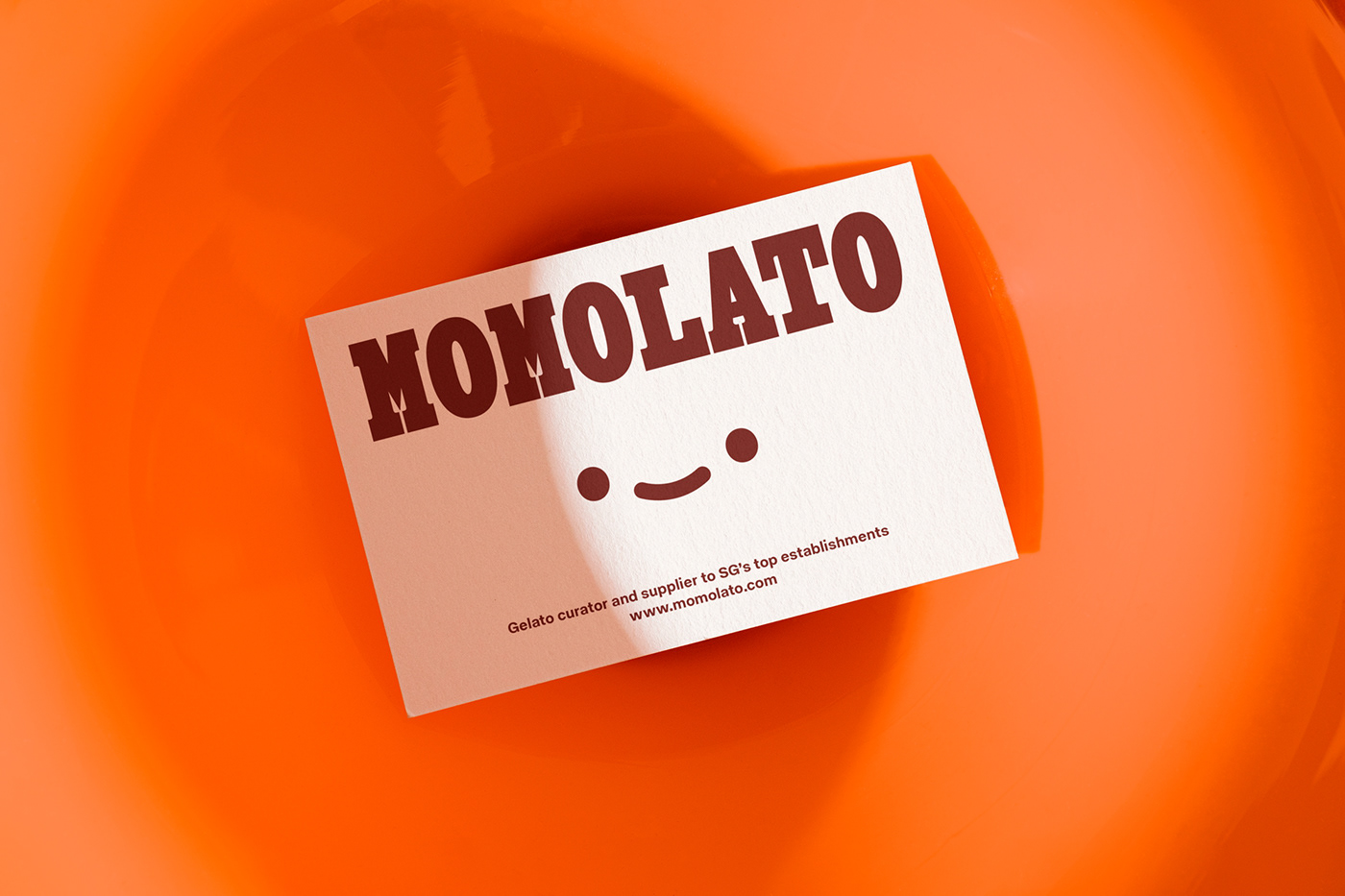
Set in all uppercase, the wordmark lends the brand a certain character and presence, while the supporting typography contributes to the overall lively and fresh visual narrative. The typographic selection overall was chosen for its unique characteristics and visual appeal, captivating attention and communicating the brand's personality directly.
The color palette further reinforces Momolato's identity, with a rich dark red serving as the primary color, accented by vibrant hues of bright orange and cyan. These colors, along with the illustrations and typographic elements, strengthen the brand's dedication to warmth, freshness, and vitality, giving the project an approachable and friendly tone.
