
Lina is one of Russia's largest producers of frozen pancakes, semi-finished products and ready-to-eat food. The most famous trade mark of the company, "S Pylu S Zharu", according to the research of GFK RUS, is named "Pancakes No. 1 in Russia".
Task
The company "Lina" approached us for redesign of the well-known brand "Syty Papa". This is a special offer from the largest producer of pancakes - especially for those who need a lot of energy and who want to enjoy a large portion of their favourite dish.
- "Sityy Papa" is a product loved by millions of Russians for its democratic price and excellent taste, - says Elena Vitsina, Executive Director of "Lina", - the most important task we faced was not only to keep those consumers who already buy our product every day, but also to continue to grow.
The Getbrand team was tasked with maximising the effectiveness of the packaging design, while maintaining continuity with the old design.


Our fruitful co-operation with Lina started with our author's workshop "Altitude". This is a strategic two-day session in which our team, together with key employees of the client, generates the best concepts and ideas for brand promotion. During the session, we work together step-by-step to define goals, immerse ourselves in the consumer world and develop a comprehensive brand building and promotion strategy.
With the help of our workshop, the company producing one of the most famous domestic pancakes built a harmonious brand portfolio with a common positioning, which should be reflected on the packaging of all lines. One of the first examples of the realisation of our joint work was the design of the packaging of the Fiero sub-brand, which we told you about earlier.

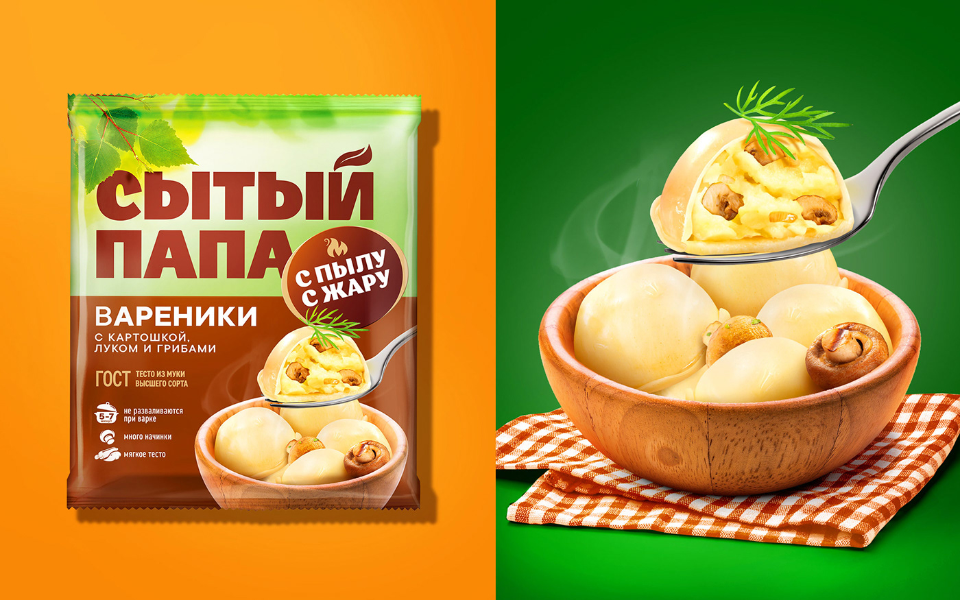


"Sityy Papa" is a brand of hearty pancakes with different fillings. It was important for us to show the breadth of such an offer, as the product itself implies an increased portion of a standard dish. An audit using the patented "Three Layers of Effectiveness" tool showed the low effectiveness of the old design, which could be mistaken for a brand of another category. Our experts emphasised all the benefits of the product with improved visual communication and separated it from the competition.
Thanks to the redesign of the packaging, there is a juicy appetising fudzone, which shows that this is a special pancake: not rolled up in a classic tube, but folded into an interesting envelope. It was important for us to make the packaging design stand out, which is why we also paid attention to a harmonious colour scheme.
The free die shows the advantages of the product, and the logo of the famous brand "S Pylu S Zharu" guarantees a high level of quality of the content. However, the mention of the popular brand doesn't take attention away from the main logo of "Svyatiy Papa". On the contrary, the logo zone looks confident and powerful with a stable and prominent font, so that it cannot be lost sight of on a crowded refrigerated shelf.
The increased portion volume is also emphasised with the horizontal positioning of the tray, in contrast to "S Pylu S Zharu". The new packaging design perfectly conveys the precious family values that Lina stands for, and now "Sityy Papa" looks like a "big" and "strong" offer among its competitors.


