IN ICELAND WE HAVE TWO SEASONS:
WINTER AND A BIT LESS WINTER
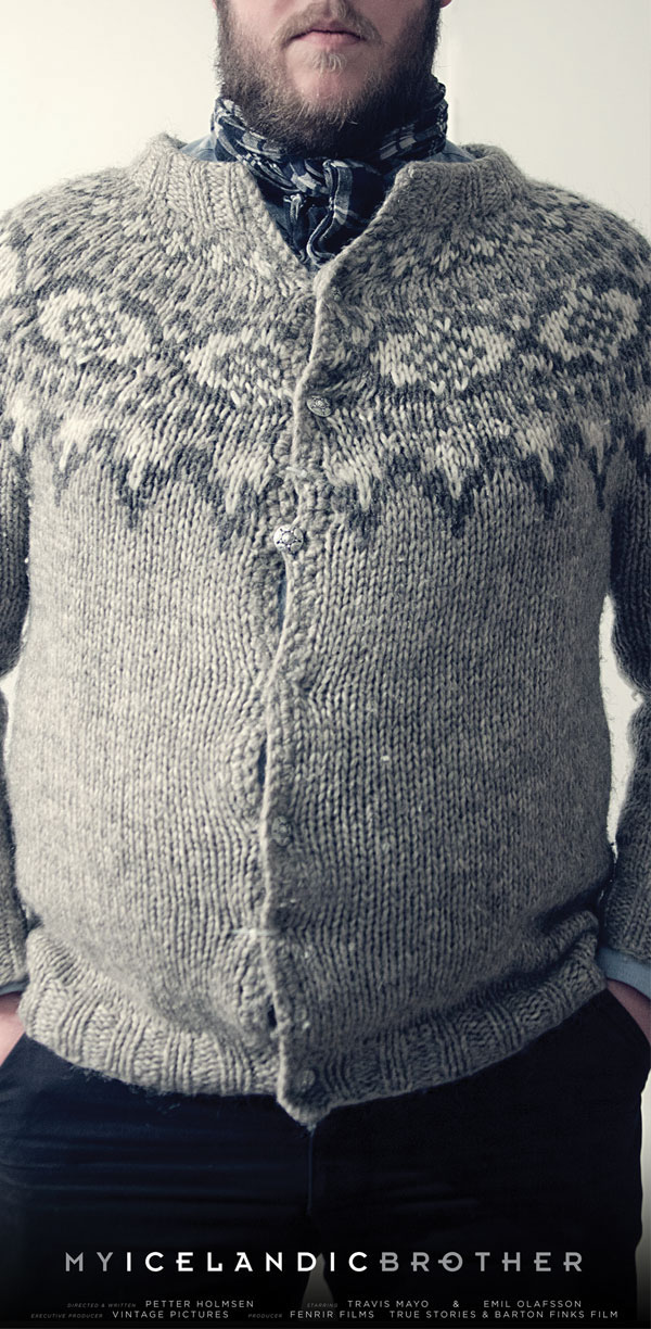
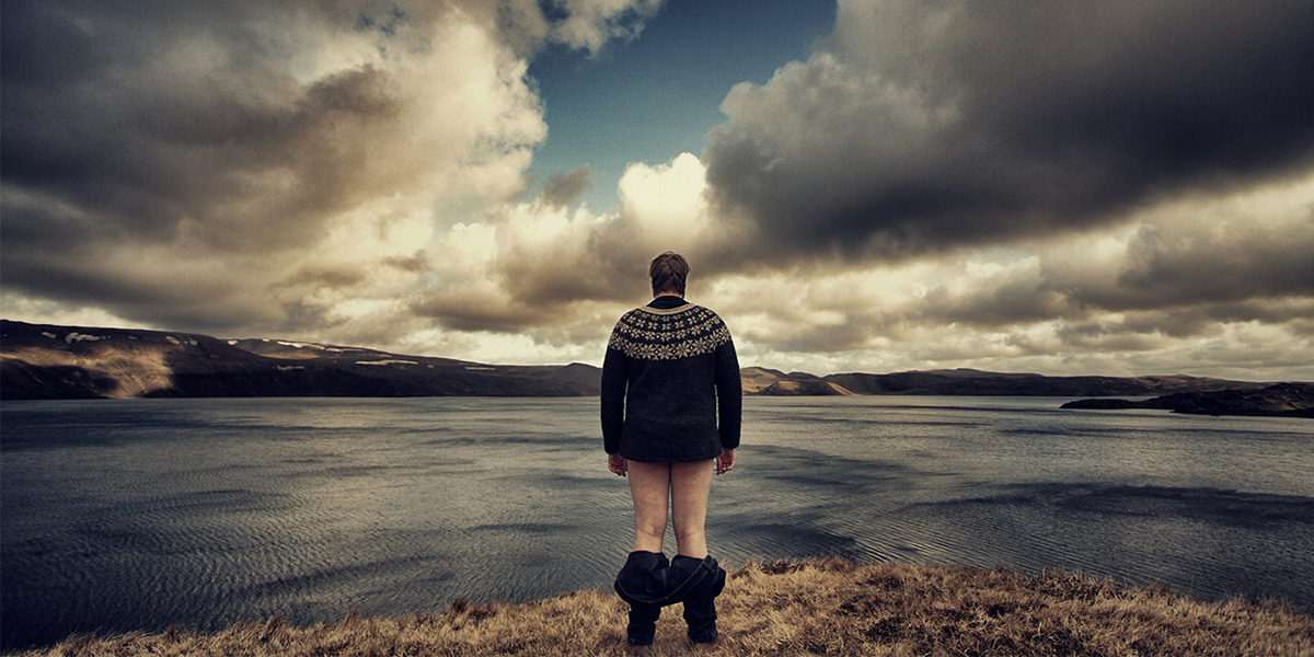
The director, Petter Holmsen came to me to design the identity as well as the first set posters to promote his up coming short film entitled “My Icelandic Brother”. After explaining to me the general concept and background behind the movie, I was given full creative power to brand the movie. My first instinct was to take advantage of the truly beautiful and different landscape of Iceland. Its black volcanic beaches and grey over cast sky were very unique as well as eerily striking. As a result I chose to go very image heavy on the posters, and use type and other graphics as little as possible. Besides the beautiful scenery, what caught my eye next was the very intricately knitted pattern of the classic Icelandic sweaters. This motif was very strong and as a result was used through out.
For a color scheme I thought it was fitting to stay with a very muted colors pallet, as a result of the overcast scenery and the darker nature of the film. So for the most part I used a slightly cooler mid-tone grey and white. For the logo I wanted to go very simple and clean. I chose to go with the font Insignia and tracked it out pretty wide. I also added distinctive Icelandic characters to emphasize the culture.