


Асtimuno packaging design
The production of the world-famous fermented milk brand Actimel had recently been fully localized in Russia, for which reason the Health&Nutrition company (ex-Danone) changed the name of the Actimel brand to Actimuno. Actimuno products are set to be produced to the same high quality standards with full preservation of taste characteristics, recipes and production technologies.
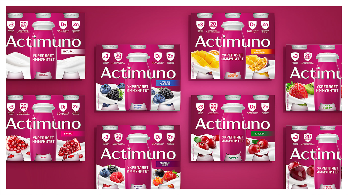
Naturally, the new development should primarily be reflected in the packaging design, while still maintaining a high degree of product recognition at the proper level. In addition to changing the name, our creative team had to solve a number of marketing tasks aimed at improving the visual component of the brand. Not so long ago, ex-Actimel received a uniform purple background color for all SKUs, Which made it possible to create a bright, eye-catching, noticeable color block when displayed in retail stores. However, a large number of a variety of red berries in the brand’s portfolio (strawberries, raspberries, cherries, etc.) significantly reduced packaging differentiation; the differences in some SKUs were not obvious to the consumer. While updating the design of Actimuno, we decided to slightly rearrange the composition; in the lower third of the package we started using white yoghurt waves, into which we integrated different kinds of berries and fruits - this approach makes the products more appetizing, and also allows the consumer to distinguish the composition of each specific SKU in the most simple and noticeable way, thereby successfully solving the problem of “red berries” and a purple background, of course, without disrupting the color blocking. When redesigning the graphic block with RTB the techniques that we used were more succinct; information icons were redone in the shape of a shield, thus enhancing the message about strengthening the immune system. The design of the new Actimuno has become richer in contrast and more balanced, and its compositional structure is now way more understandable.
All changes were scaled to 10 main SKUs that included multipacks and individual packaging, and they were also adapted to the children’s line of the Actimuno Kids brand.
Packaging redesign, food style development, product zone development, SKU distribution, line-up differentiation, adaptation to packaging formats, prepress


