


Redesign of Almette
Almette curd cheese is one of the main brands of the German family company Hochland, which has been in the business of cheese production for 90 years.
The homeland of Almette is located in the foothills of the Bavarian Alps, where, for centuries, home farms have upheld the tradition of making young cheeses. It was there, in the town of Schongau, that the history of the brand began in 1988, when the Hochland company acquired a Bavarian cheese factory and established industrial production of curd cheese in accordance with an Alpine recipe.
Almette curd cheese has been present on the Russian market since 1994. Over the past two decades, the brand has won the trust and love of a great number of Russians, becoming both a favorite sandwich ingredient or a beloved snack, and an important component of holiday and everyday dishes. Today, the Almette brand is a major player on the curd cheese market, the standard of taste and quality in its category.
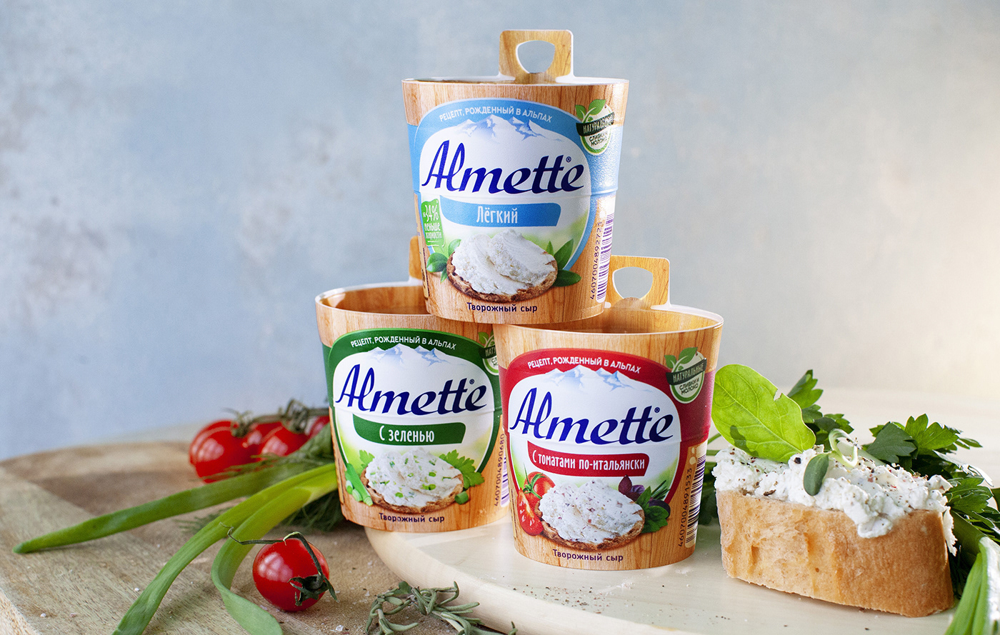
The brand’s packaging has always stood out among competing brands on the shelves due to its expressive and unique nature - the shape of a barrel with warm wooden textures perfectly conveys the inherent values of the brand, and of course, makes it extremely recognizable and memorable.
The latest visual changes to the packaging were made in 2014, and as time passed, it became clear that the design needed some long-awaited and logical updating. In the course of the redesigning process, we tried to strengthen and more blatantly reveal the product component of the brand, integrating more understandable, noticeable and appetizing food groups into the design. The color differentiation between flavors, the number of which has expanded greatly, has become more obvious; we made it more noticeable and convenient for the consumer. The packaging design now contains a brief element of storytelling, explaining the idea behind the Almette recipe - young curd cheese whipped with cream. A new, visible natural claim and a new, more natural wood “barrel” texture have also been developed.
The result of our work was a more modern, noticeable, appetizing and vibrant design that not only retains a high degree of consumer recognition, but also embodies a significant step in the consistent development of the brand.
Packaging redesign, food style development, product zone development, SKU distribution, line-up differentiation, prepress


