"Casa Margot" is a brand of premium cheeses and sausages of the Remma company.
Since 1994 it has been successfully operating on the Russian market of premium quality products and occupies one of the leading positions in this sphere.
Thanks to its activities, many premium segment cheeses from various countries, including Switzerland, France, Spain, Norway, Germany and Portugal, have been introduced to the Russian market.
TASK
Remma applied to us for redesigning the packaging and logo of Casa Margot. The Getbrand team was tasked with developing an effective visual communication with the consumer: to make the product noticeable and memorable, without forgetting to communicate the brand's core values.


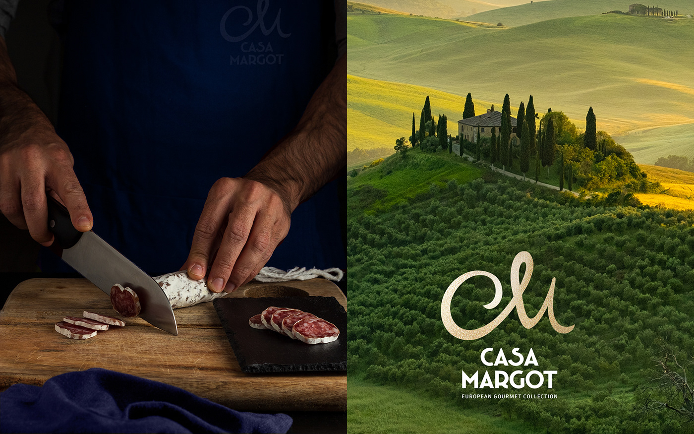
Product packaging is an important point of contact with the consumer, and it becomes decisive at the moment of making a purchase decision in the store. Effective brand design allows companies to become a strong argument in the customer's mind to choose their product. An integrated approach, advocated by Getbrand, allows you to communicate values correctly, and thus increase the rate of return on investment.
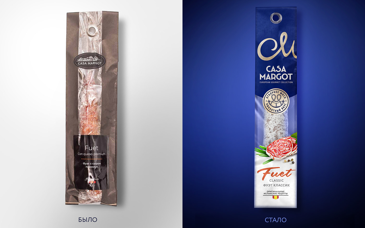
That's why our work in the redesign of Casa Margot's packaging and logo began with our patented "Three Layers of Effectiveness" audit. Using the author's tool, we evaluate the packaging design on three layers: visual, contextual and conversion. Based on the results of the audit, our experts estimated the effectiveness of the visual communication of the old brand design at only 34%.
The identified points for further growth allowed us to perform an effective redesign of the product. The redesign of the design and logo was done as part of the EXPRESS DESIGN service and is a perfect example that the concepts of INexpensive, FAST and QUALITY can become synonymous with each other, thanks to Getbrand. As a result, you get one effective design option from the leading experts of our agency.
"Casa Margot" is a brand of premium raw sausages, distinguished by its unique approach to production and unique taste of products made according to original European recipes.
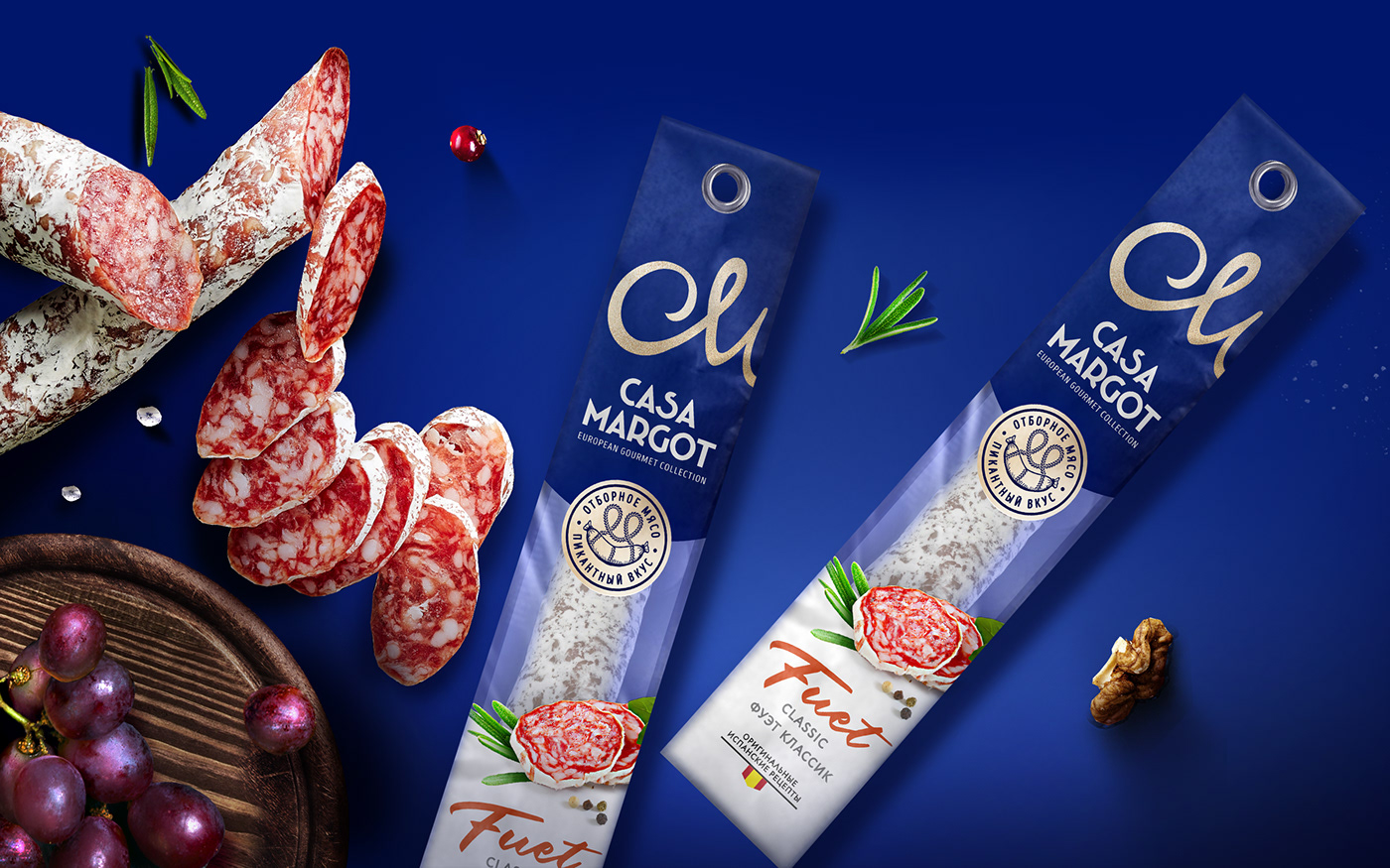
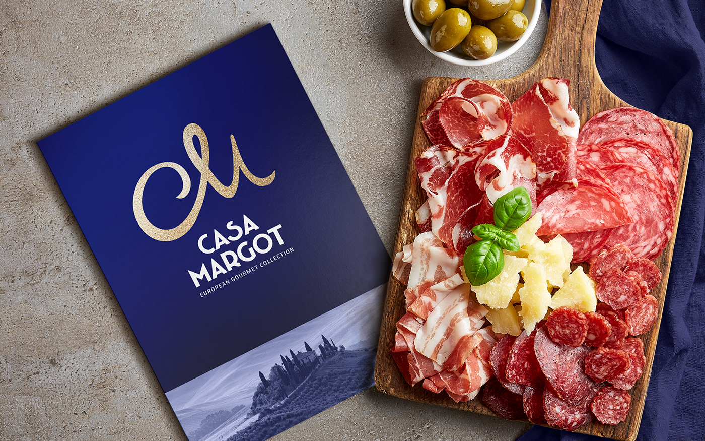
In order to show the category of the product we took as a basis a rich blue color, which stands out noticeably among competitors and creates a strong brand zone. The chosen shade creates a perfect tandem with the elegant letters.
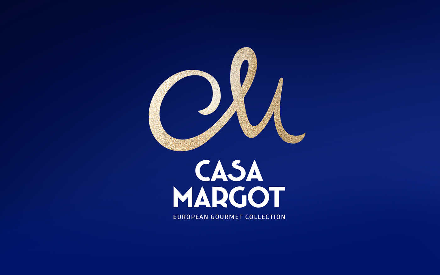
The new logo has an interesting grapheme. The symbol of the intertwined two letters "C" and "M" creates an elegant image of the logozone and conveys the authenticity of the broadcast aesthetic. Proper branding showcases the unique benefits of the product.
The new packaging design enhances the visual impact and undoubtedly attracts the attention of the sophisticated buyer.


