
OCTO‧
Visual identity
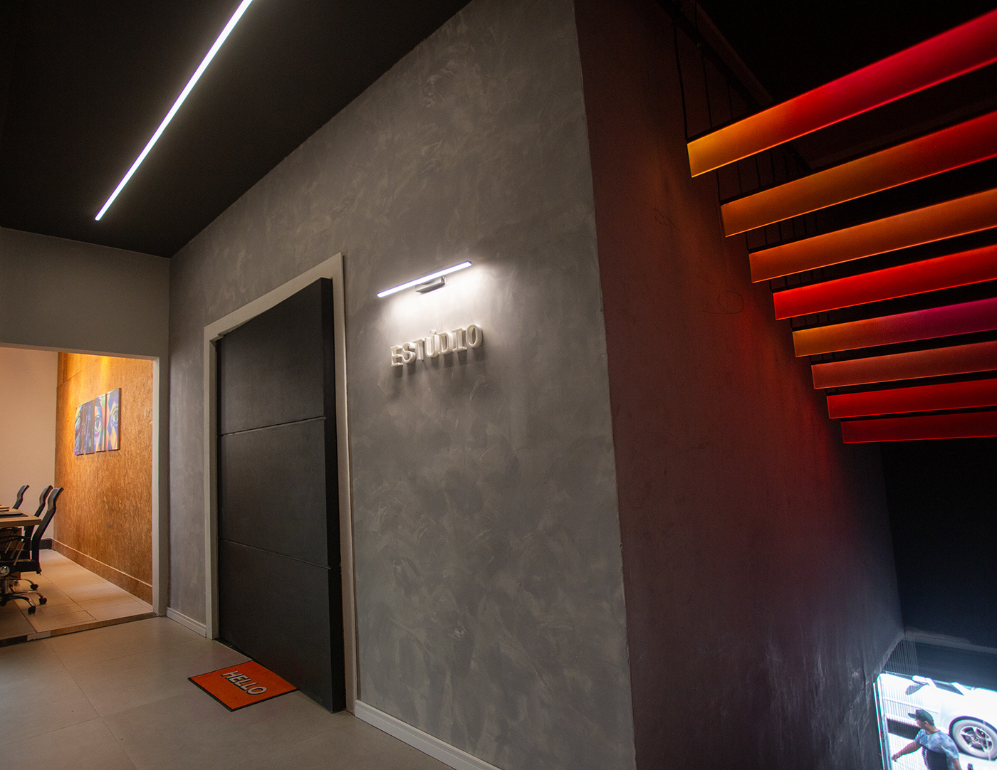
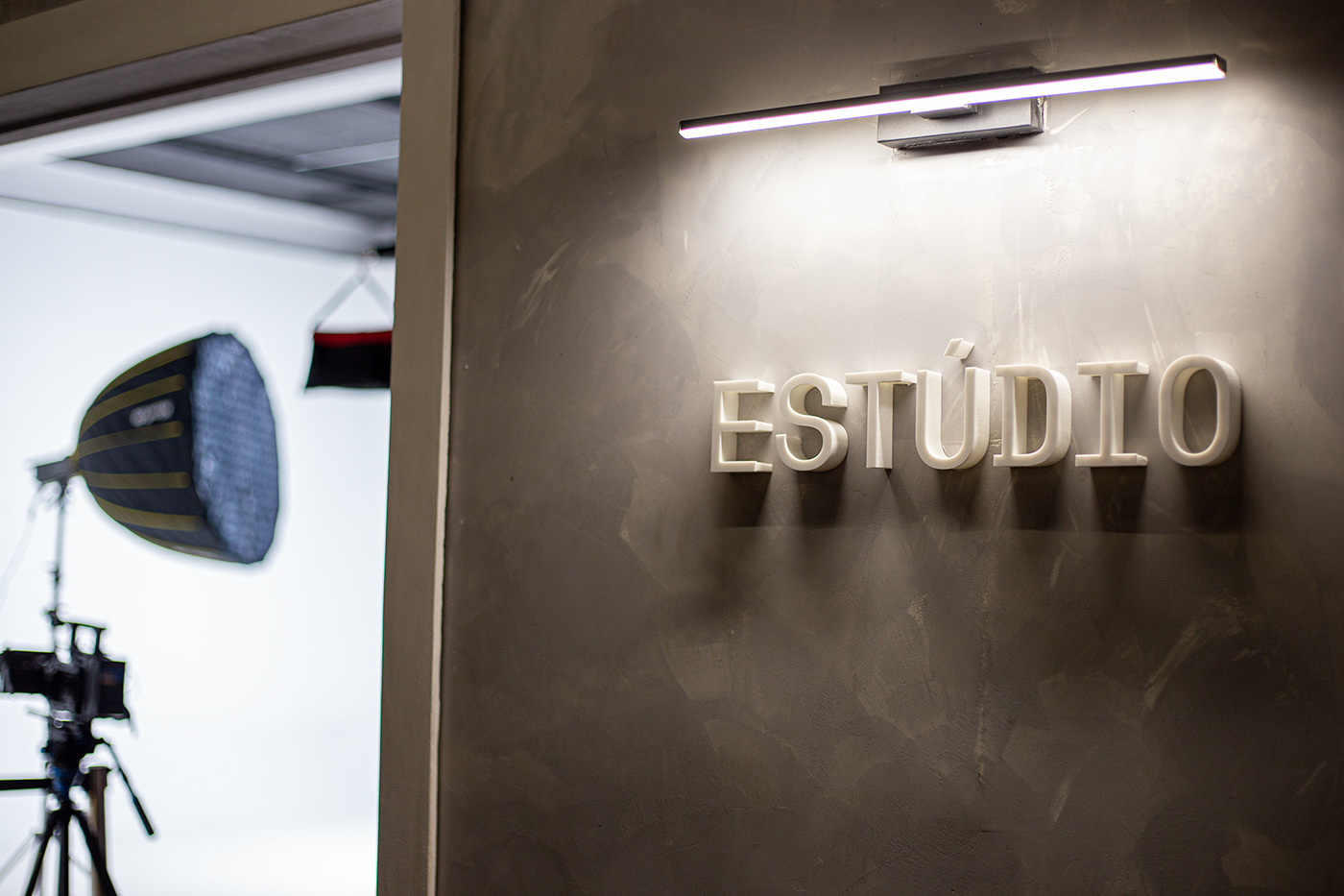
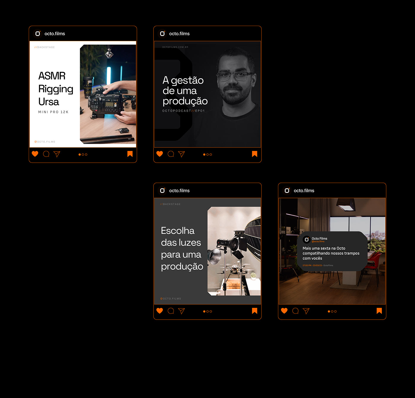
Octo is a company that began as an audiovisual producer in Belém - PA and has become a reference in audiovisual quality in the north of Brazil, which has driven the company to expand its mix of services, with a space that includes coworking, studio recording, photography, podcast, productions, editing room and equipment rental. As the company matured, the company found itself in a position to also build a brand that reflected this new positioning.
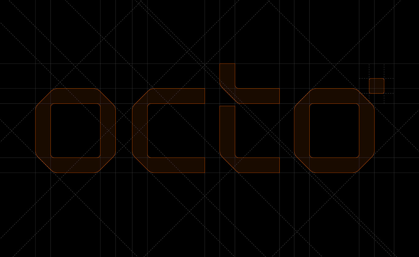
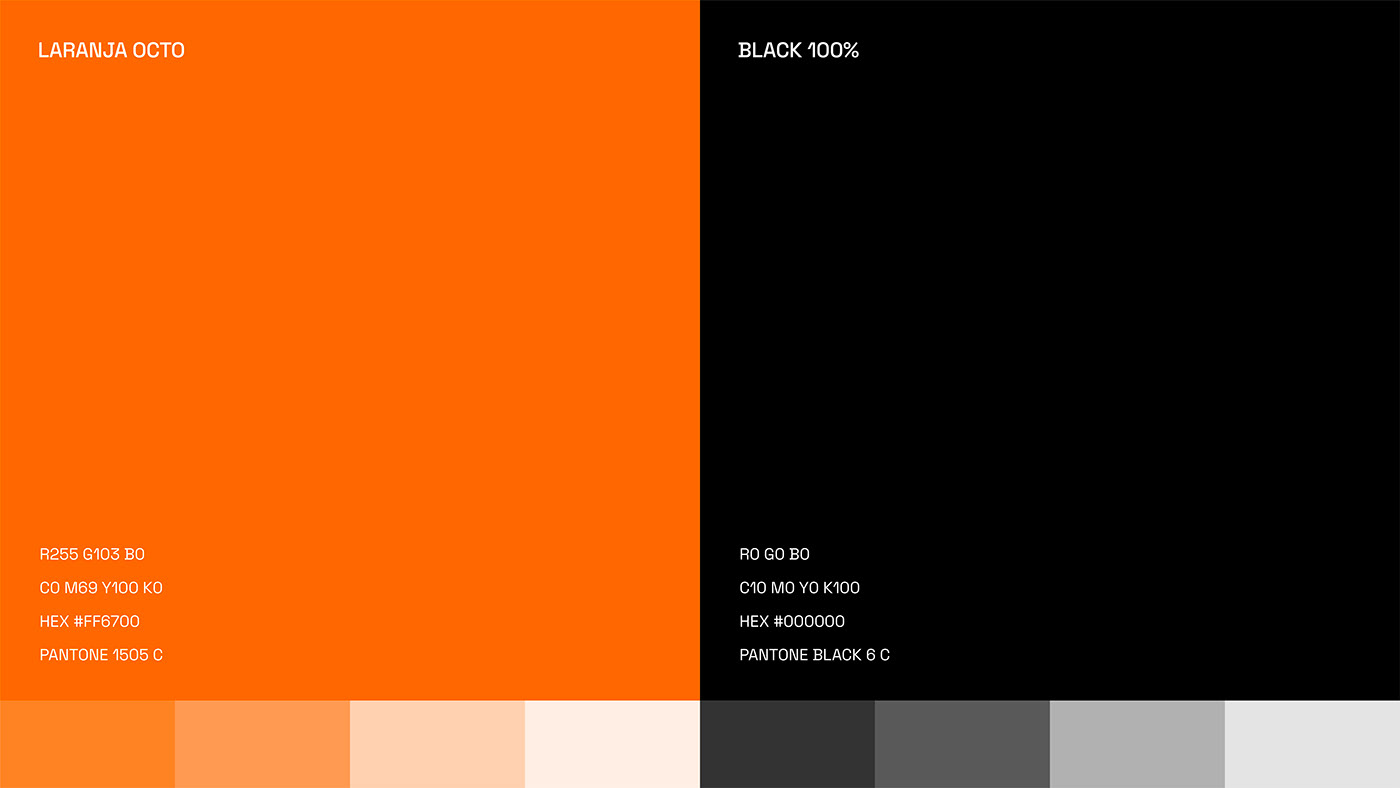
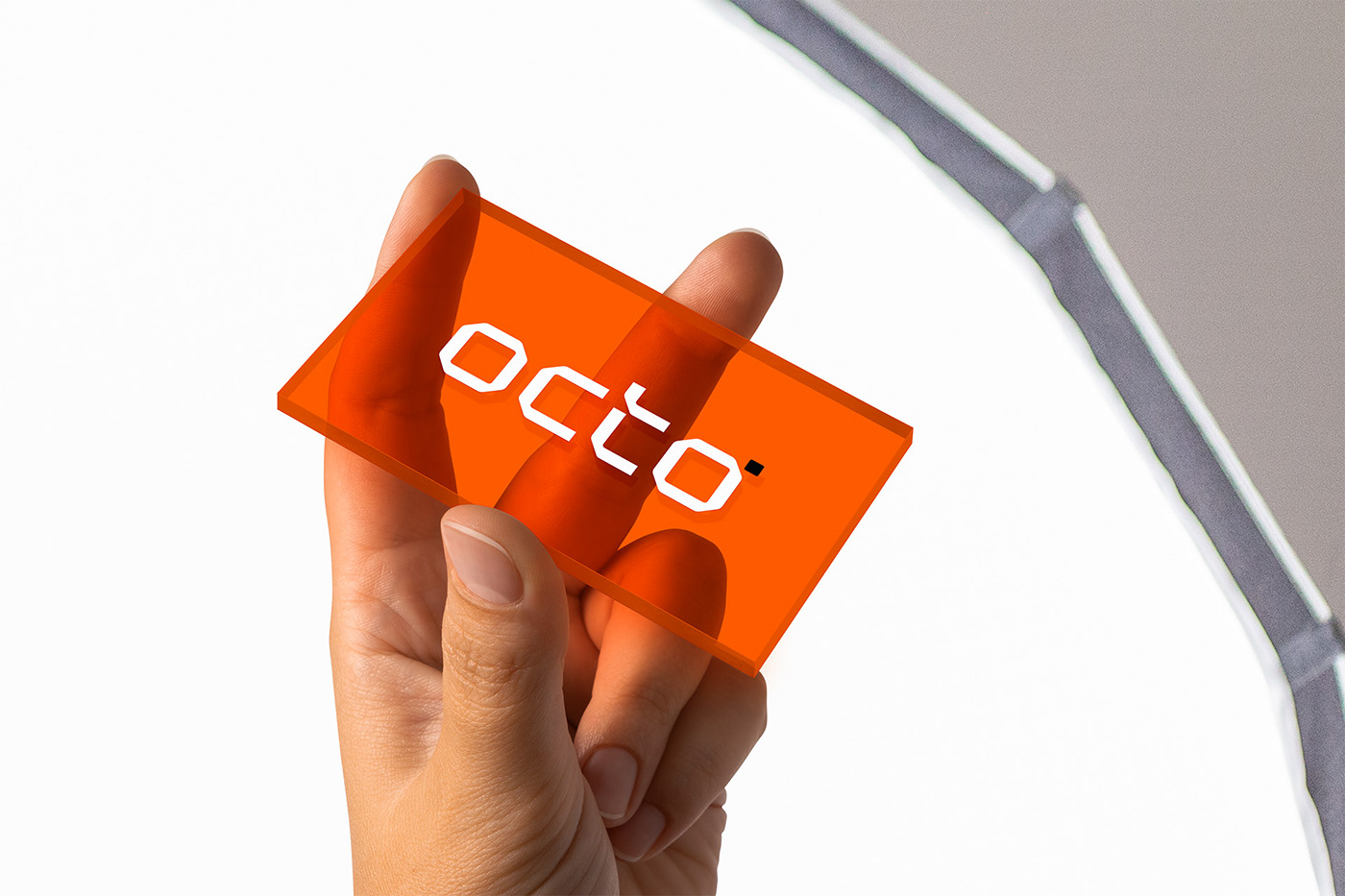
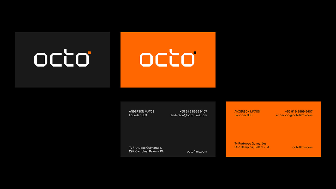
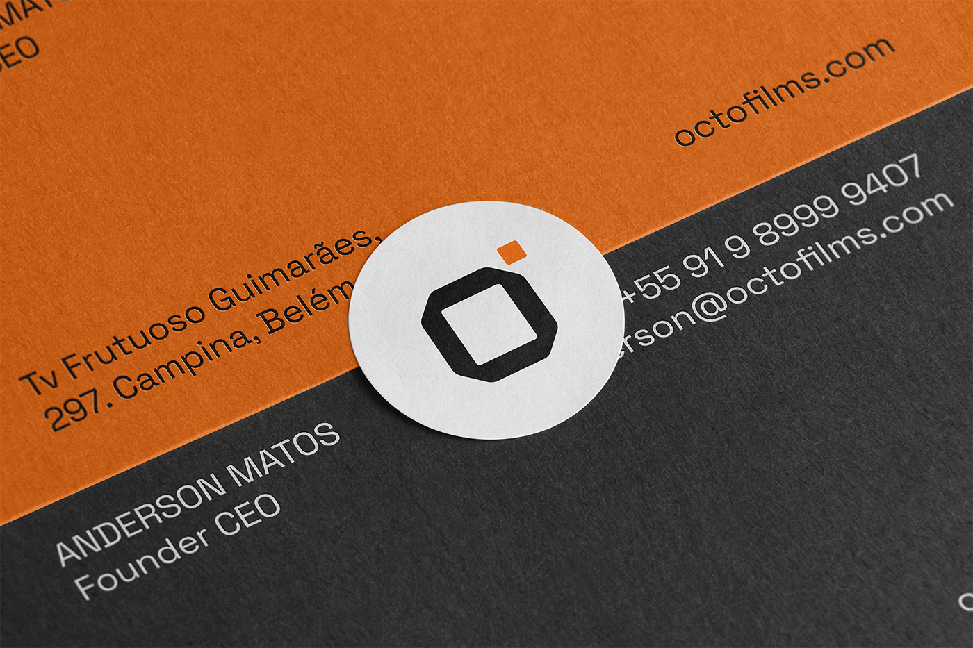
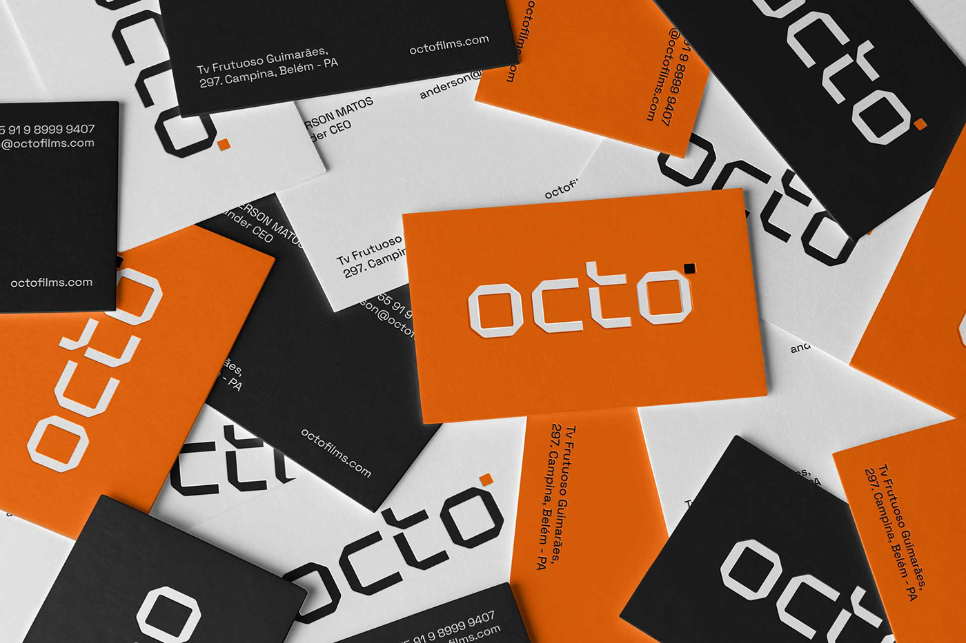
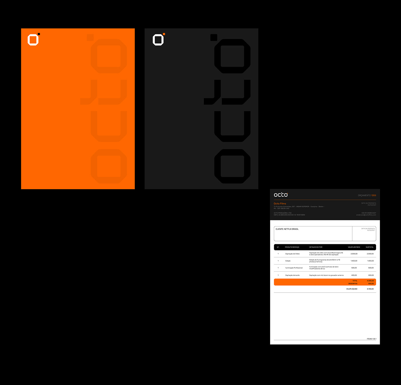
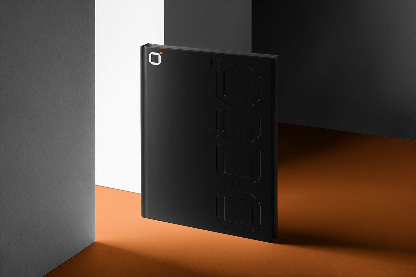
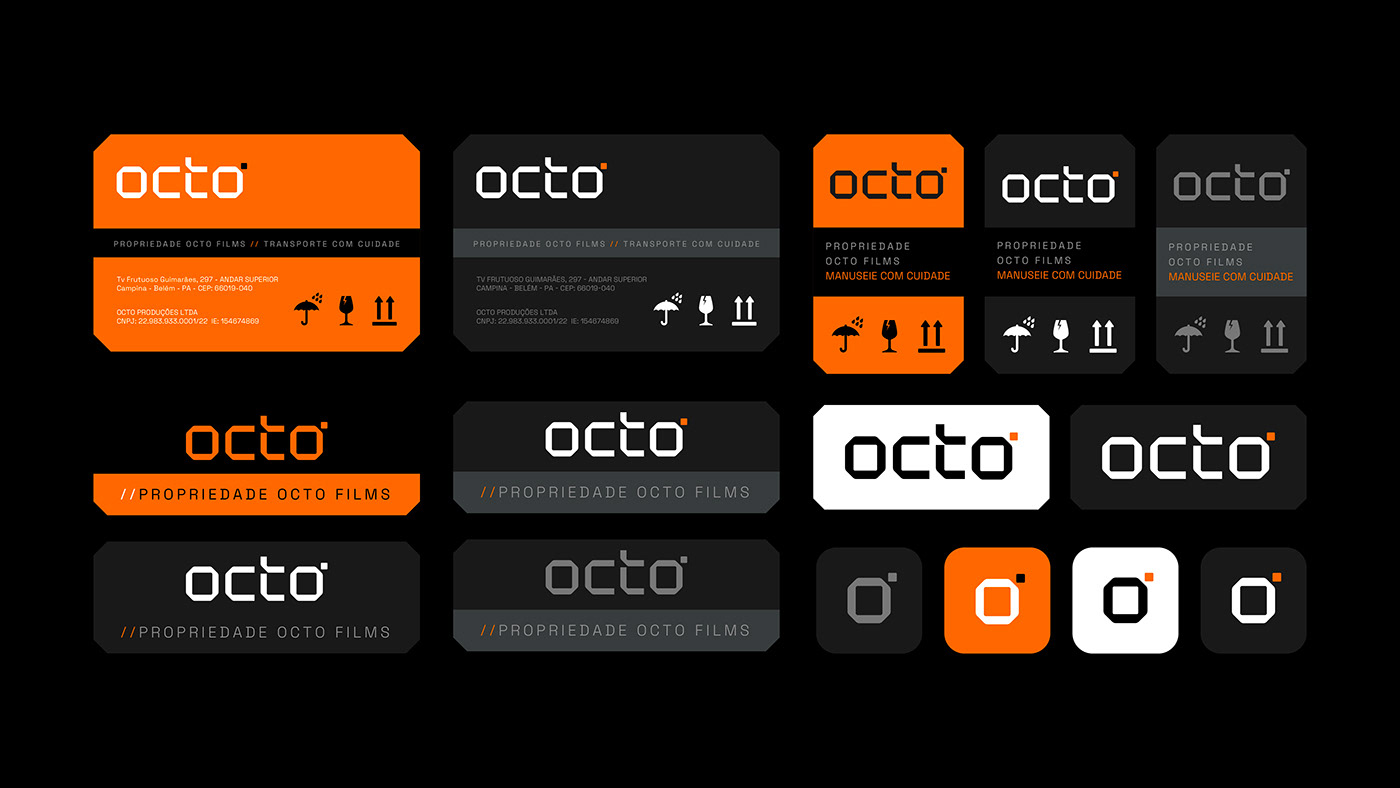
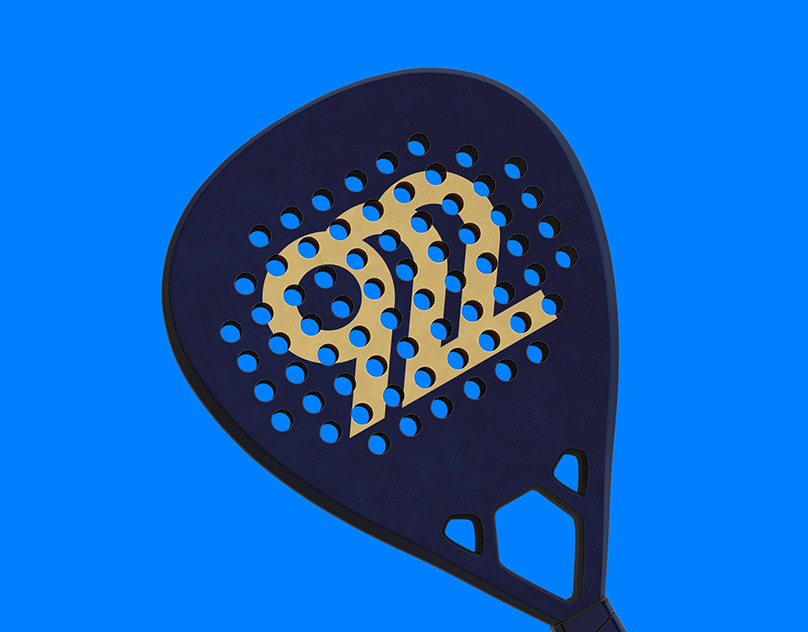
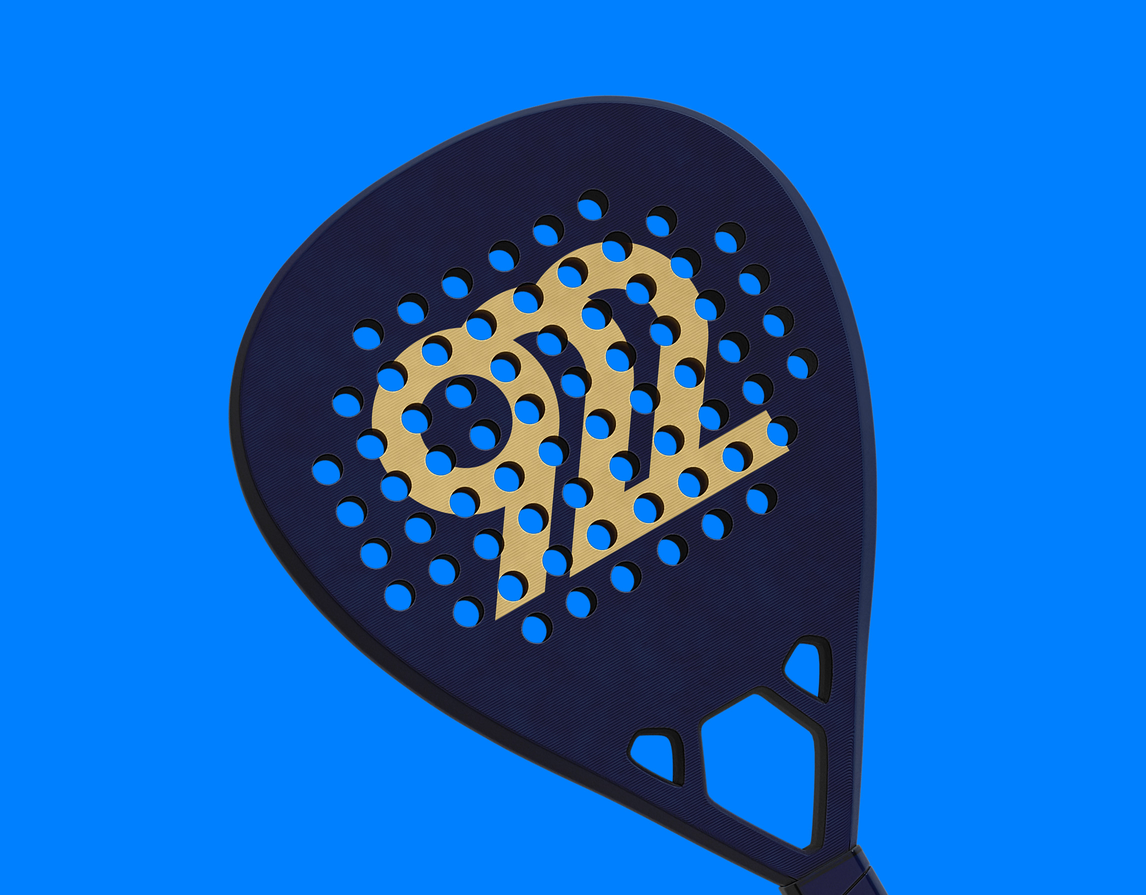
Our challenge was to build a new visual identity for Octo, which would convey a message of modernity, visual power, maintaining some aspects of the previous brand, but distancing itself mainly from the colors and shapes of the previous project. Therefore, we replaced the octopus with an octagonal symbol with ' which represents a camera filming, we gave warmer and more dynamic shapes and colors to build the brand's language.
SERVICE
Strategic positioning and visual identity
Strategic positioning and visual identity
TEAM
Creative Leader: Léo Tavares
Motion Designer: Ariel Santos
Original photos and videos: Octo Studios
Creative Leader: Léo Tavares
Motion Designer: Ariel Santos
Original photos and videos: Octo Studios