Rebranding
SKRA Częstochowa
[ EN ]
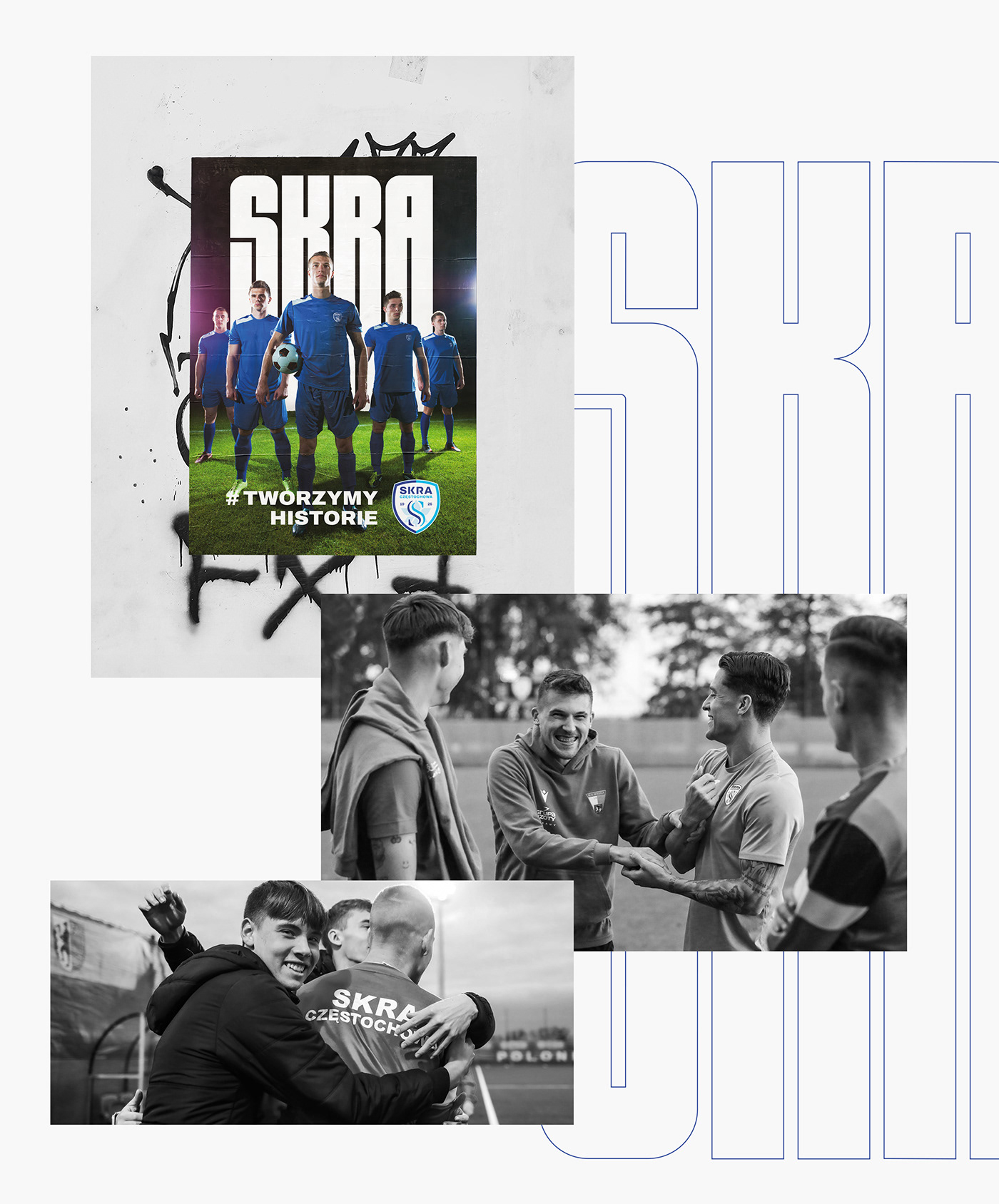
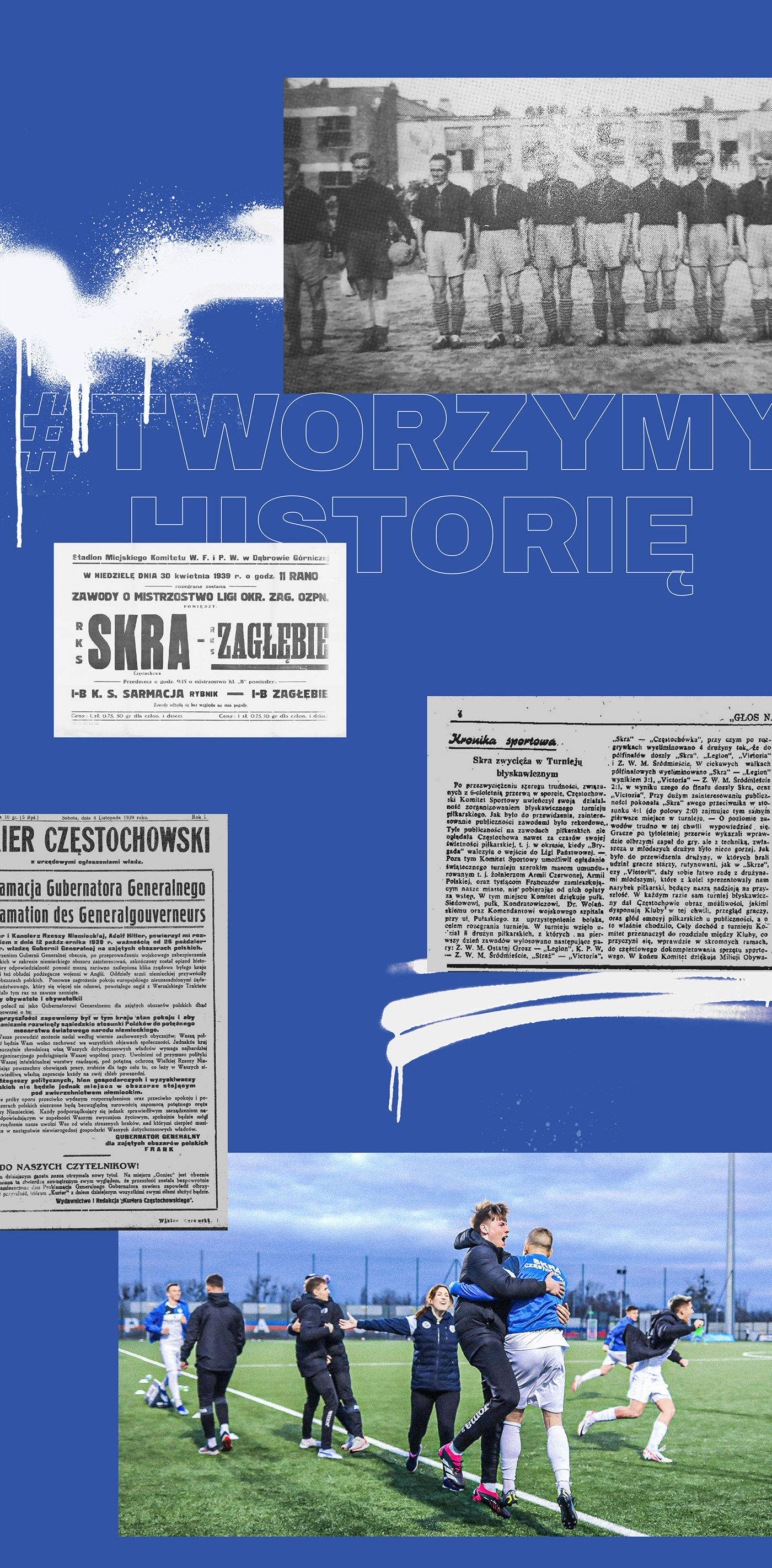
Task we have faced was to refresh the image of Skra Częstochowa – a club loyal to its roots and history. The first stage of our actions was the rebrand the logo. Within the scope of the design work, the emblem underwent modifications in terms of geometry, typography, and colour scheme while simultaneously respecting the original. This should be seen not as a revolution but as a visual evolution of the crest.
Regarding visual identification, we decided to eliminate the colour red in favour of a blue-navy colour palette. The aim is to boost shades of blue as the club's primary colours combined with bold typography that is about to build the character of "Skra”.
[ PL ]
Zadanie, jakie przed nami postawiono, polegało na odświeżeniu wizerunku Skry Częstochowa –
klubu wiernego swoim korzeniom i historii. Pierwszym etapem naszych działań był lifting logo.
W ramach prac projektowych znak został poddany modyfikacjom w zakresie geometrii, liternictwa
i kolorystyki z równoczesnym poszanowaniem oryginału, co należy traktować nie jako rewolucję,
a wizualną ewolucję herbu. W zakresie identyfikacji wizualnej podjęliśmy decyzję o wyeliminowaniu koloru czerwonego na rzecz błękitno-granatowej palety barw. Jej celem jest ugruntowanie odcieni niebieskiego jako ścisłych kolorów klubowych, co w połączeniu z odważną typografią ma budować charakter "Skry".
Bartłomiej Osiński — project coordinator
Mateusz Dzierża — graphic designer (logo, visual identity, brandbook)
Yanislava Hrytsaienko — graphic designer (visual identity, presentation)
ADINO branding studio