
Piv&Co is a federal chain of draught beer stores. It was included in the top 30 most profitable franchises in Russia for 2020 according to Forbes magazine.
Piv&Co offers draught beer from all over Russia and from its own brewery, more than 500 varieties of bottled beer from all over the world, snacks of its own production and goods for every day.
Task
Our fruitful and successful cooperation with " Piv&Co" continues: the company asked us to develop the design of another brand, which would not contradict the general positioning: "Territory of Happiness". We needed to convey the atmosphere of a holiday and a noisy party for the Dolce Miele brand.
Our fruitful and successful cooperation with " Piv&Co" continues: the company asked us to develop the design of another brand, which would not contradict the general positioning: "Territory of Happiness". We needed to convey the atmosphere of a holiday and a noisy party for the Dolce Miele brand.
Solution
Our collaboration with Piv&Co started with our author's workshop "Altitude". This is a strategic two-day session, during which the client's team and I work out the best ideas for creating the company's positioning and developing ideas for brand promotion. Together, step by step, we define the company's goals, immerse ourselves in the world of the consumer and develop a comprehensive branding and promotion strategy.
It was thanks to the workshop that we adjusted the company's STM positioning, and the workshop materials formed the basis for the creation of new brands for the retail network, the development of which we will definitely tell you about.
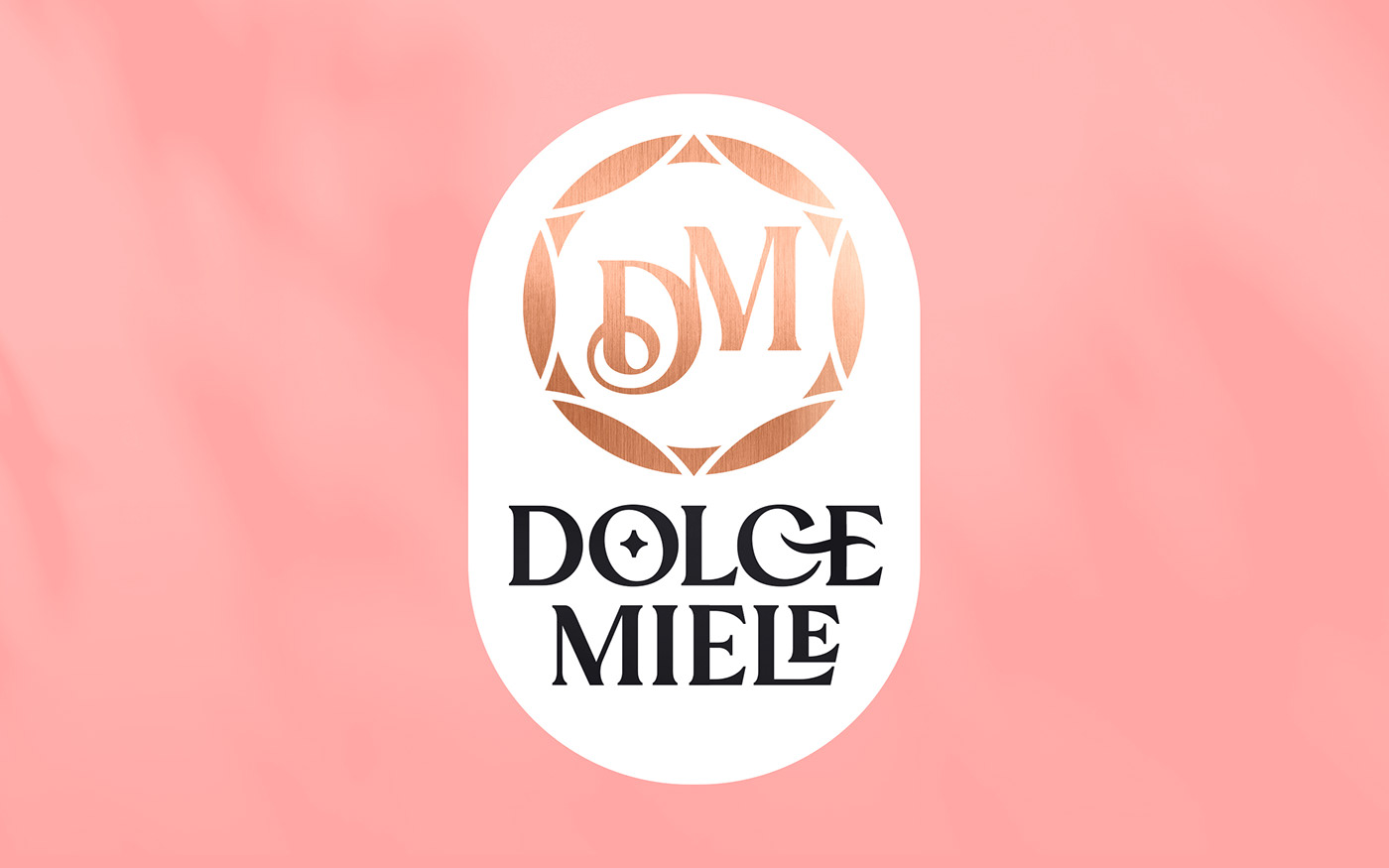
One of the results of our joint work was the design of the Dolce Miele brand. We made the packaging design within the framework of the tariff "EXPRESS DESIGN". The service allows you to realize in a short period of time and for an acceptable amount of money an effective variant that will successfully work on the market. As a result, you get one variant of effective design, developed by the leading designers of our agency.
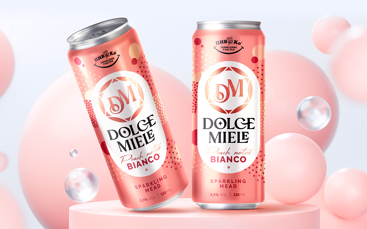
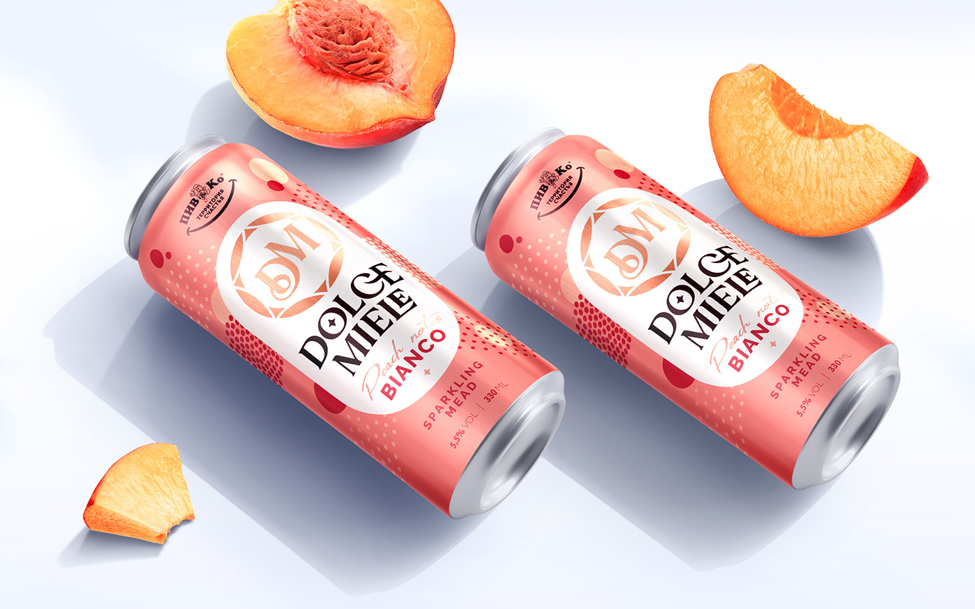
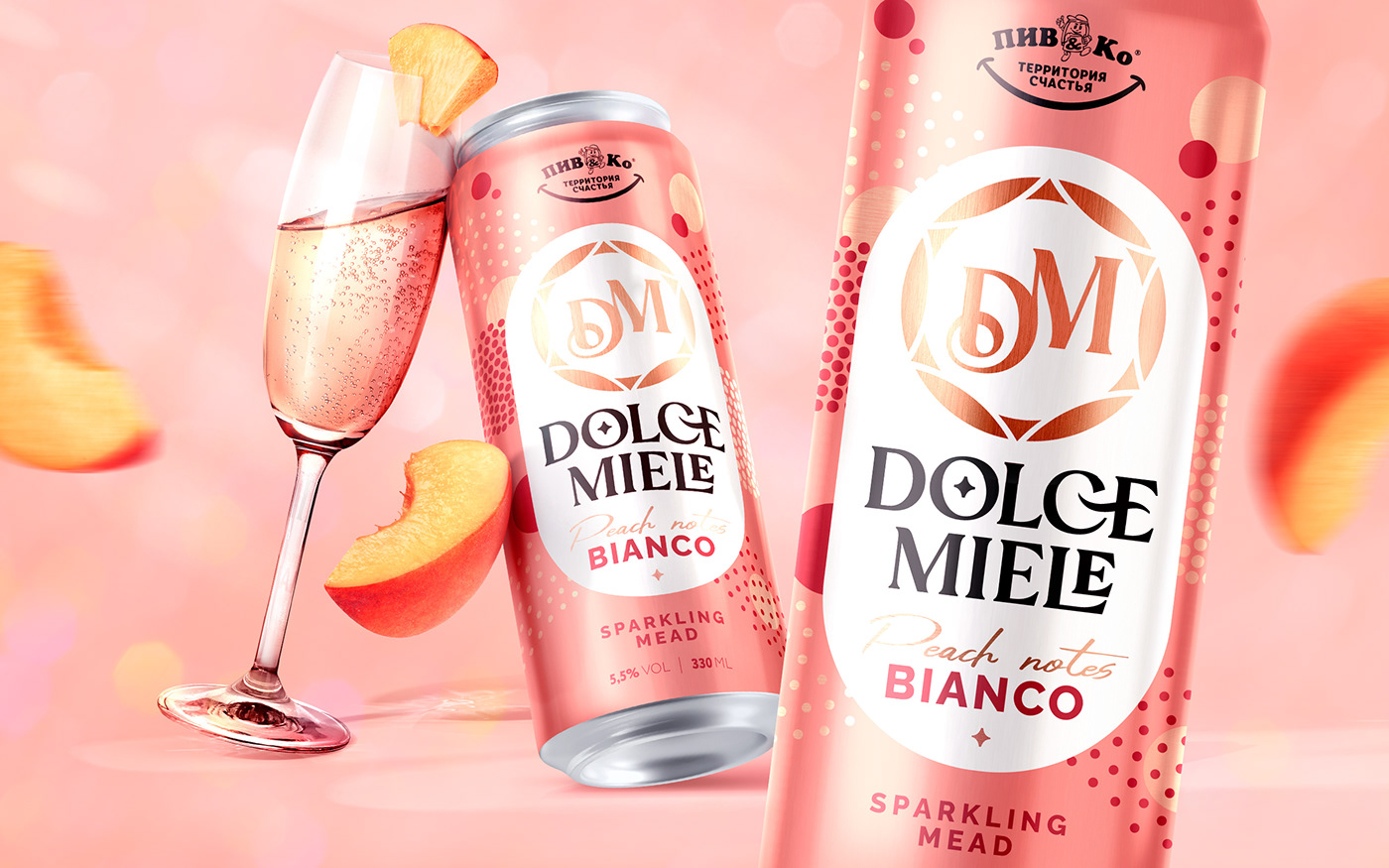
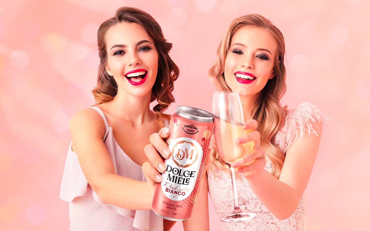
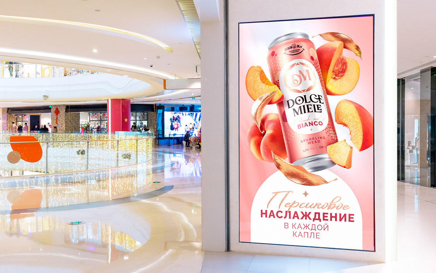
"Dolce Miele" is a refreshment that can be the perfect addition to an atmospheric hen party. With the help of visual communications we tried to evoke an association with a luxurious event and support the Italian style of the brand name.
As the drink is suitable as a soft aperitif to a perfect evening, the target audience of Dolce Miele is predominantly female. We chose soft shades of pink and peach colors to convey a light and cheerful mood. Small images of geometric figures represent champagne splashes, conveying all the sweetness of spending time in pleasant company.
The powerful logo zone makes the drink stand out on the shelf among competitors and is pleasantly memorable. In order not to destroy the general atmosphere of the design, we used a special version of the Piv&Co logo in black and white format, moving away from the usual accent on the yellow color to delicately place it above the main logo.
We are happy to cooperate with Piv&Co, and we are sure that there will be more successful results of our work ahead!
