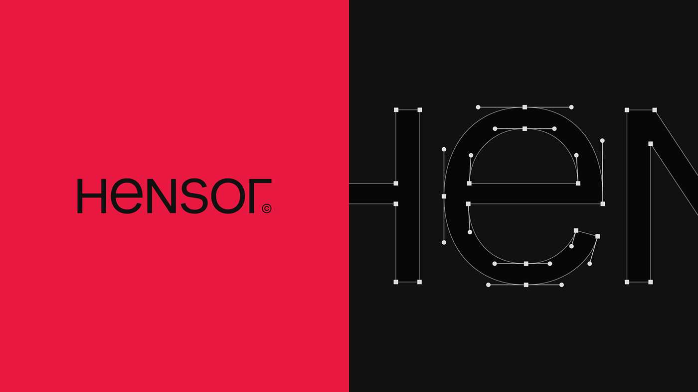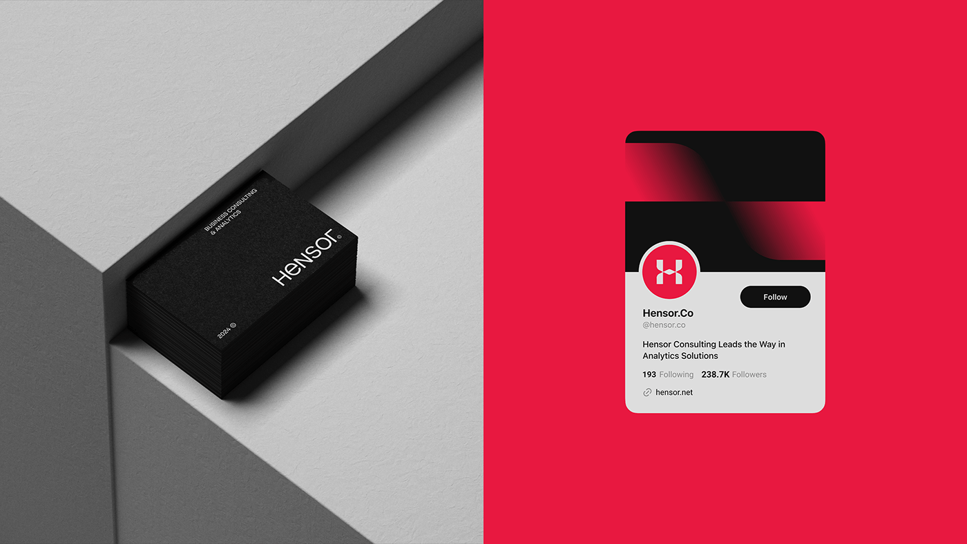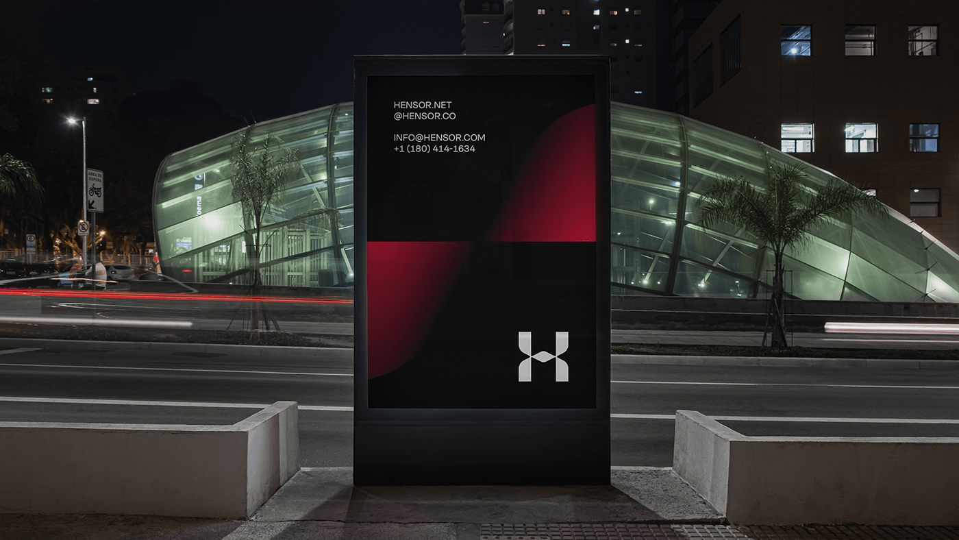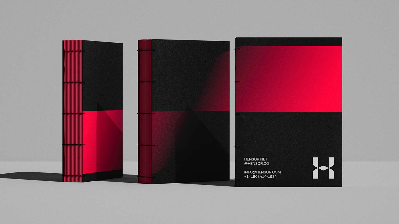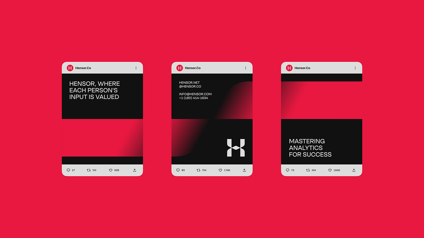
Hensor
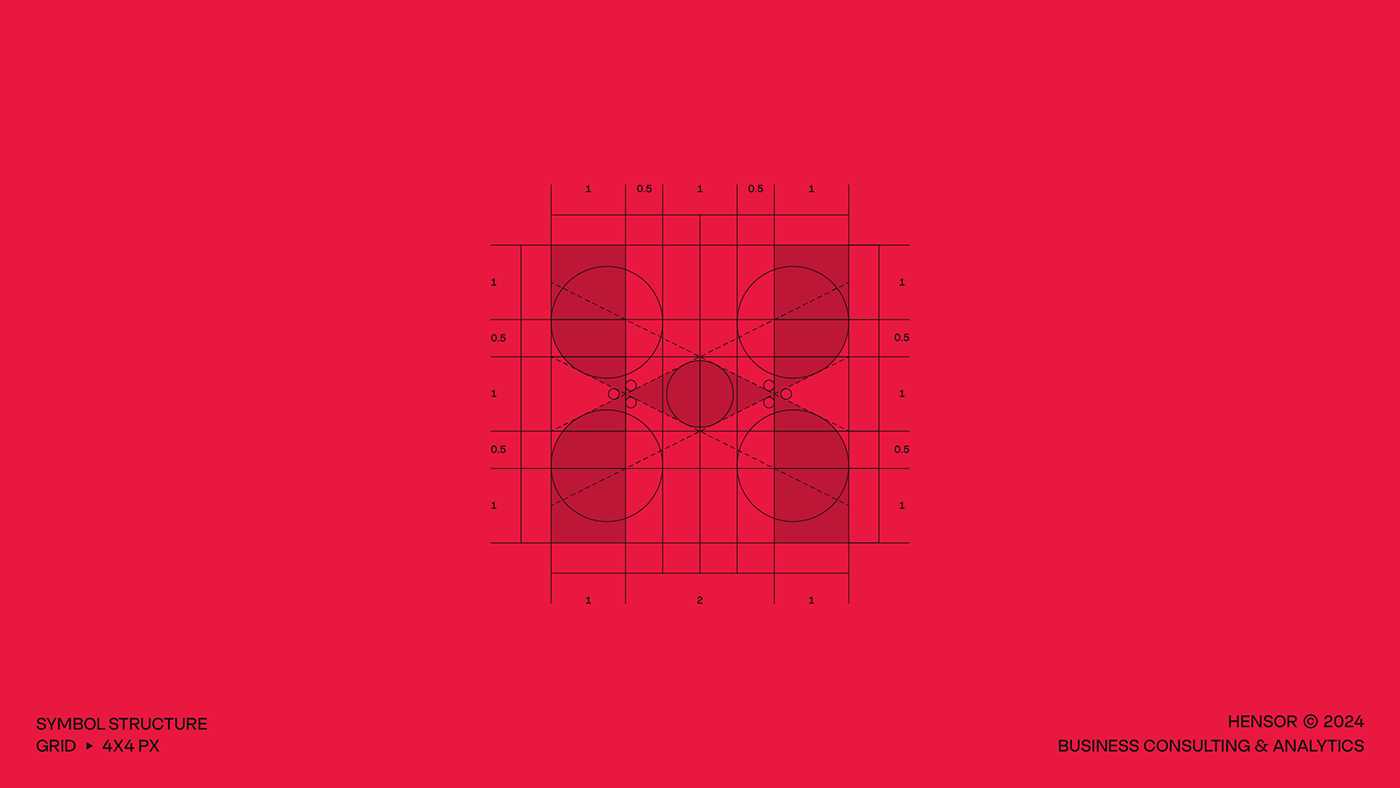
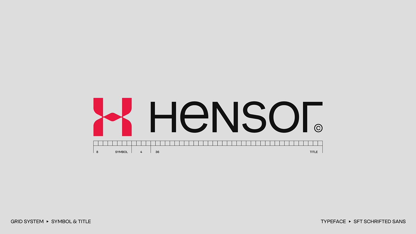
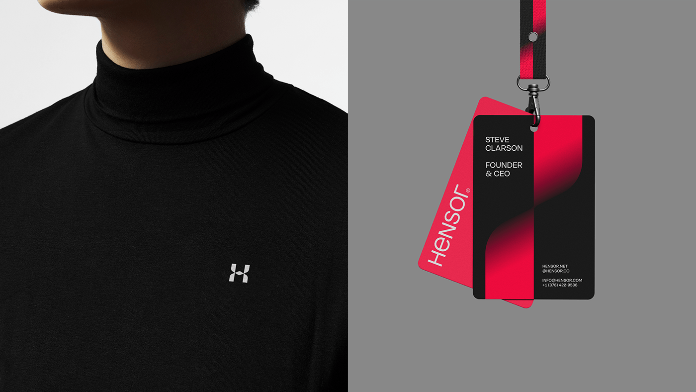
Dynamic consulting and analytics firm, specializes in strategic repositioning to solve business problems. Our challenge was to create an elegant and impactful style that aligned with the company's goals. Using a subtle twisting effect, we skillfully created a minimalistic yet unforgettable symbol of the letter H.
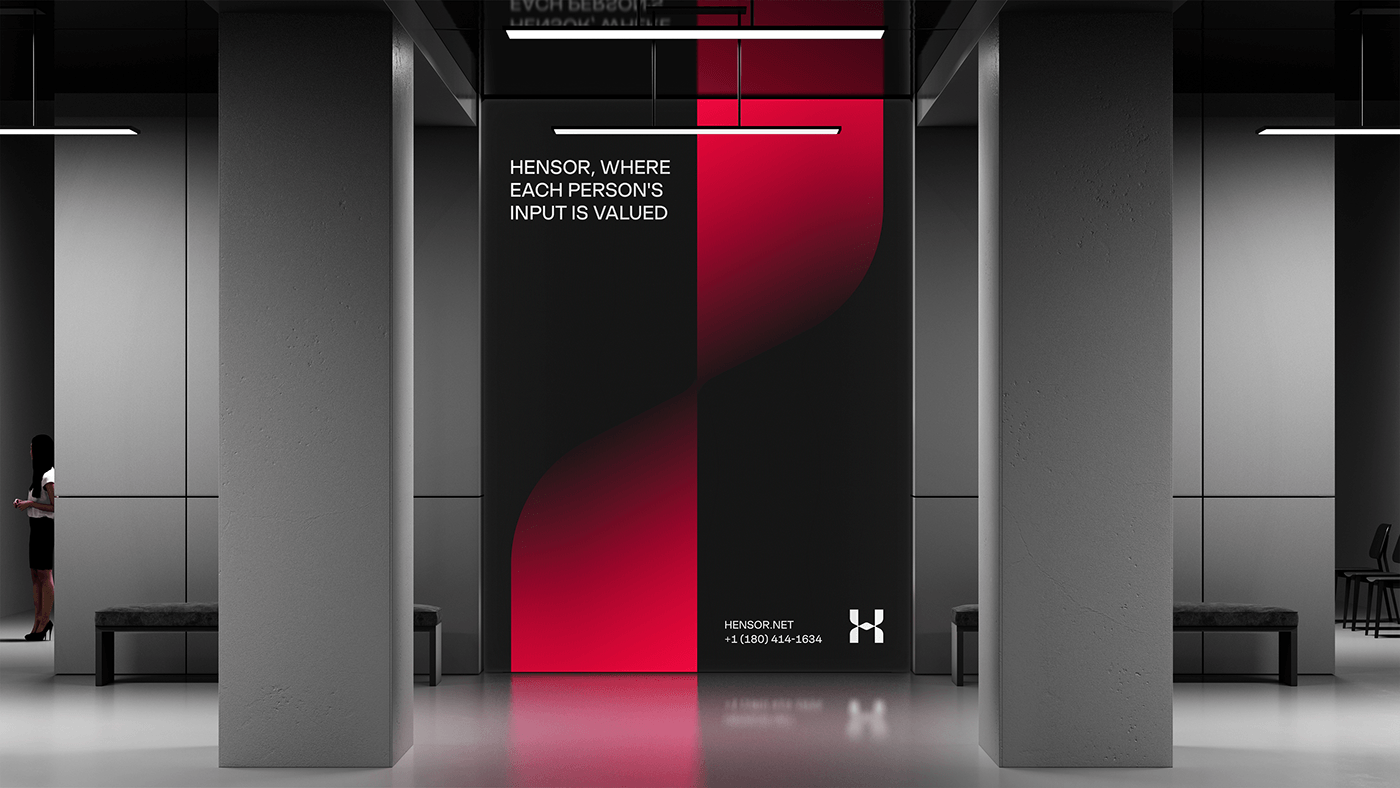
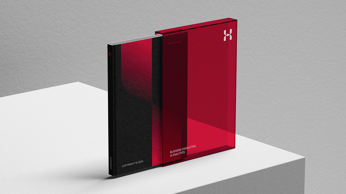
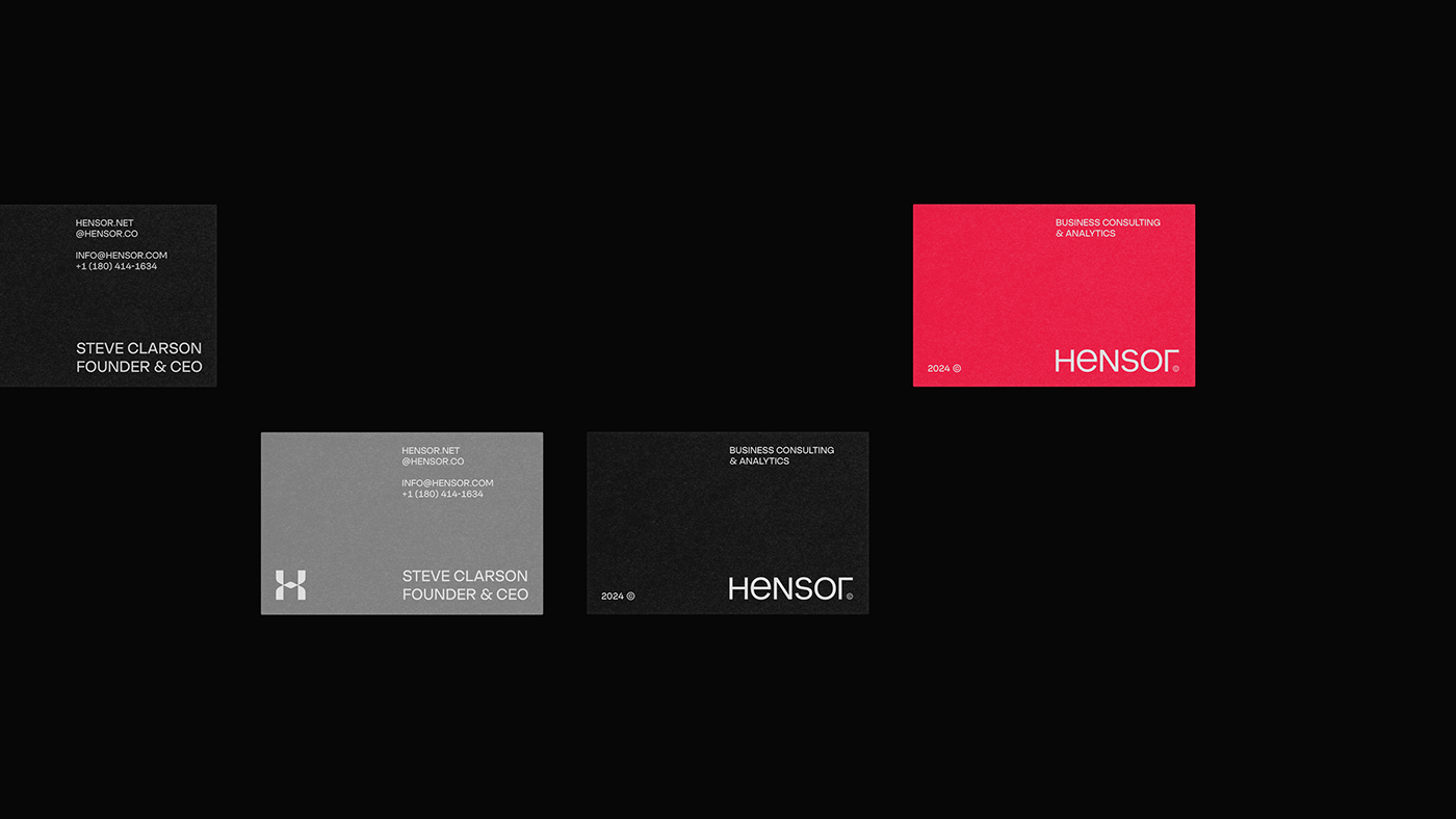
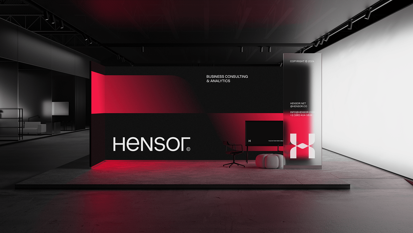
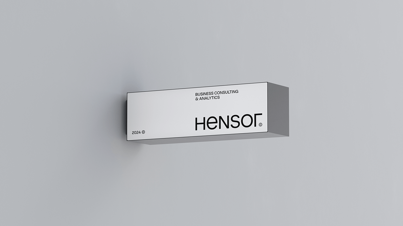
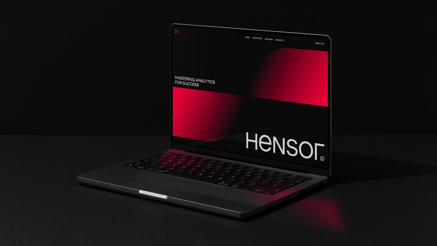
The brand element incorporating the characteristic twisting effect is not only scalable but also universally adaptable to all media. The bold choice of red emphasizes the company's dynamic energy in solving complex problems and provides a confident presence in a competitive environment.