Kander
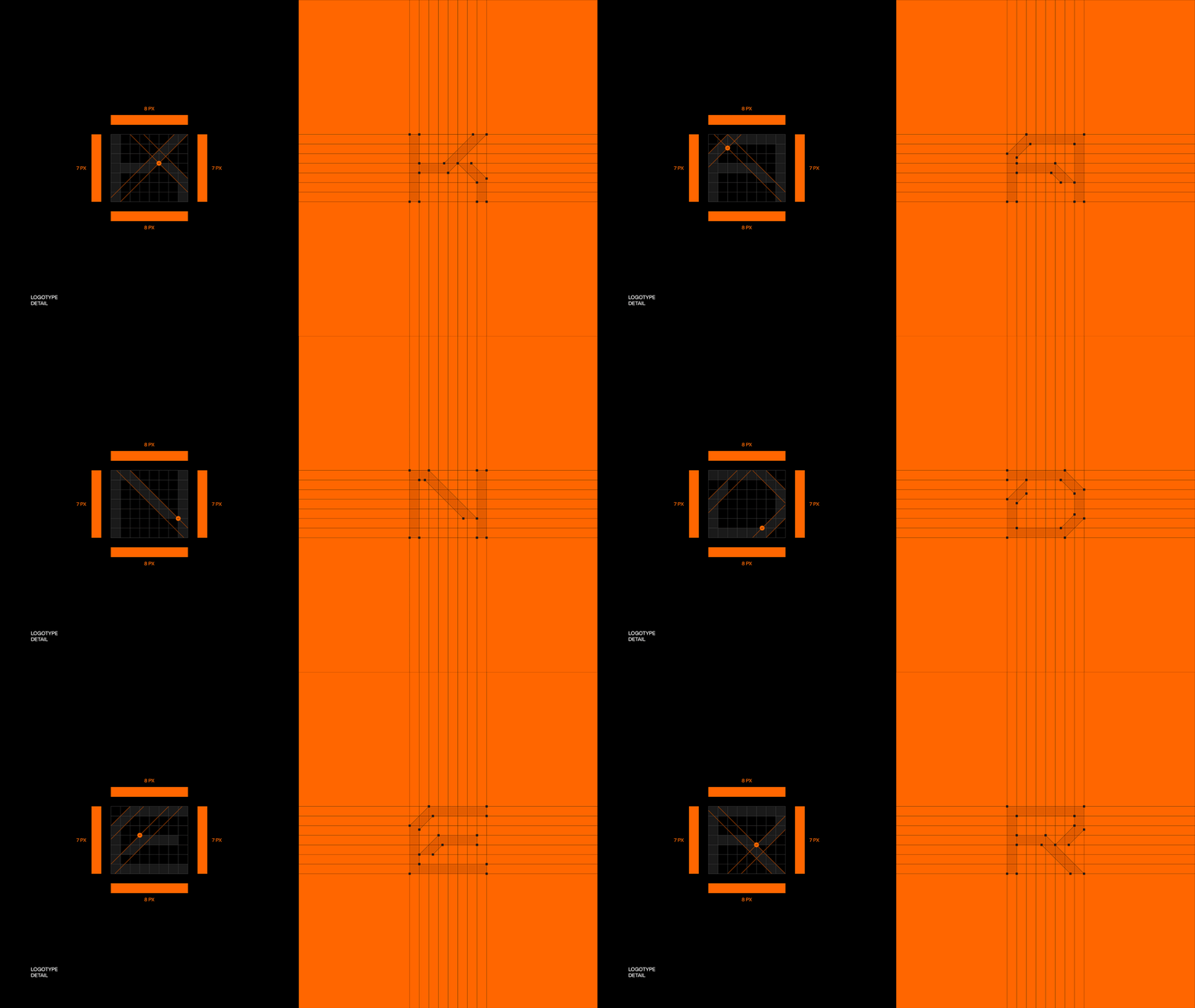
Creating a logo that is inspired by technology and reflects our company's vision is our mission at Kander. With a deep understanding of the engineering industry, especially the petroleum sector, we utilized high-risk selections, 45-degree lines and an 8x7 grid in the logo to bring precision and calculation to our design. The sleek sft schrifted sans font conveys professionalism and clarity, reflecting our commitment to providing top-notch engineering services.
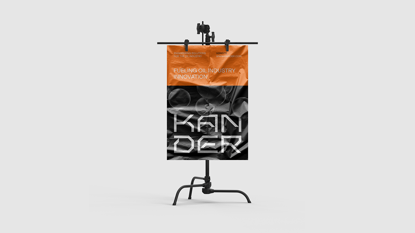
The color palette, consisting of three distinct shades, carries a vibrant and innovative energy, allowing us to remain at the forefront of the industry. Branded elements that symbolize the essence of the oil industry. These elements blend seamlessly into the overall design style, emphasizing our focus on providing exceptional engineering solutions for the petroleum sector.
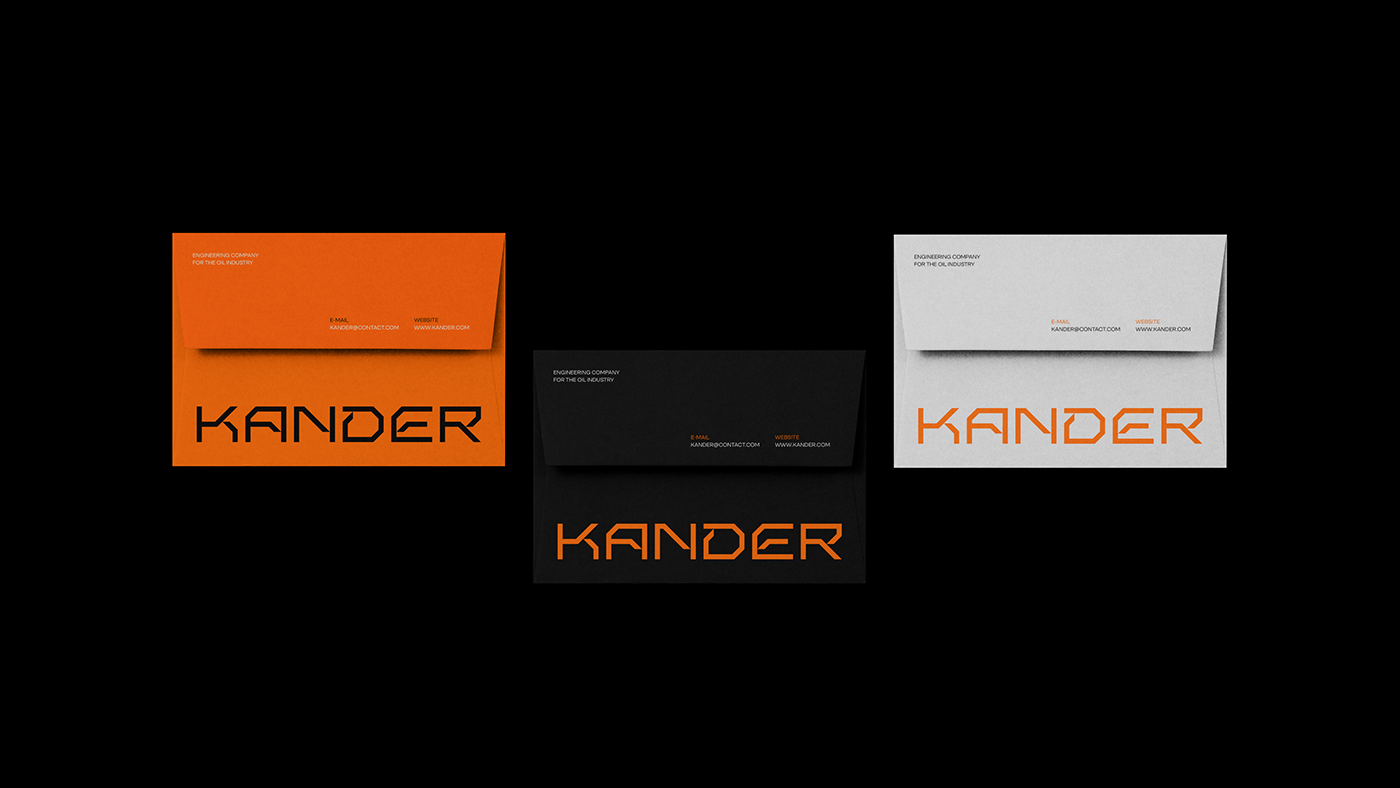
To increase versatility and adaptability, we created multiple variations of the logo. This allows our logo to be used effectively across a variety of applications and platforms, ensuring that the brand identity remains consistent across different environments.
—
obrazur@icloud.com — bento.me


