

As a personal project, I decided to investigate typography by making an ABC book.
I've taken each individual letter, and searched for a font that also started with that letter.
I investigated the fonts, especially on what kind of vibe, feeling or personality it had.
After the investigating part I wanted to capture that personality in one shot,
so I went out and created each letter with a specific material and tried to
create a setting in which the character of the font is represented.
The idea was to make people look differently at typography. We see
a lotof type around us every day, but why are certain fonts used?
To fit that idea in the cover, I've created a sleave which, if you pull
it off the book, will create an optical illusion of moving letters. It
also leaves you with type that's harder to read, so you'll need to
take a closer look at it before it will be readable.


Rotten bread on concrete.

Hairgel on skin.

Wordart and gradient nightmare, combined with shines and a dropshadow.

Molten parafine on a fancy tablecloth.

Punched letter in folded steel.

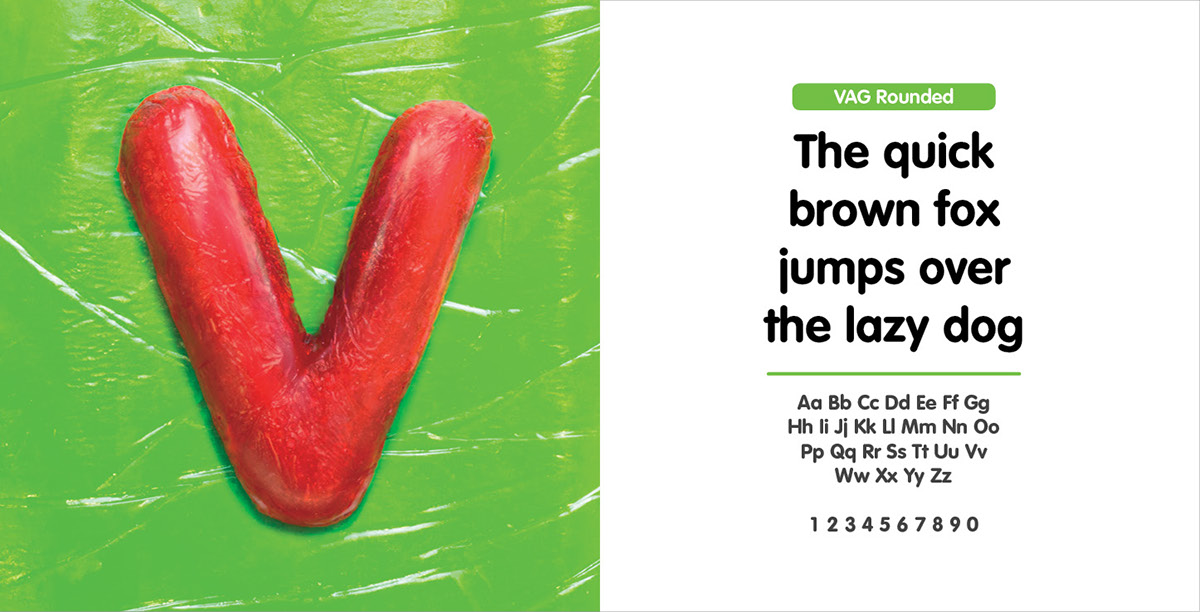
Polyetheen casting on yellow plastic surface.

Glass plate with dust.

Old letterpress printing letters on a hardwooden table.

Regular brick on concrete.

Sawn wood on wooden cutting table.

Polyester resin icecube in a glass of coke on a painted wooden table.

Handmade tattoo on pigskin using a regular needle and Indian ink

Paper cut-out on plain paper with a very bright lamp to create the shadows.

Neon sign on an old alley wall.

Brushed and smoothed wood painted with metalic paint on an old metal surface.

Rusted and lasered steel on a stone floor.

Home made bagle on a regular plate and a picknick cloth.

Painted jigsawn letter on an old wooden table.

Graffiti on cardboard on a plain paper surface.

Ketchup and fries on a blue plate.

Coffeestain on a newspaper.
Homemade jelly mixed with molten gummybears on a jelly surface.

Polyetheen casting on a black surface.

Collage made out of everything that a kid in 3rd would use, including wool strings, glitter, cheap glue and coloured paper.

20 cent coinpieces on a leather surface.

Ceramic on an old tablecloth on a wooden table.

The list containing all the fonts that were used, and the people who originally created them.


As an extra I've also made a businesscard to go with the book. I decided to animate a circle,
cube and triangle to represent that I can do a lot of different things and to show my diversity in skills.


