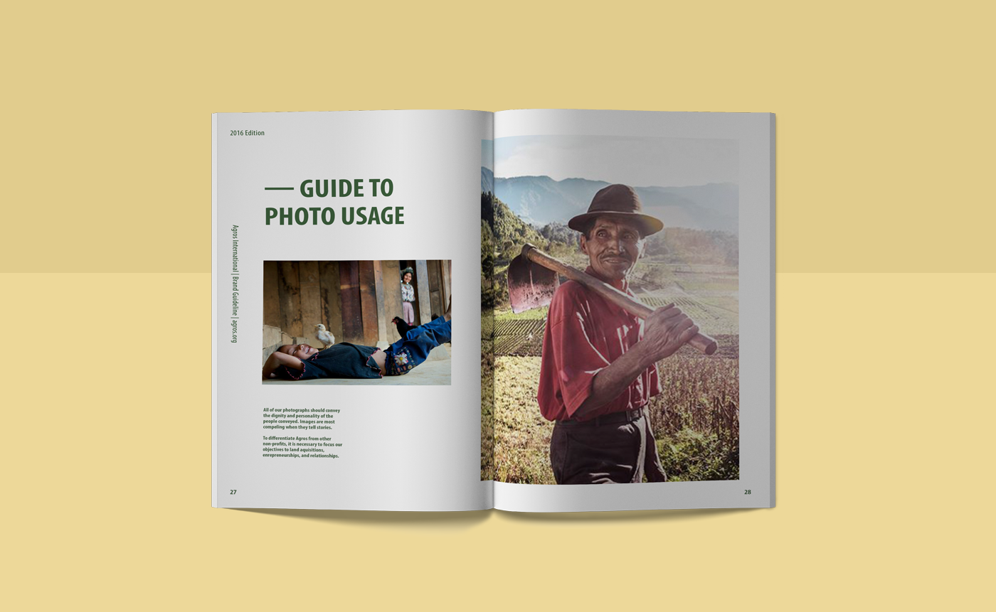
This is a re-brand project for non-profit, Agros International. Modernizing an outdated logo while maintaining the "Agros feel" was the challenge for this project. Our choices in color and typography enhance Agros' beliefs of community and a "hands on" approach in helping families of Central America.
______________________________________________________________________________________________


Before diving into logo design, we collaged a mood board to help us get the right look & feel. We ended up with organic photos with lots of negative space. This free, airy look, gives us lots of breathing room to play with. It creates an open and welcoming atmosphere.
______________________________________________________________________________________________


The concept of land (and land ownership) as the primary vision of Agros is emphasized with the symbol of the growing leaves. The positive vibe and upward growth of the symbol gives off the feeling of hope for families supported by Agros.
______________________________________________________________________________________________