rokotype design // branding with illustration + motion
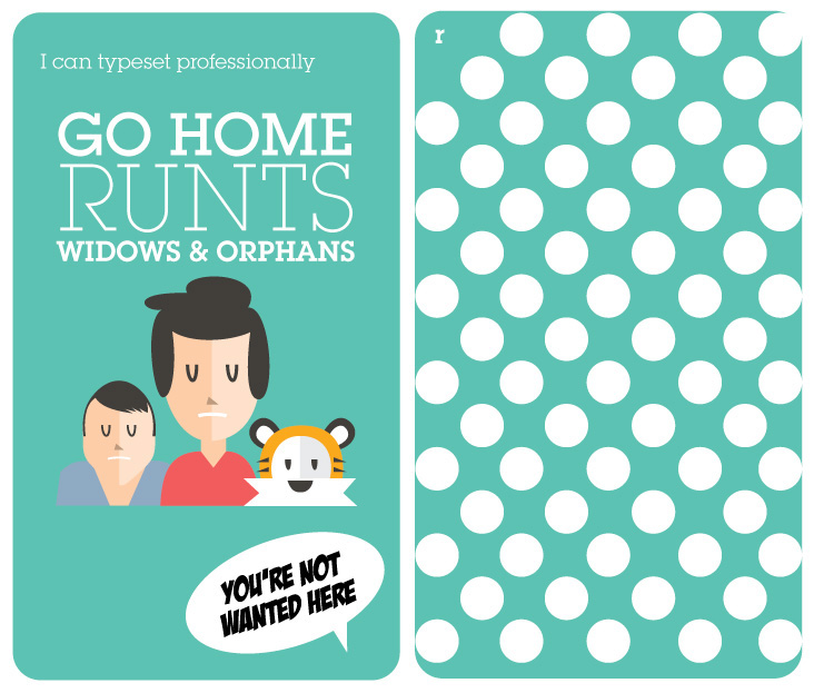
Branding, motion project: Business cards are fine but they only get you into someone’s wallet.
To stand out in todays very saturated market place, ingenuity and innovation can take you far. I
struck out to create a heavenly union of illustration, motion and infographics displayed on web
and in print to communicate my brand. What’s the result? A hybrid brand that engages, puts smiles on faces and gets bums out of
seats to dance while fully communicating my message in a concise manner.
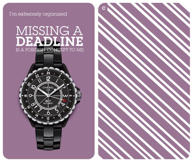
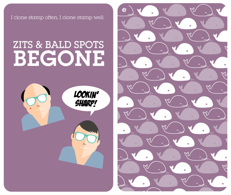
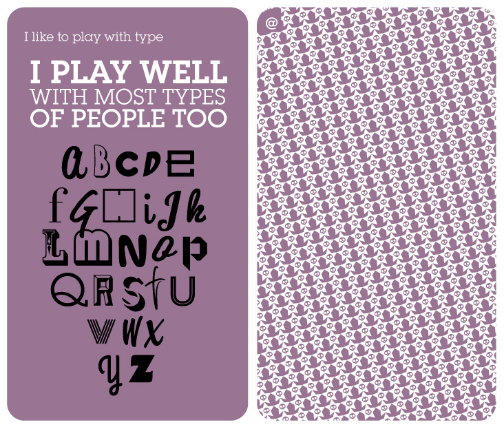
My visual resume targets Art Directors and my objective was to showcase how I would
complement a potential client. Being an Economics major, the analogy of buns and wieners
represented my diverse background. The variety of textures made the printed piece represent a
swatch book which is an Interior Designers reference bible. I view my role as an Art Directors
swatch book.
The fact that it doesn’t fit in a wallet doesn’t hurt either.