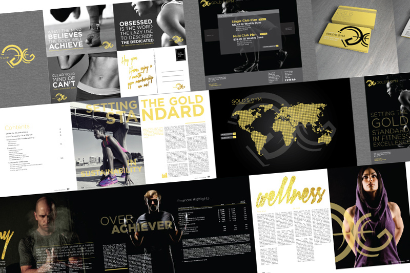
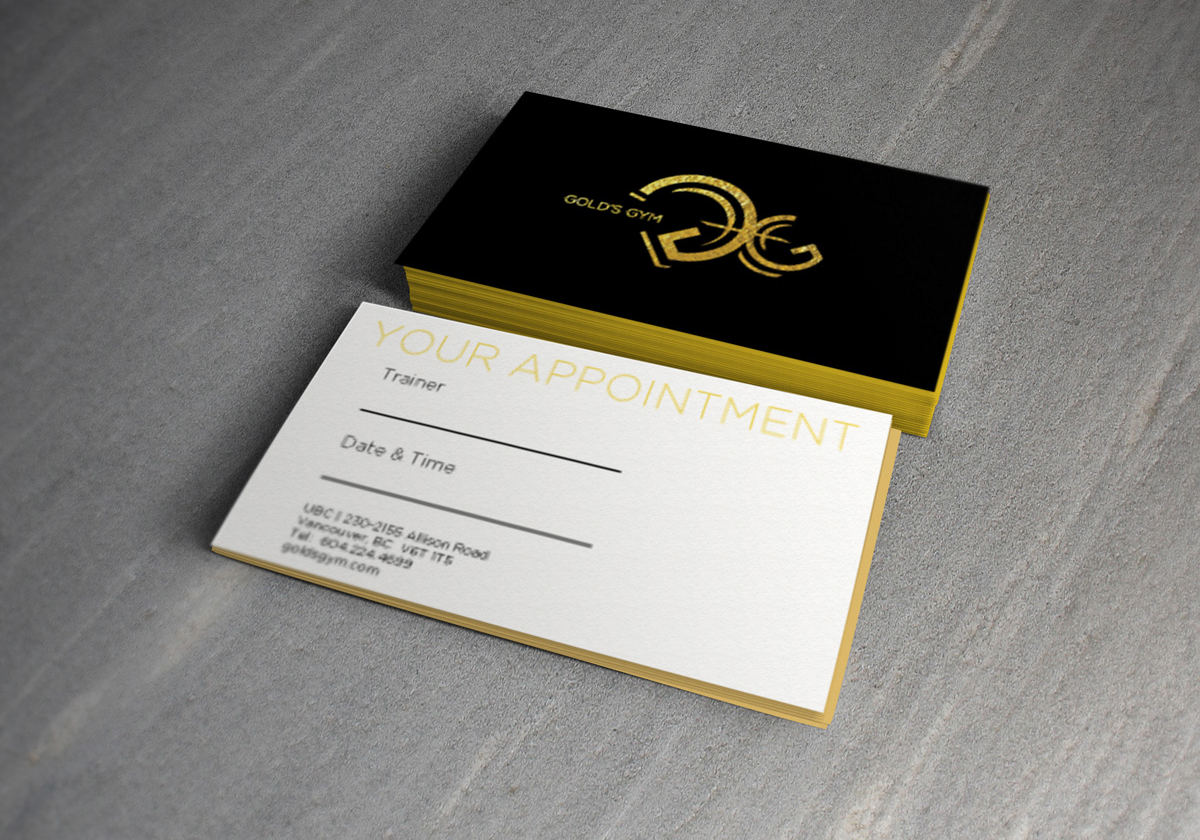
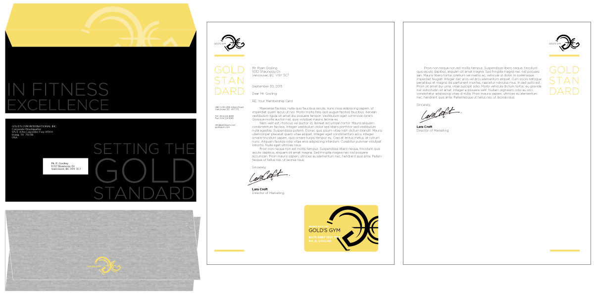
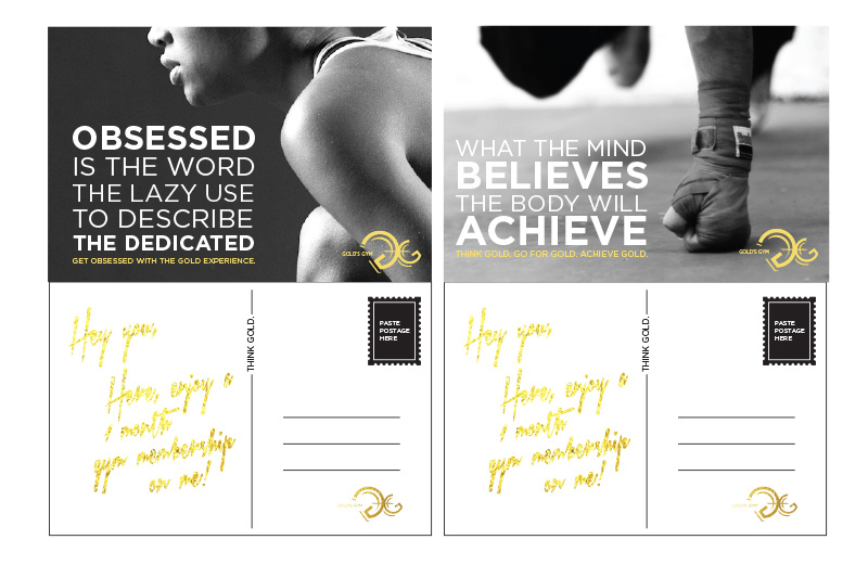
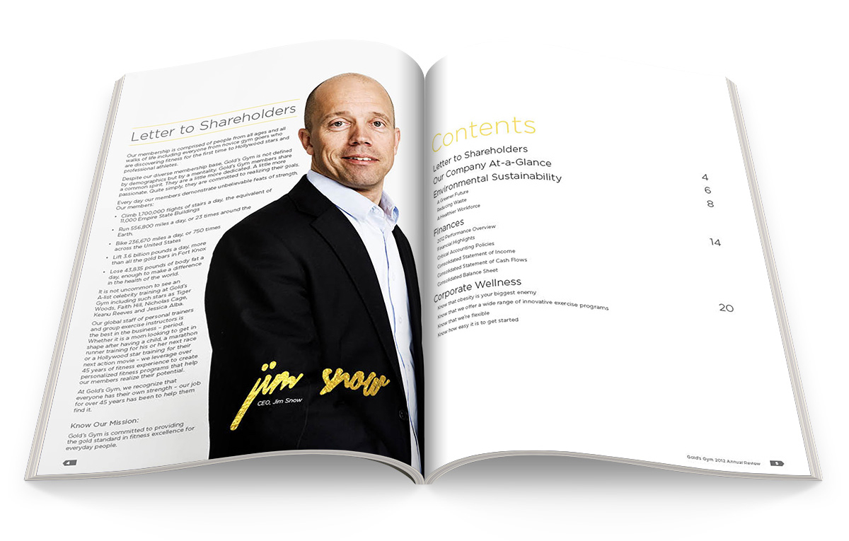
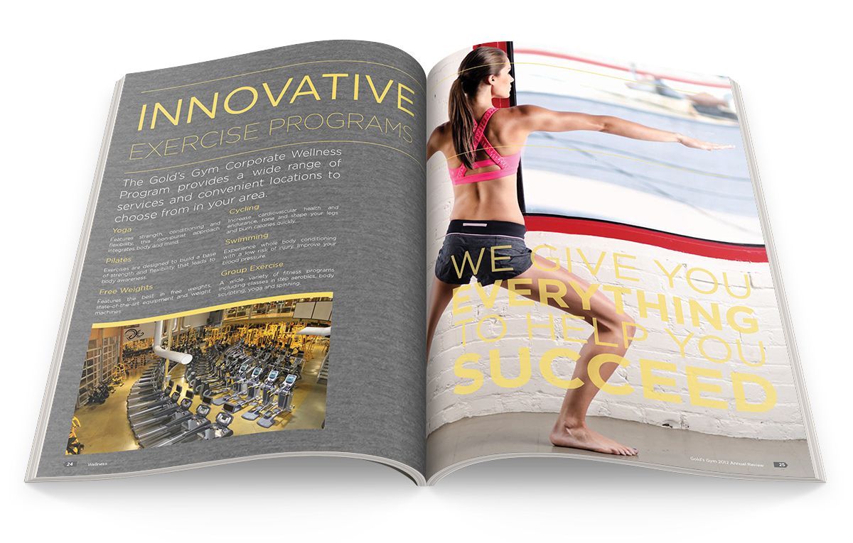
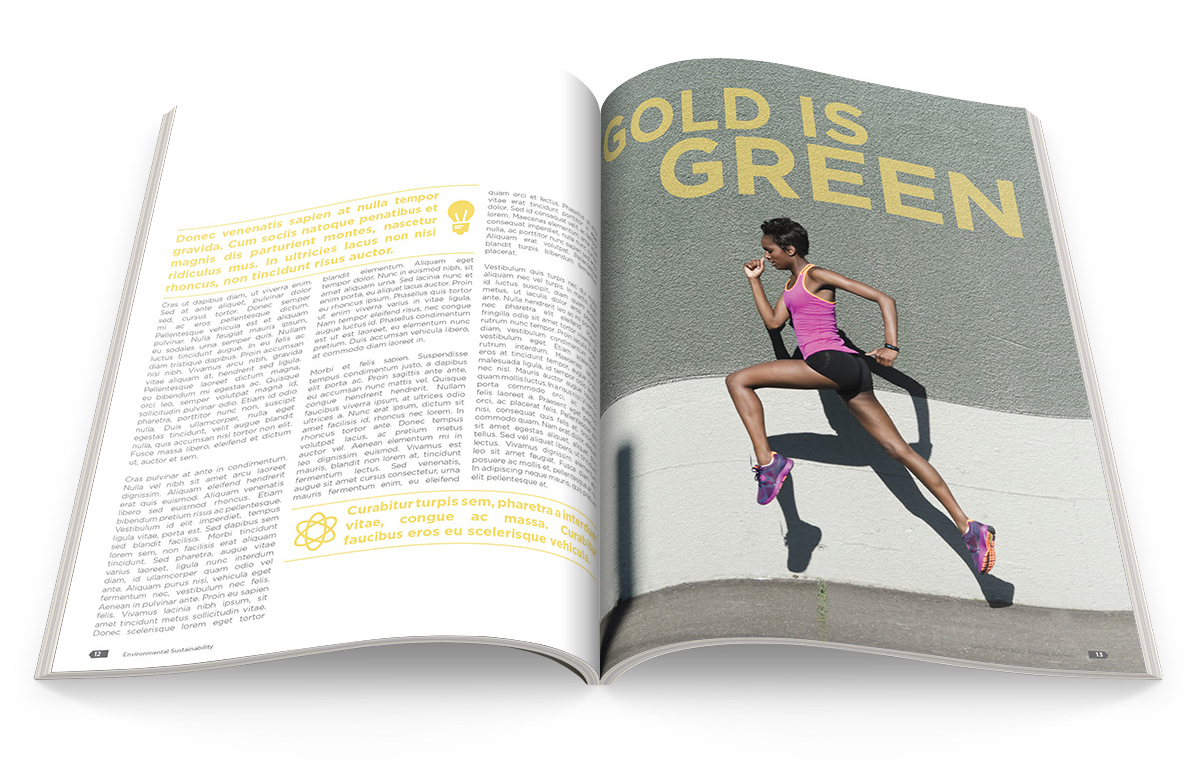
golds gym // rebranding a masculine look + feel to be gender neutral // concept design
Branding, graphic design project: The Gold’s Gym’s logo was designed in the 60′s and was
slightly updated 4 years ago. The logo is hardcore and dated, and doesn’t resonate with their
female audience.
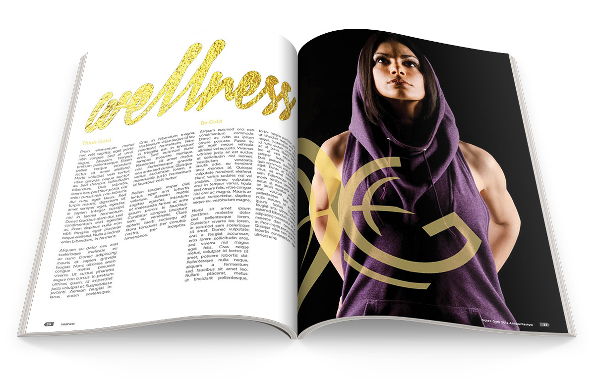
For this rebranding project, I used three visual words: Diversity, Contemporary and Excellence.
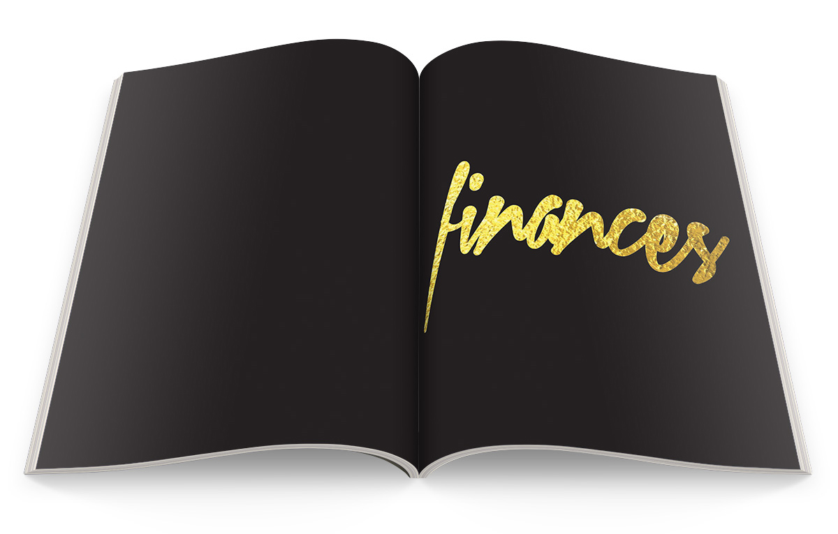
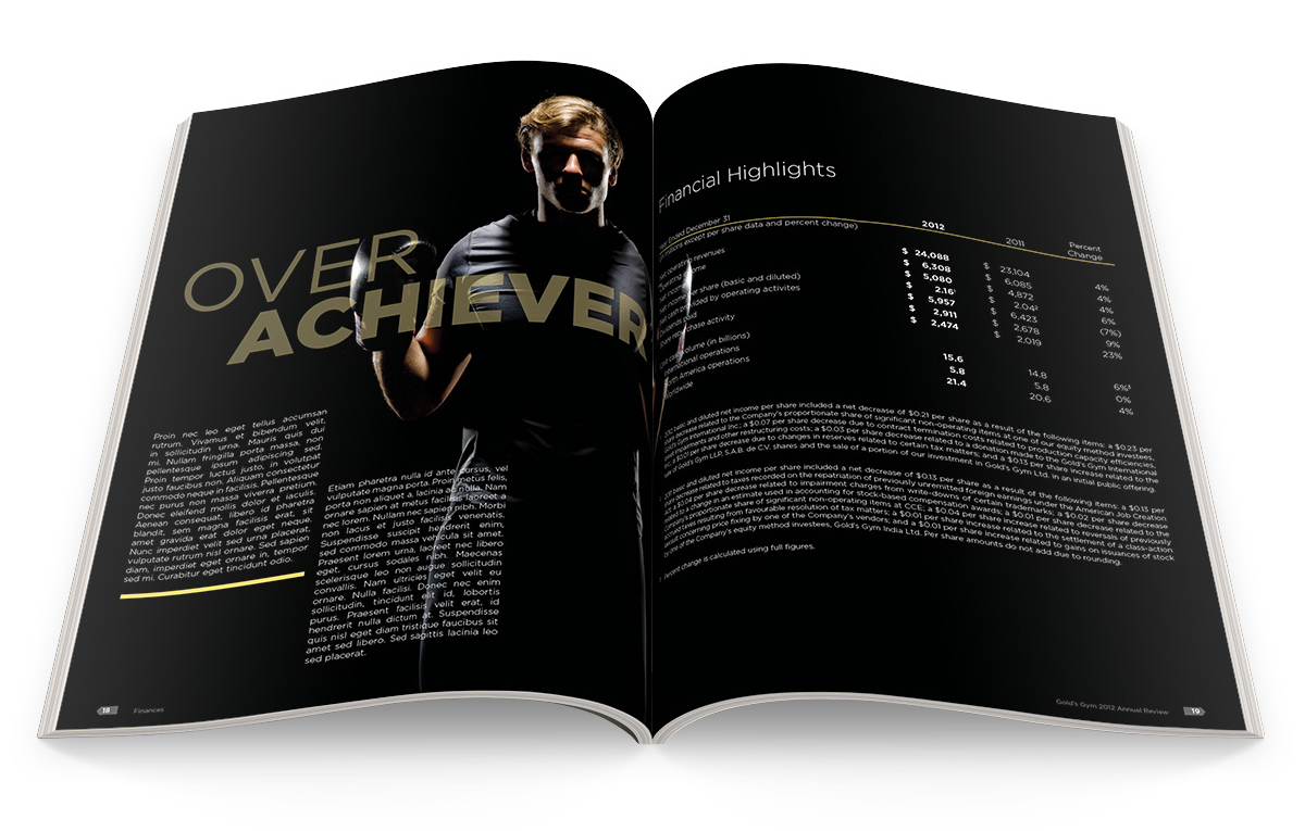
The logo is a pair of G’s that resemble stylized dumbbells. The use of gold foil and matte black
throughout the printed collaterals speaks to “Excellence”, as they currently rank #1 in the world
in respect to the number of clubs they have. The use of gender-neutral and female models
speaks to “Diversity”, and the use of a modern typeface, Gotham, speaks to “Contemporary”.


rokotype.com // follow us on instagram


