
Situation:
AIM X is not a regular skincare product. Instead, it gives new meaning to the idea of achieving your finest skincare goals. AIM X takes skincare’s best ingredients and formulations developed in close cooperation with a leading South Korean cosmetics manufacturer and well-known skincare professionals in Europe to create high-performance skincare with a frisky twist that brings happiness to your face. The project aimed to create a logo and packaging design concept which could represent this.
Logotype solution:
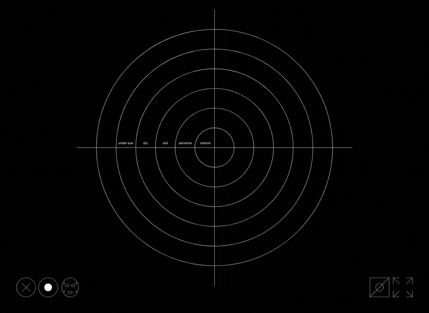
The brand name communicates that it is goal-oriented. Targeted skin problems are its number one focus. It listens to consumers' needs and that is the goal "x". As with aiming at a target, the key is to focus on the essence and not to be distracted - this is communicated by the minimalistic, bold logotype.
Packaging design solution:
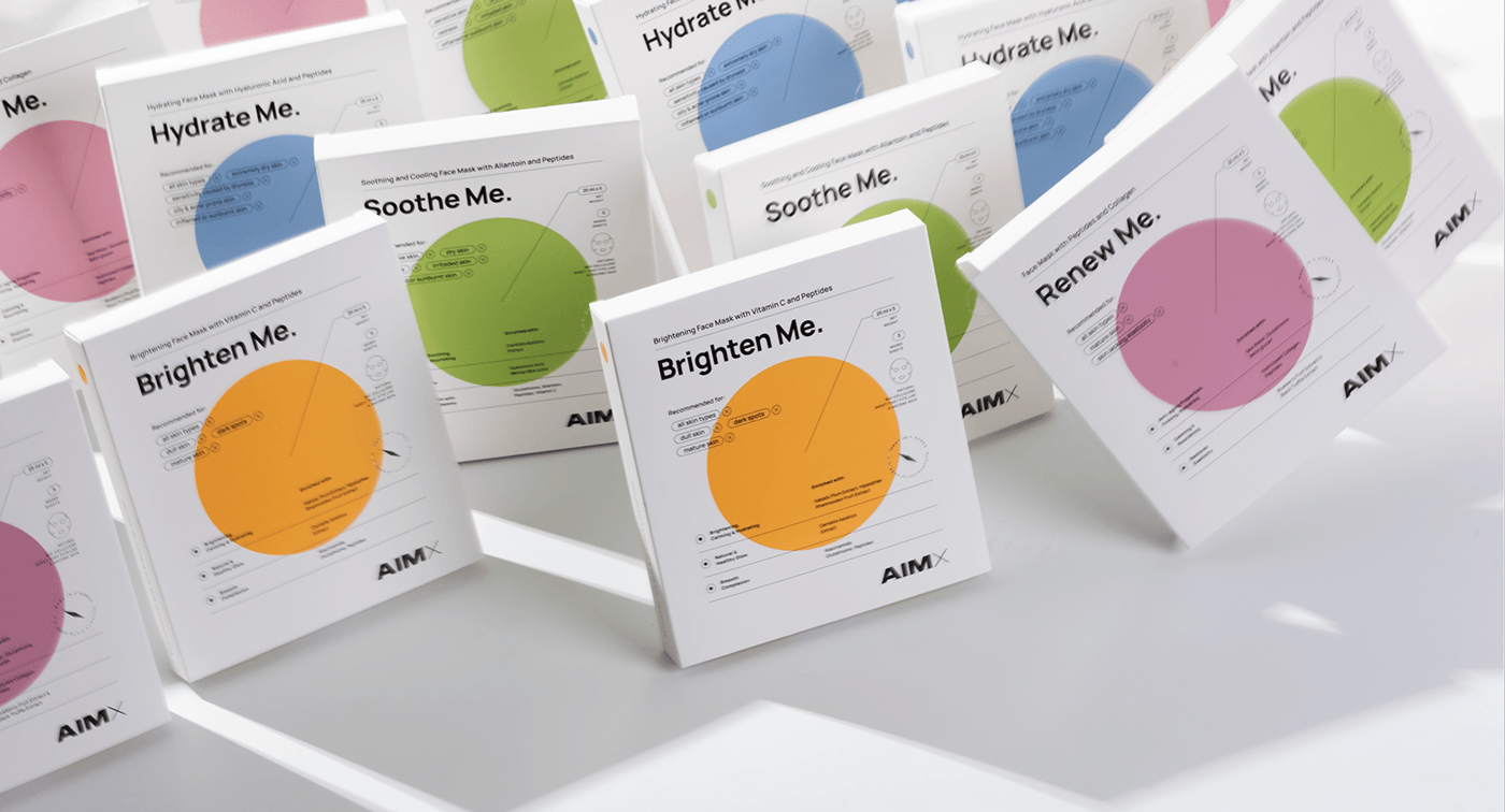
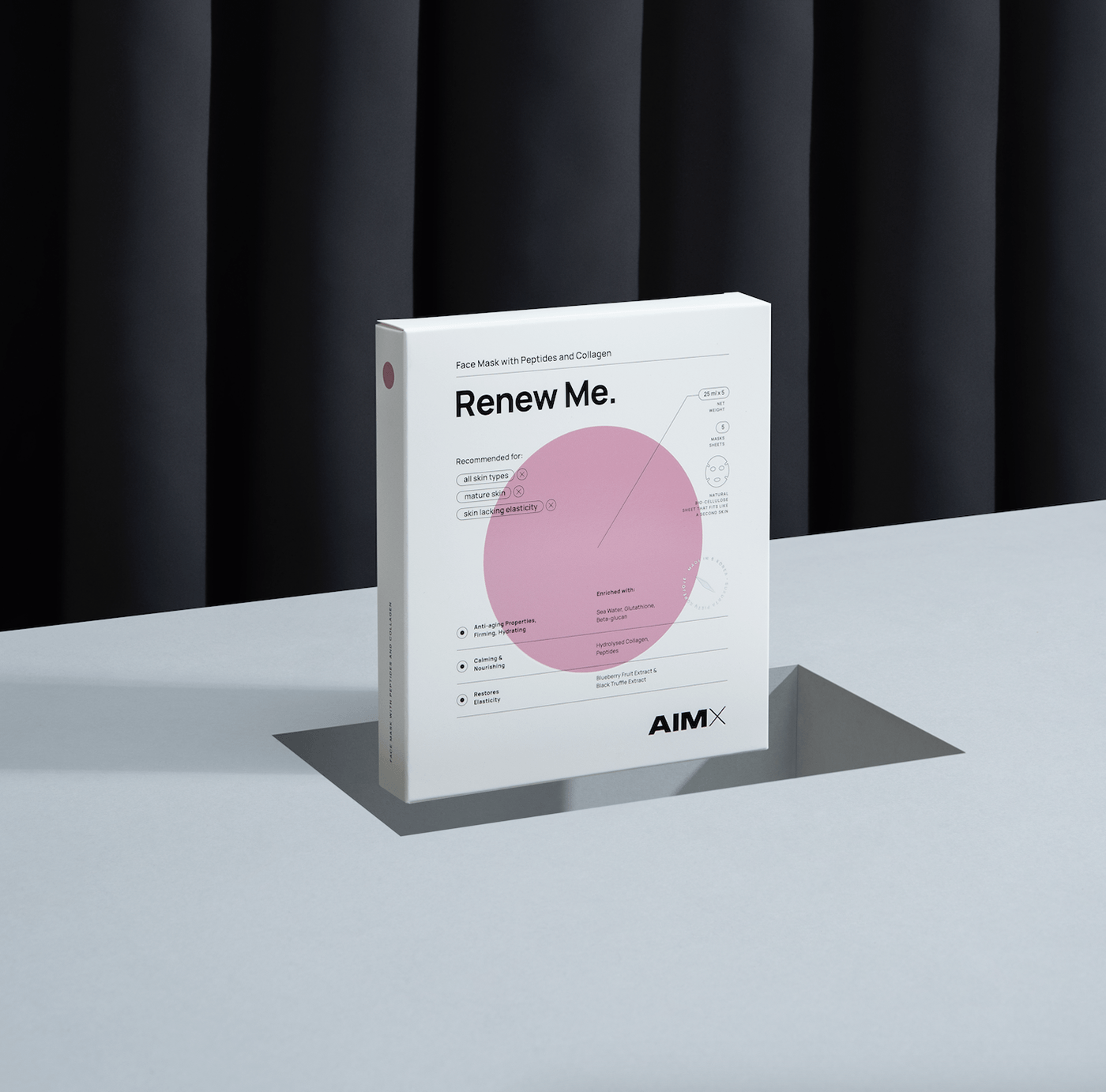
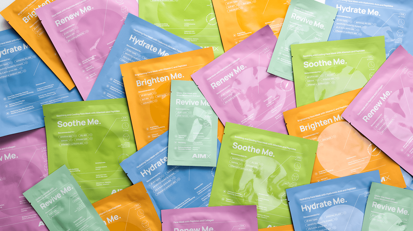
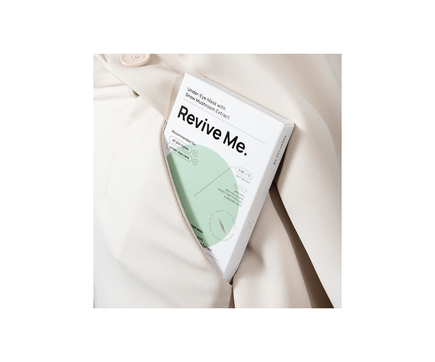
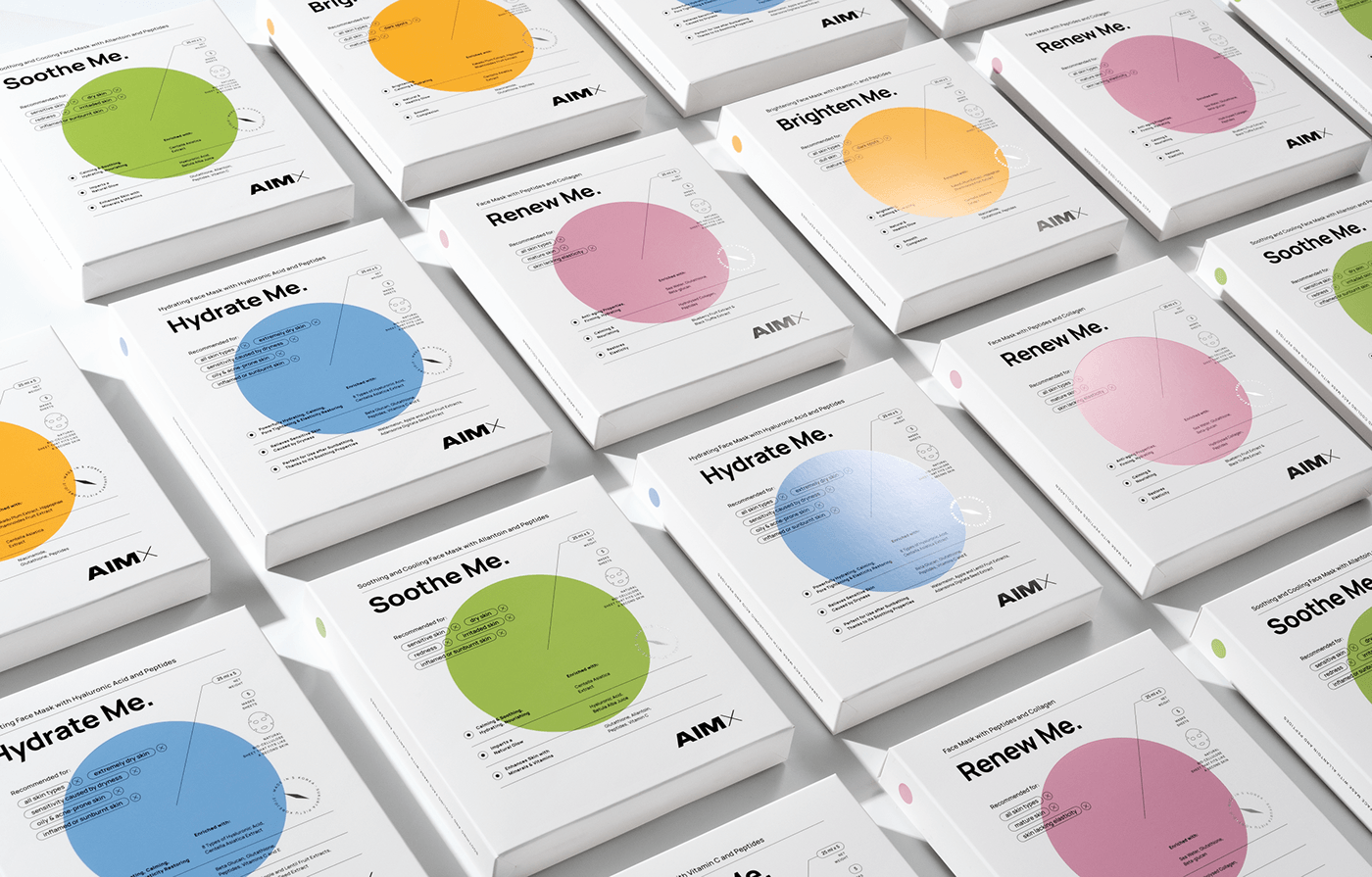
Different skin problems are visualized as different colored targets. The design communicates the brand's serious approach to solving targeted skin problems. The design is minimalistic, aesthetic and creates a feeling that the product is of the highest quality and can be trusted.


Color palette solution:
Each package is made up of a combination of three colors. The white color communicates a professional, medical approach to facial problems. The black typography reveals the characteristics of each product, making it clear what is intended for the consumer. Meanwhile, the colored targets differentiate very clearly between the products and make it quick and easy to find your way around the range. The colored targets are displayed on each side of the packaging, creating a fun game of face-problem targets.


Details:
For the packaging, we have used different laminates that make it an interesting tactile experience to touch the product. Soft touch varnish is combined with glossy varnish elements and silver foil details. The vibrant colors add positivity, and all these elements together invite the user to a unique experience when using the product.
Credits:
Client: UAB Bioklinika
Logotype design: Ingrida Kirkliauskaitė
Packaging design concept: Ingrida Kirkliauskaitė
Packaging design execution: Ingrida Kirkliauskaitė, Marija Matiušova
Photography: Kernius Pauliukonis, Robertas Gaudiešius, packshot.lt
Year: 2021


