

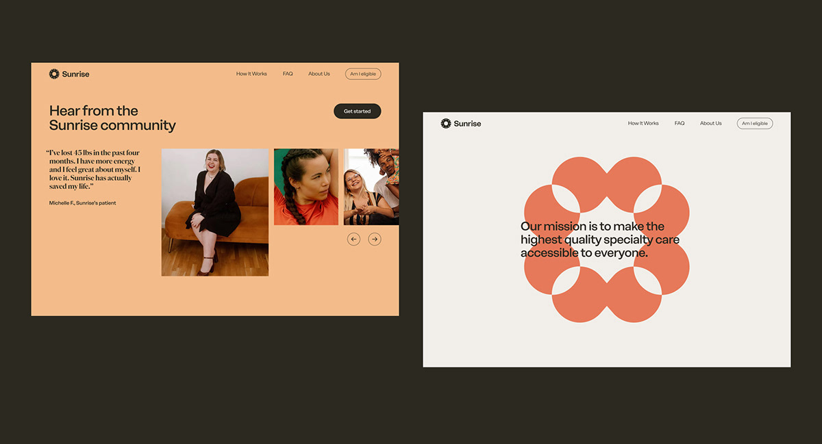
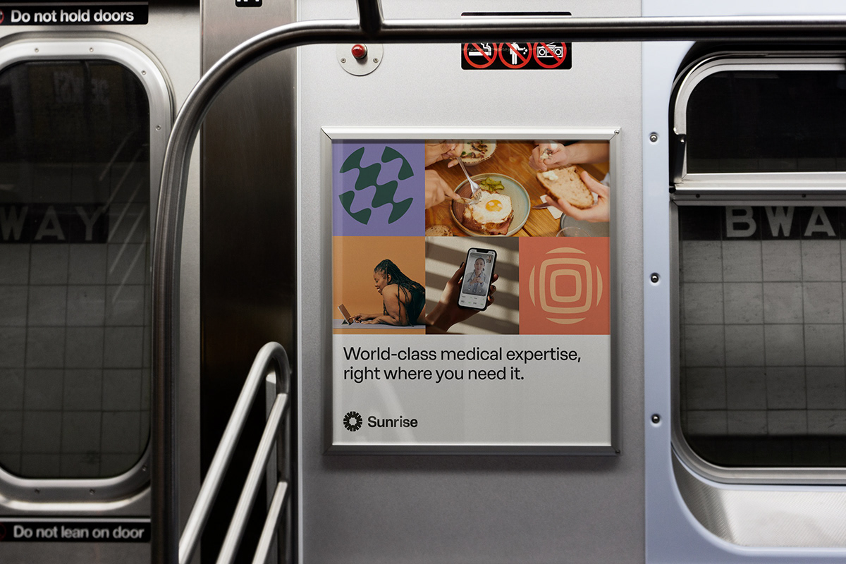
Sunrise is a health care provider on a mission to make the highest quality specialized care more accessible for everyone.

Crafting an identity for effective, clinically-based recovery
Sunrise is on a long-term path to revolutionize the health care industry, and their first step is making clinically driven weight loss easier and more effective. We created a brand that brought their values and patient-centric approach to life. The identity represents the strength of a united community, and Sunrise's continuous pursuit of innovation.


Identity
The foundation of the Sunrise brand is the emblem, created by an interlocking circle of U shapes. The repeated shape represents individuals coming together in unity, and the energy that emits from the transformative power of that collaboration.


Functional Icons
We developed a suite of illustrative icons originating from geometric shapes. We incorporated a sense of movement and upward motion to add a sense of actionability to the family of icons.

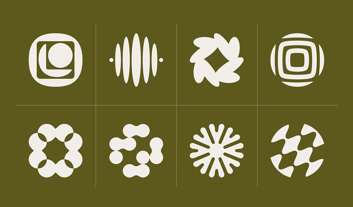
Experience Symbols
Another foundation of the Sunrise brand were the symbols developed to parallel the brand's values. Based in geometric shapes, each symbol is mirrored to values like patient-centrism, operational excellence, and impact-driven care. These symbols used in harmony work together to bring the visual metaphor of support and harmony to life.


FEATURES
PARTNERSHIPS
Apoorva Mehta, Founder/ CEO
Caitlyn Durcan, Marketing
Jake Horobitz, Marketing
Jacob Gilson, Growth
Daniel Todorov, Product
YUNG TEAM
Alli Berk, Design
Caleb Couturie, Copy
Melody Yung, Creative Direction
Whitt Mitchell, Design
Yu Rong, Design
WHAT WE DID
Brand identity system
Website design
Social media templates
Design guidelines
Website design
Social media templates
Design guidelines


