

PETER JENSEN Fashion Brand Renewal Project
2022
Project Overview
Peter Jensen is a brand that began with a license from a UK brand created by a Danish graphic artist. It has established a strong brand identity with its witty rabbit character, based on the unique kitsch, funkiness, and the combination of sensuous colors of British culture. However, in the Korean market, it was positioned as a brand for children, leading to consumption focused on certain products such as school bags and pencil cases for the new semester, rather than increasing brand recognition. The focus was on discovering attractive products for short-term success.
As a result, internal product designers and marketers have been tasked with proposing standards that can serve as the foundation of the brand. Based on these standards, we are undertaking the construction of a brand identity that allows for consistent communication from product planning to various touchpoints.
Brand Story
Peter Jensen is a brand where anyone who wishes to express themselves can come and share their dreams and hopes. It is a brand that communicates at the eye level of the 'child' within everyone, regardless of age, who never grows old. The essence of Peter Jensen's work is to refresh their daily lives and to offer new inspiration.
Brand Essence
Ordinary Fantasy
Peter Jensen is a brand that offers a unique perspective on the world, providing a wealth of inspiration and positive energy. It allows both adults and children to experience the fantasies of everyday life, big and small, and to focus on their own happiness and existence.
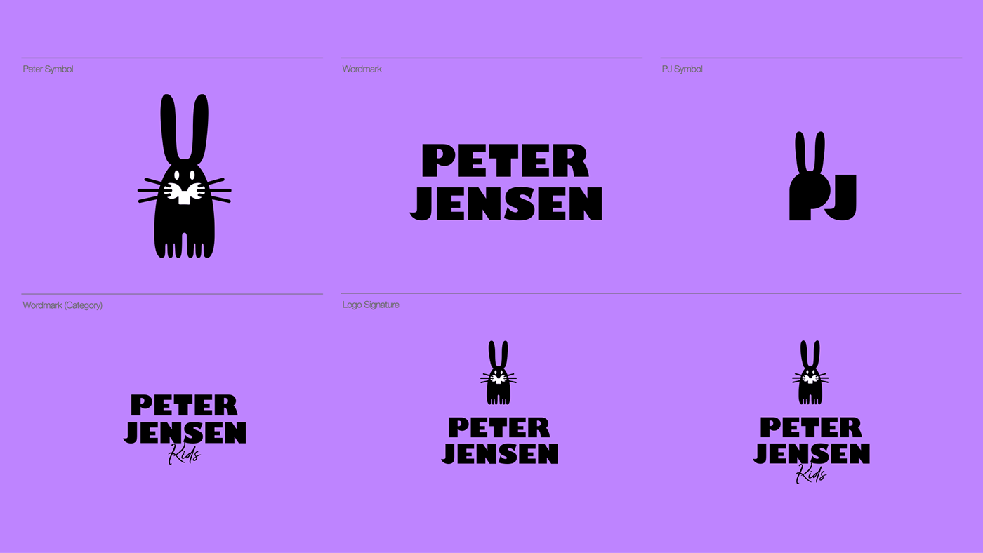
Brand Symbol

Brand Wordmark

The Gill Sans Ultra Bold, which served as the base for the wordmark, possesses a stronger rarity and aesthetic form compared to the Light series often used by other brands, and as a British typeface, it continues the origin identity of Peter Jensen.


Brand Color
We suggest a bright color from the various color ranges of purple that represent everyday fantasy, capable of sparking the imagination in both children and adults.

Brand Color Palette
The sub-colors consist of bright and soft pastel colors, which serve to enhance the vibrancy of the main color purple. By utilizing the tints of the designated colors, they are used in conjunction with the main color purple to prevent monotony.


Brand typeface (EN/KR)
The designated typeface for the brand, Cerebi Sans, possesses both the flexibility of curves and the clarity of straight lines, mirroring the characteristics of the Peter Jensen logo wordmark while not conflicting with the logo design's sculptural qualities.

The designated Korean typeface is NotoSans CJK KR, known for its readability, clarity, and a variety of weights. It is a well-crafted typeface that possesses both aesthetic form and usability, launched in collaboration between Google and Adobe Systems.

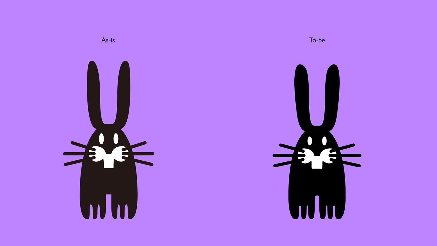
New Symbol
From a macro perspective, we have considered a new symbol design as an alternative for brand scalability and usability. Starting with the wordmark, we propose the most suitable type after various reviews of form, balance, and proportion.


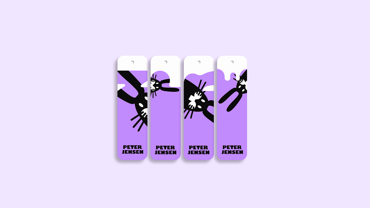
Brand Application Design


PETER JENSEN Fashion Brand Renewal Project
2022
Client
Creative Director : Bohyun June Kook
Brand Strategy : Bohyun June Kook
BX Design : Tropicallion


