


Harbour — Brand Identity
for a British Neobank
for a British Neobank
Design Type: Brand Identity
Specifics and Business Area: Financial Services, Cryptocurrency
Client
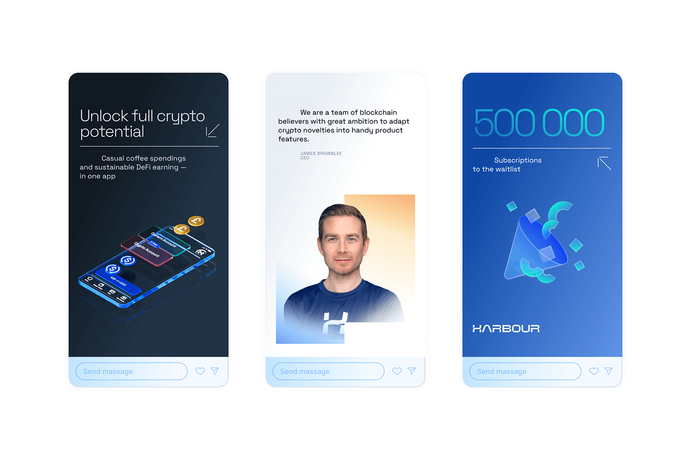
Harbour is a bridge between the world of cryptocurrency and traditional finances. As a neobank, it creates a seamless experience for users eager to integrate both worlds into their financial portfolios. Harbour embodies clarity, simplicity, and futurism from its innovative approach to user experience.
Transport hubs make the world more accessible, and Harbour does the same but with cryptocurrency. Various transport modes move parallel, preventing unnecessary transfers and saving money and time. Harbour is doing the same thing — accelerating the introduction of new possibilities between crypto and the banking space.
Design goals
The task was to create an identity that emphasizes Harbour's uniqueness and aspiration to make the most transparent banking experience in the world. We aimed to convey the product's simplicity while retaining a sense of innovation.

Concept
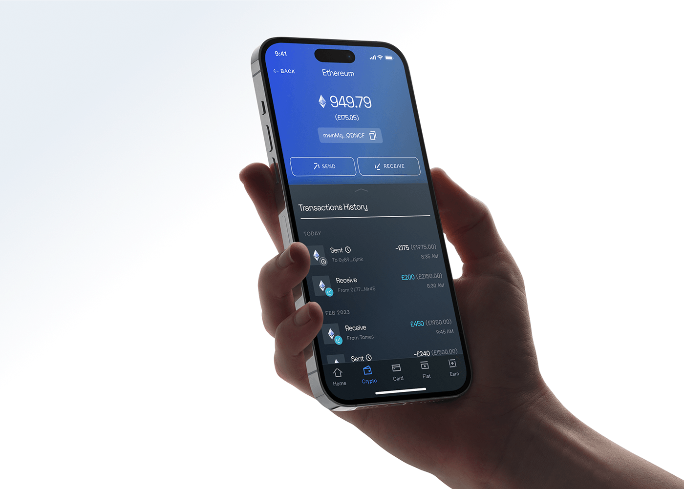
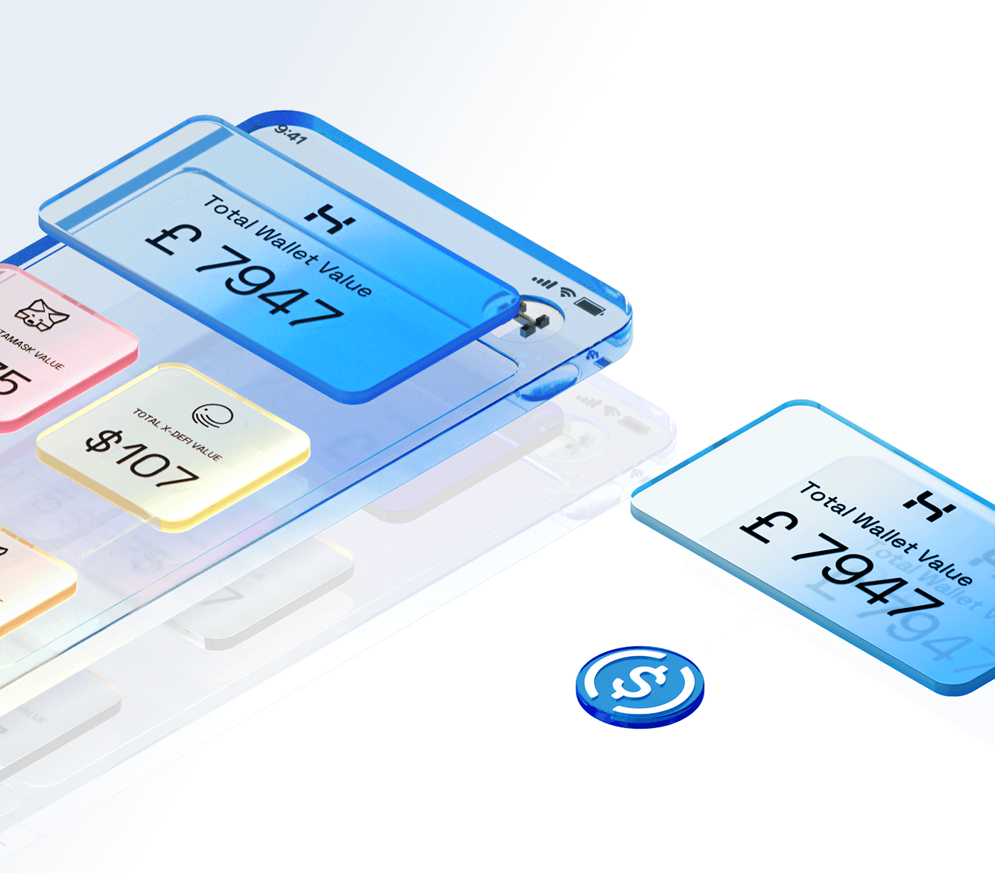
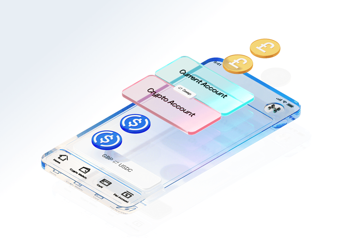
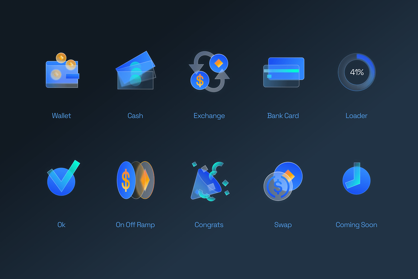
The main idea revolves around 3D graphics that visualize the principle of uniting a transport hub. As different types of transport meet at a hub, our application becomes a meeting place for cryptocurrency and traditional finance.
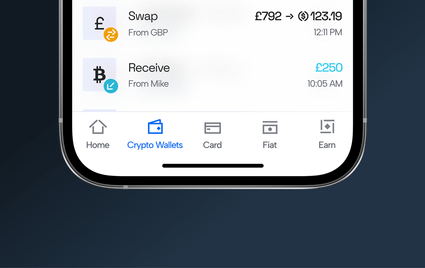
Detailed 3D visuals decorate and explain the processes and functions of our product. We ensure convenience and accessibility of the digital service by using intuitive and simplified interface elements, similar to smartphones. Glass material adds aesthetic appeal. It symbolizes transparency and technology, critical principles of transport hubs.
It's like a guide, allowing you to move between cryptocurrency and traditional finance. A new harbor with a new way of moving. A new world, just one step away.
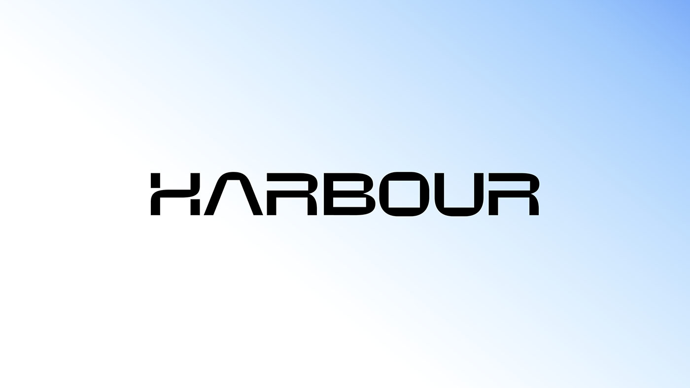
Logo
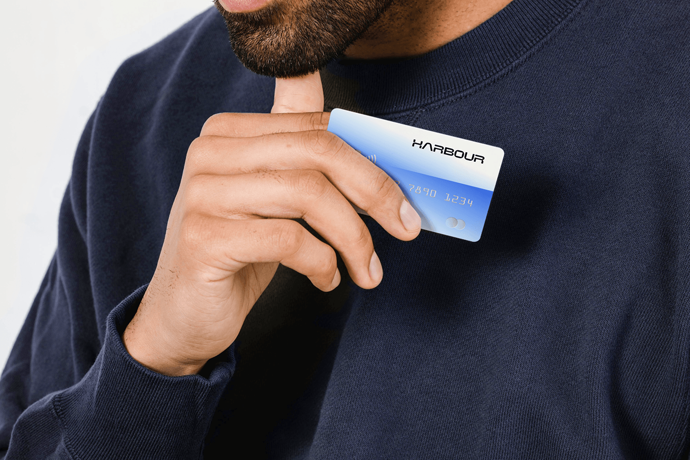
The Harbour logo reflects the synthesis of cryptocurrency and traditional finance. Its shape and structure symbolize unity, stability, and innovation. The logo conveys future-directed technology, combining round and sharp shapes, wide and stable letters.


Typography
The Space Grotesk font aims to be functional and inject a technological mood into the identity. The Albert Sans font makes the text readable for voluminous texts and nicely complements Space Grotesk. We make a large indentation for headlines or main text in typography, opening the idea of transactions.
Color Palette
We show the future through metallic and glass color reflections of transport hubs. The primary approach is gradients, applied to backgrounds and graphics. The central theme of the identity is dark, with a significant blue gradient. Sometimes, we use a white version and a medium less (blue) color.
Gradients consist of two different but close colors to convey the multifaceted reflection. They are semi-transparent and quite light, akin to glass shimmers. We make colors nuanced with transparency, despite their brightness.
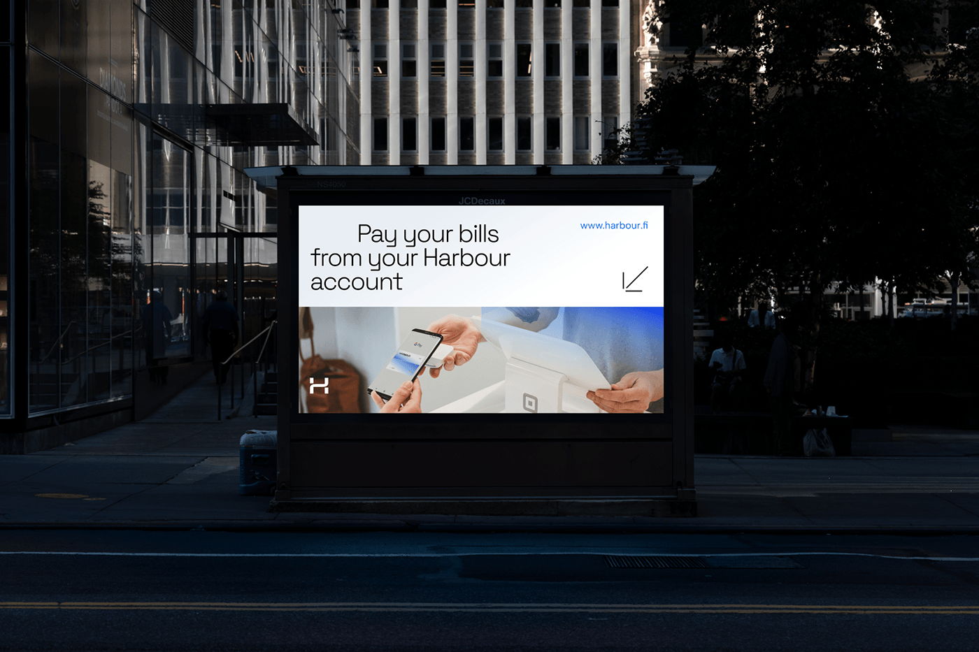
Visit our website and look how we make so unique designs!


Decorations
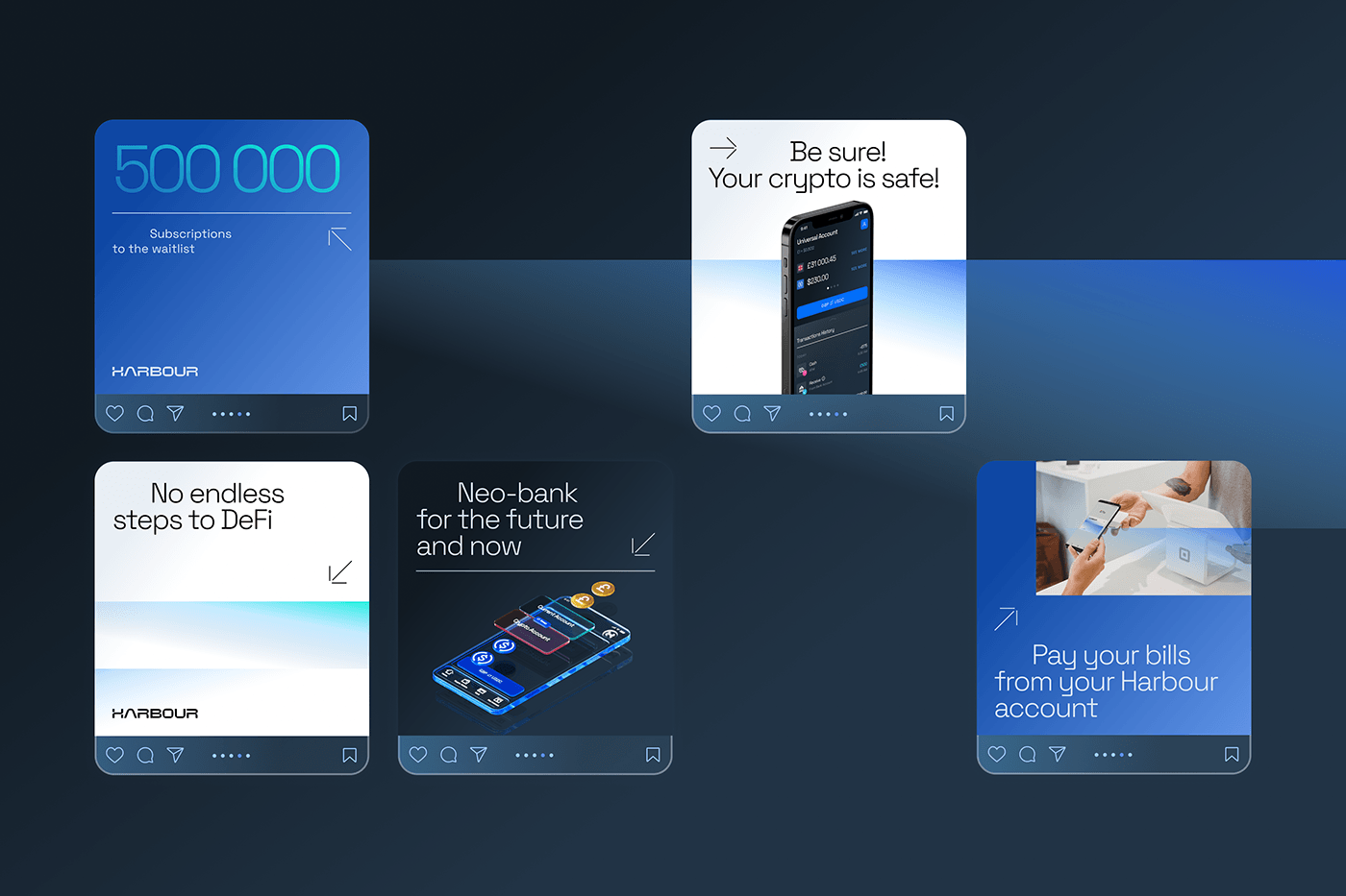
We use an arrow to direct users into the future, similar to navigation in transport hubs. A line combined with the arrow helps decipher the content and be confident about where to move next.


League Design Agency Team:
Design Director: Mike Samovarov
Team Leader: Aleks Gusakov
Graphic Designer: Sasha Hevko
Creative Project Manager: Maryna Blyzniuk
Design Director: Mike Samovarov
Team Leader: Aleks Gusakov
Graphic Designer: Sasha Hevko
Creative Project Manager: Maryna Blyzniuk
3d Designer: Vadim Revin, Dima Khrunov
Case Design: Anna Fedorovych, Anton Bukoros, Alina Kovalenko, Dima Kaliberda
Case Design: Anna Fedorovych, Anton Bukoros, Alina Kovalenko, Dima Kaliberda
Support Ukraine!


