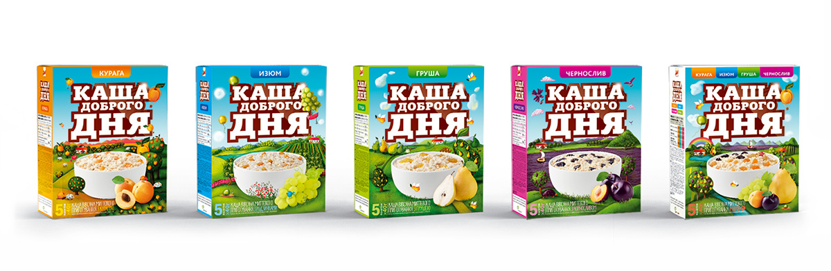
Porridge of a Good Day
This incredible fruit world to make the day good!
–
Client location: Stockholm, Sweden, Market: Ukraine + CIS
What we did: Research, Design Strategy, Brand World, Type design, Logotype,
Packaging Design
Packaging Design

BACKGROUND
The task was to re-launch product – AMO porridge – in a middle-price segment and increase the market share. The product had to promote itself from the shelves so the package had to be desirable for consumer. The taste of the product has changed to be more relative to customers’ preferences.
SOLUTION
After a deep review of a strong competitor’s sides and main drivers in this segment, Milk offers to the client to think about changing the name – AMO. According to the agency, AMO sounds very cold and detached. The names of competitors were based on product essence and on cooking method so Milk decided to make a new name more emotional and pleasant. That was the birth of new brand Porridge of a Good Day and its incredible fruit worlds: grape, apricot, plum and pear. Original illustrations fill the package with warmth and emotions.
Credits:
Client: Lantmännen
Creative Directors: Dmytro Klishchyk, Maxim Lesniak
Creative Directors: Dmytro Klishchyk, Maxim Lesniak
Packaging Design: Yevgen Glukhov
Logotype: Dmytro Klishchyk
Brand world: Svetlana Tsvelenieva, Yevgen Glukhov
Naming: Svetlana Tsvelenieva


Custom typeface was designed for Latin and Cyrillic alphabets by Yevgen Glukhov https://www.behance.net/nurel

Incredible characters were designed by illustrators bureau Moonsters