
Leonhard-Euler Akademie
–
Identity system for the educational institution
Client location: Munich, Germany
Market: Germany, Ukraine, Russia
What we did: Research, Visual Identity
Objective:
Munich-based Gesellschaft für Integration und Kultur in Europa runs a project aimed at helping young talents from Ukrainian and Russian families undergo a process of preparation/adaptation before entering universities in Germany with emphasis on mathematics. The project named after a famous Swiss scholar Leonard Euler – commissioned us to create visual identity for their brand. The goal was to create something scholarly but with fresh youthful appeal, easily recognizable yet flexible enough for usage in a variety of media and extendible for multiple academy subdivisions.

Solution:
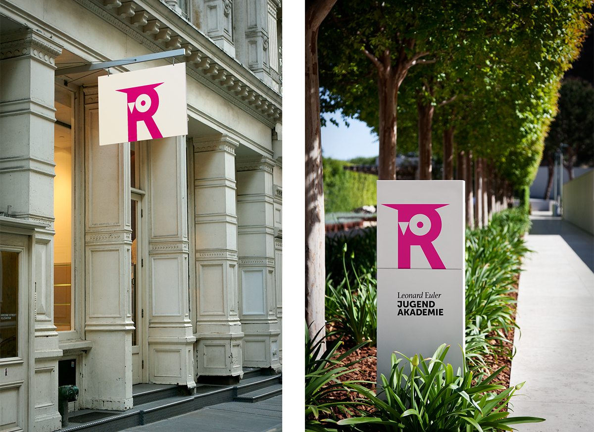
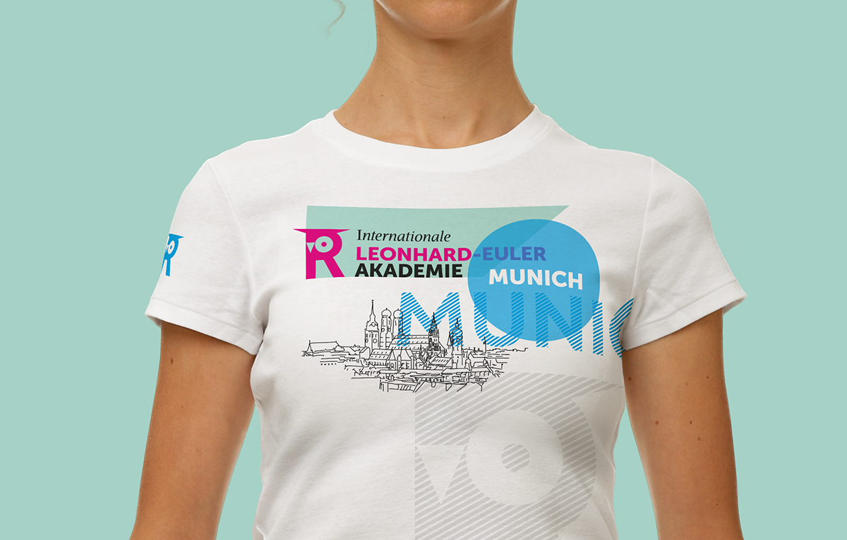
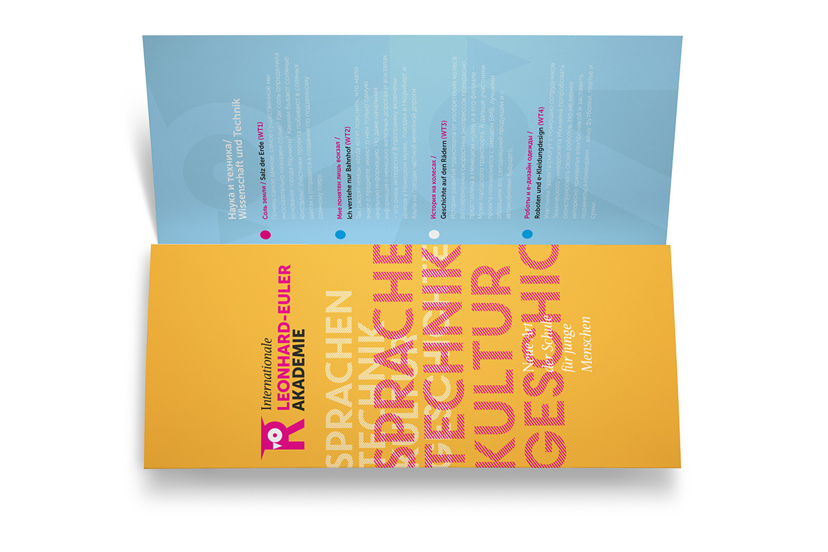
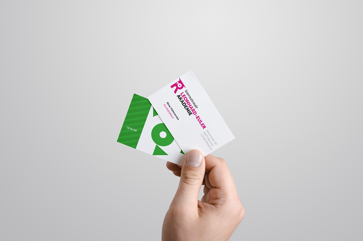
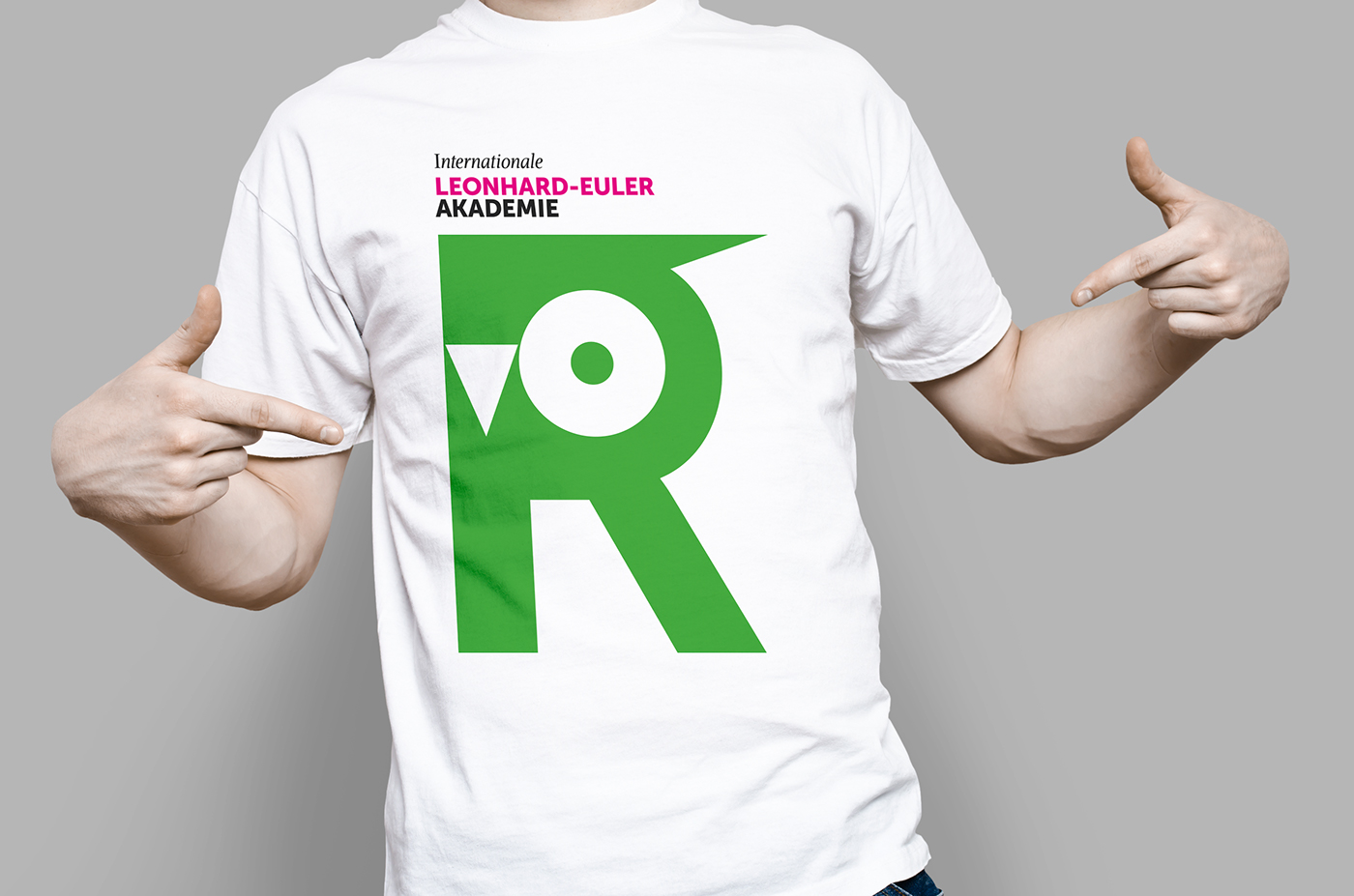
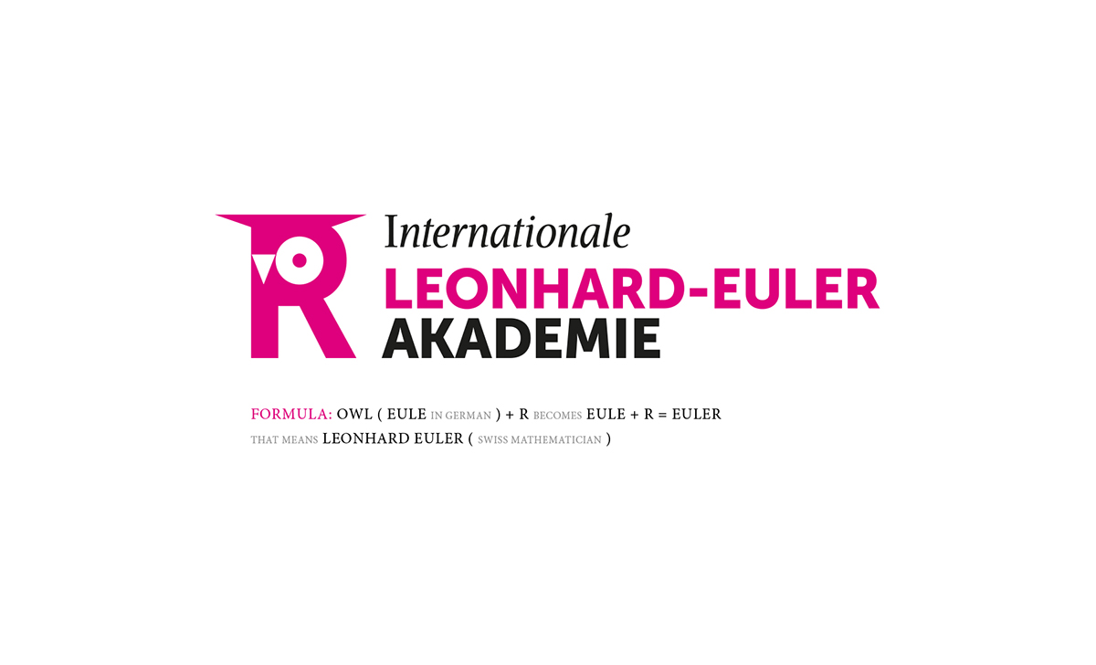
The idea came to us from Leonard Euler himself – his last name Euler without the last “R” reads like an “owl” (“eule”) in German. We have found this coincidence a happy one – owl being an internationally recognized symbol of scholarly wisdom. Euler is also often described as suffering bad vision in his right eye – this is how we arrived at the school’s logo of an owl wearing a graduation hat and shaped like a “missing” R from the Euler name. The imbedded touch of irony together with the elegant “mathematical” geometry of the logo manage to capture the spirit of the school our client wanted to convey. The identity system employs bright colors, patterns and contemporary approach to typography – creating an emotionally involving visual system, equally relevant for official representation and for targeted students appeal.