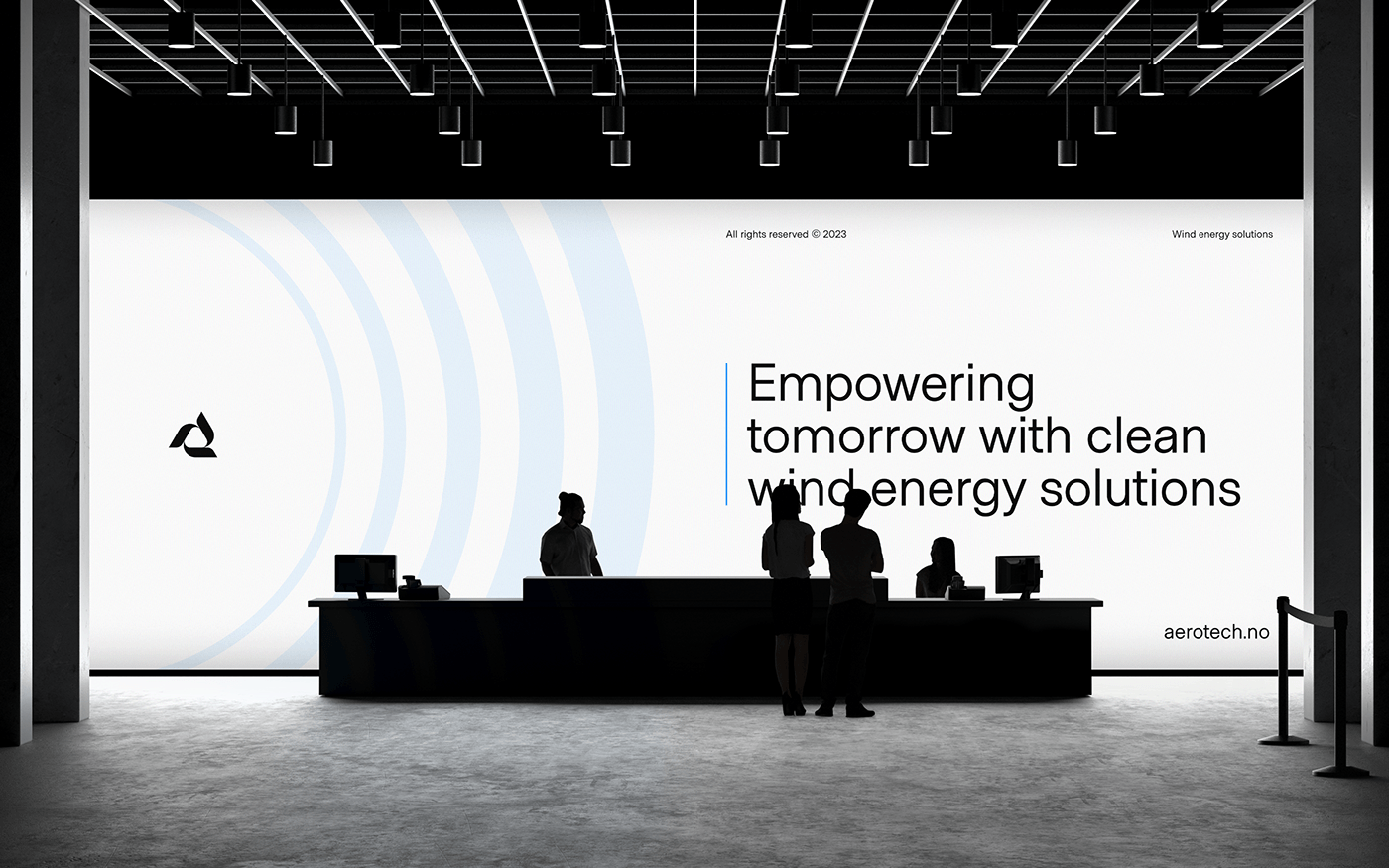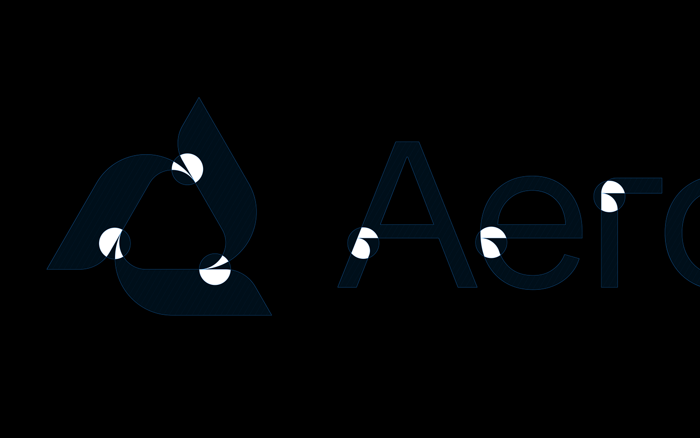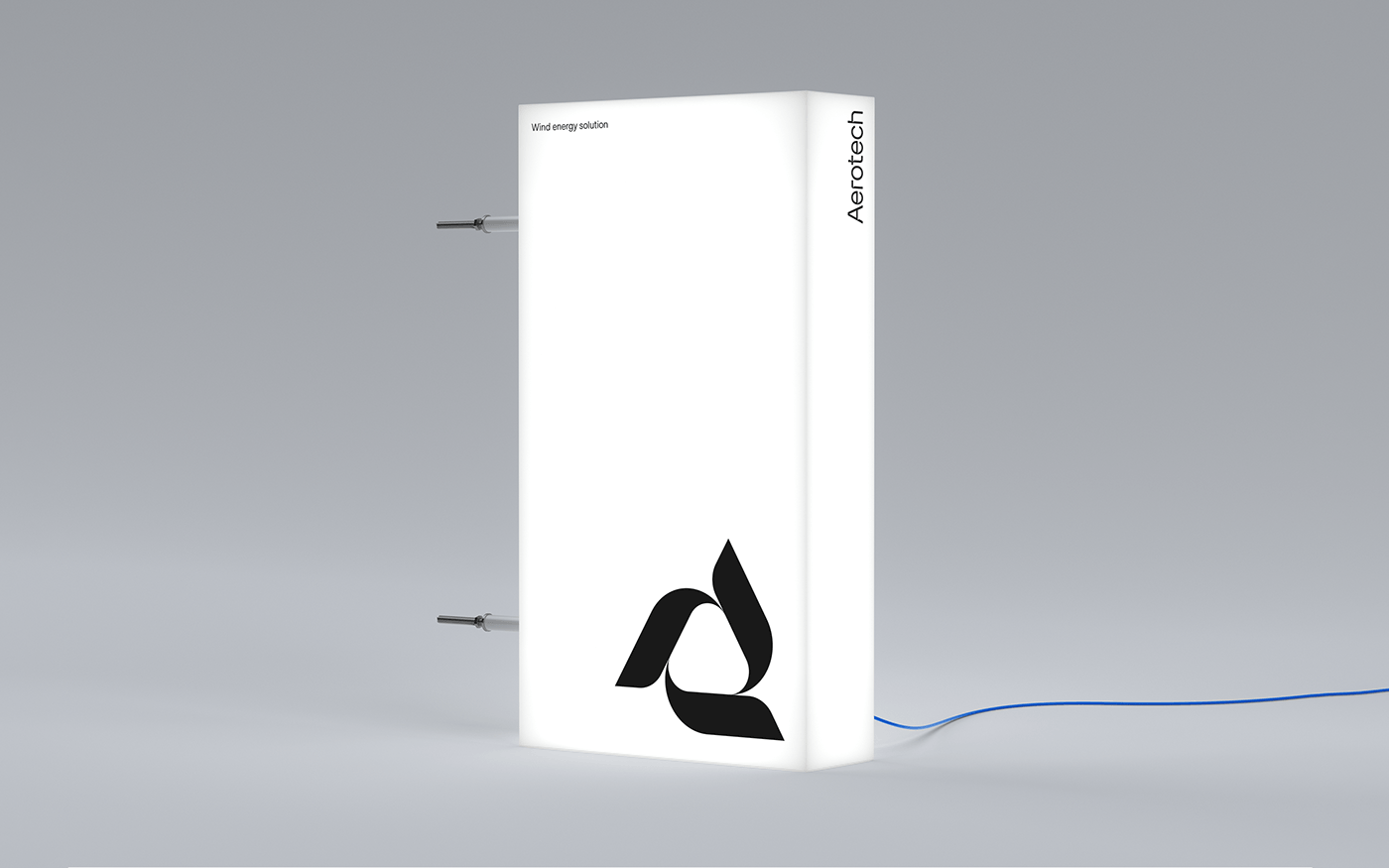
Aerotech
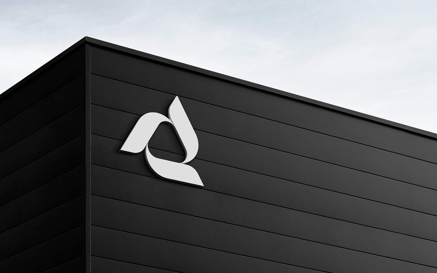
A leader in wind energy solutions, sought a visual identity marked by strict minimalism. Our response culminated in a symbol, harmonizing the company's initial "A," dynamic wind turbine blades, leaves reflecting ecological consciousness, and a recycling motif, all meticulously aligned with Aerotech's core activities.
The brand element, comprising five circles of varying thickness, encapsulates multiple meanings:
1. Symbolizing the 5 atmospheric layers, emphasizing the company's commitment to atmospheric purity, and reinforcing air as a primary resource linked to recycling and ecology.
2. Depicting a planet, aligning the symbol with Earth's sphere, reflecting the company's values and underlining its global connection with the planet and ecological stewardship.
3. Capturing the kinetic energy of windmill blades, resulting in a visually compelling circular pattern.
The typographic design, featuring cut-outs from the logo, reinforces the brand's identity, with "Aero" embodying wind and "Tech" symbolizing technology.
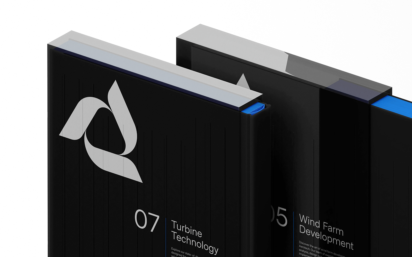
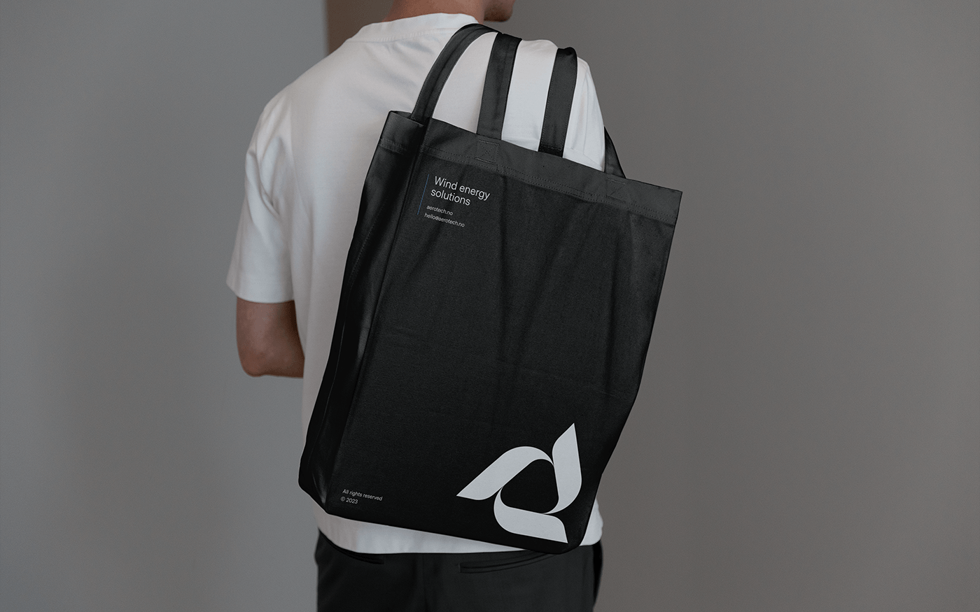
Signature colors were meticulously chosen for their significance:
- Blue: A nod to technology and the vast sky.
- White: Represents purity, spaciousness, and simplicity.
- Black: Conveys austerity and premium quality, while subtly highlighting the three states of the sky: clear, cloudy, and twilight.
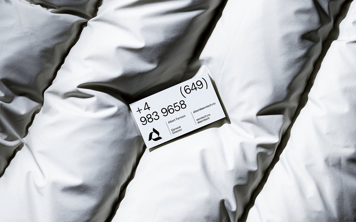
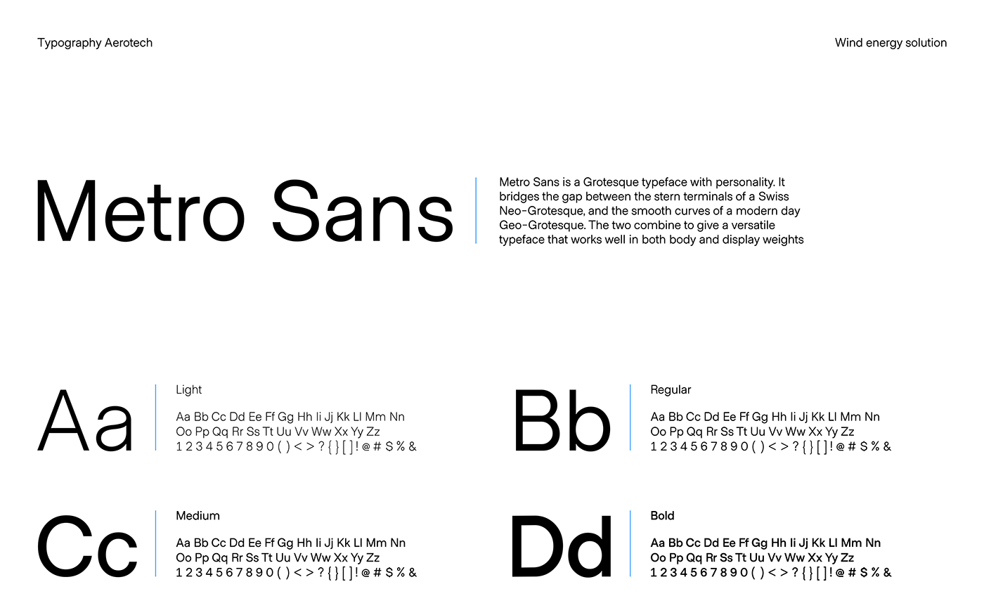
Metro Sans, a modern and versatile font, was the natural choice, ensuring optimal readability across diverse media platforms, from print to web.
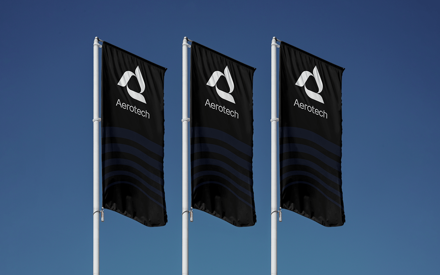
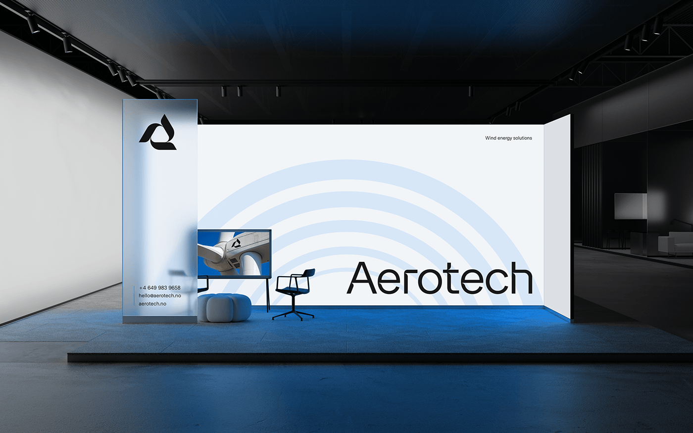
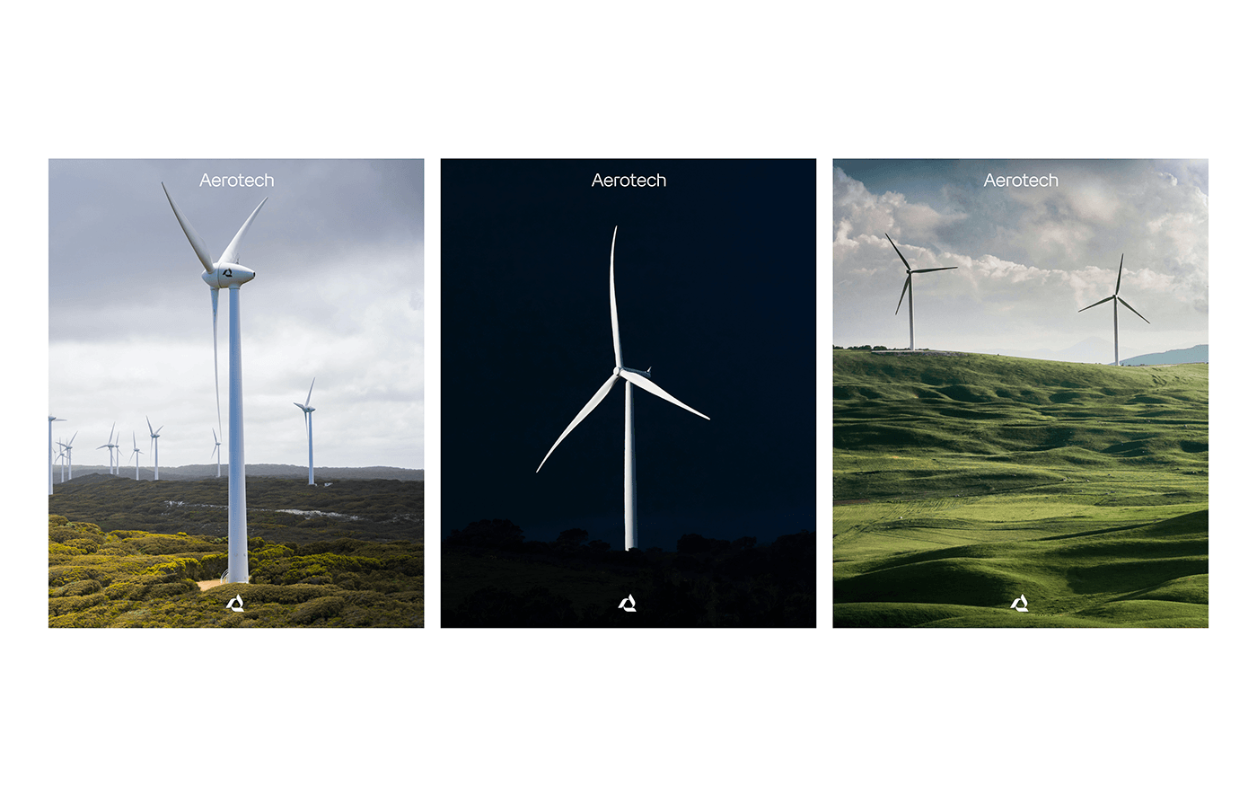
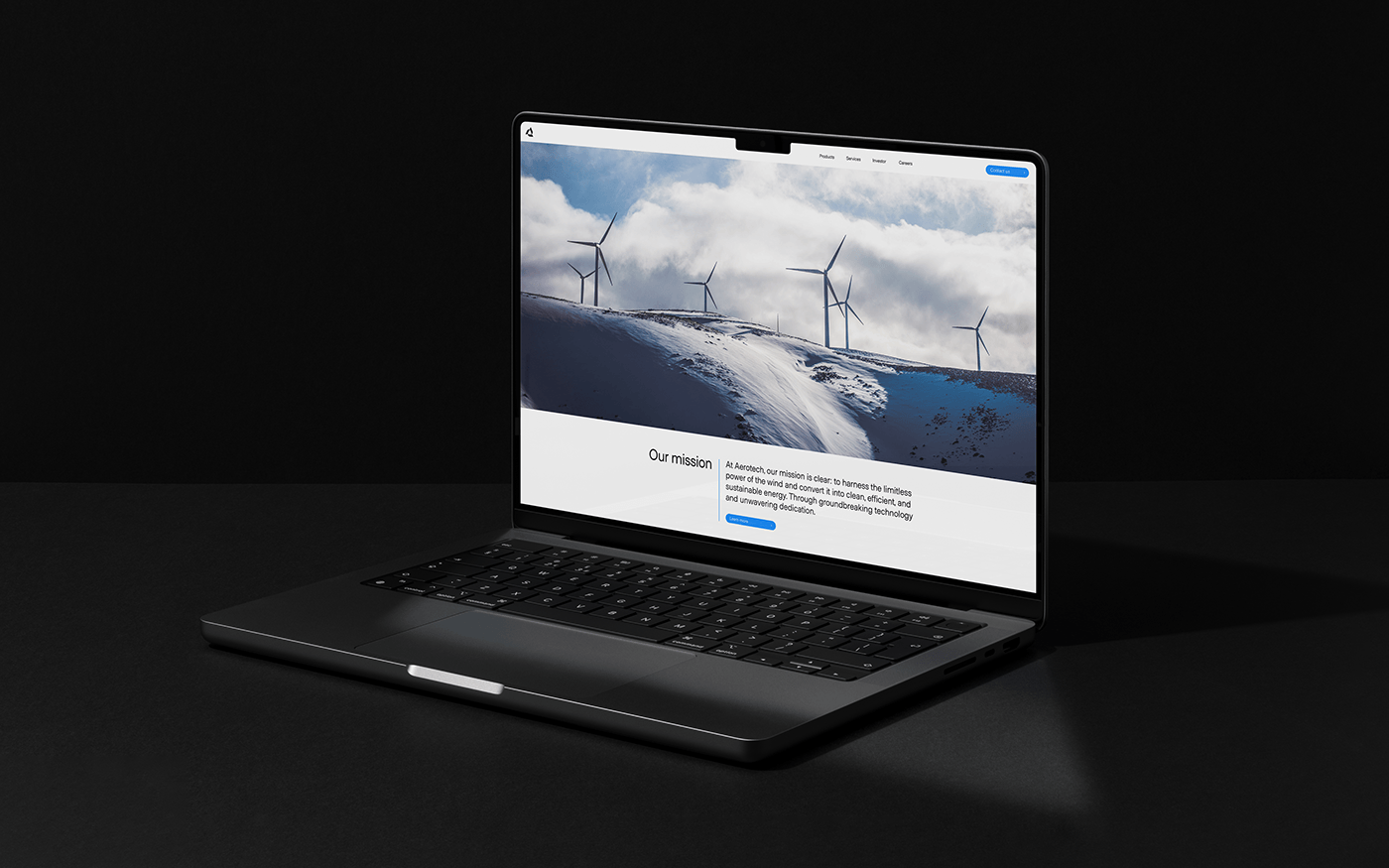
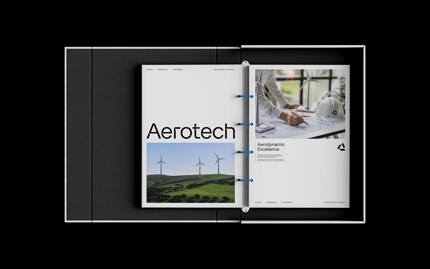
This cohesive visual style seamlessly extends to banners, documentation, outdoor advertising, websites, and branded merchandise. All elements are meticulously executed in the paradigm of technological minimalism, perfectly encapsulating Aerotech's vision and values.