

In my day job I teach in and manage a human antomy lab at a major Canadian medical school. Over the last few years we've completely overhauled the lab space to make it a little warmer, a little cleaner, a little more comfortable for the students to study in. The lab itself is meant to be a free choice learning environment, meaning that the students can come in any time and find the specimens they need to learn from. There are a lot of specimens in various formats and things do get a little cluttered. So for the new student, who knows nothing about anatomy, it can be a confusing place.
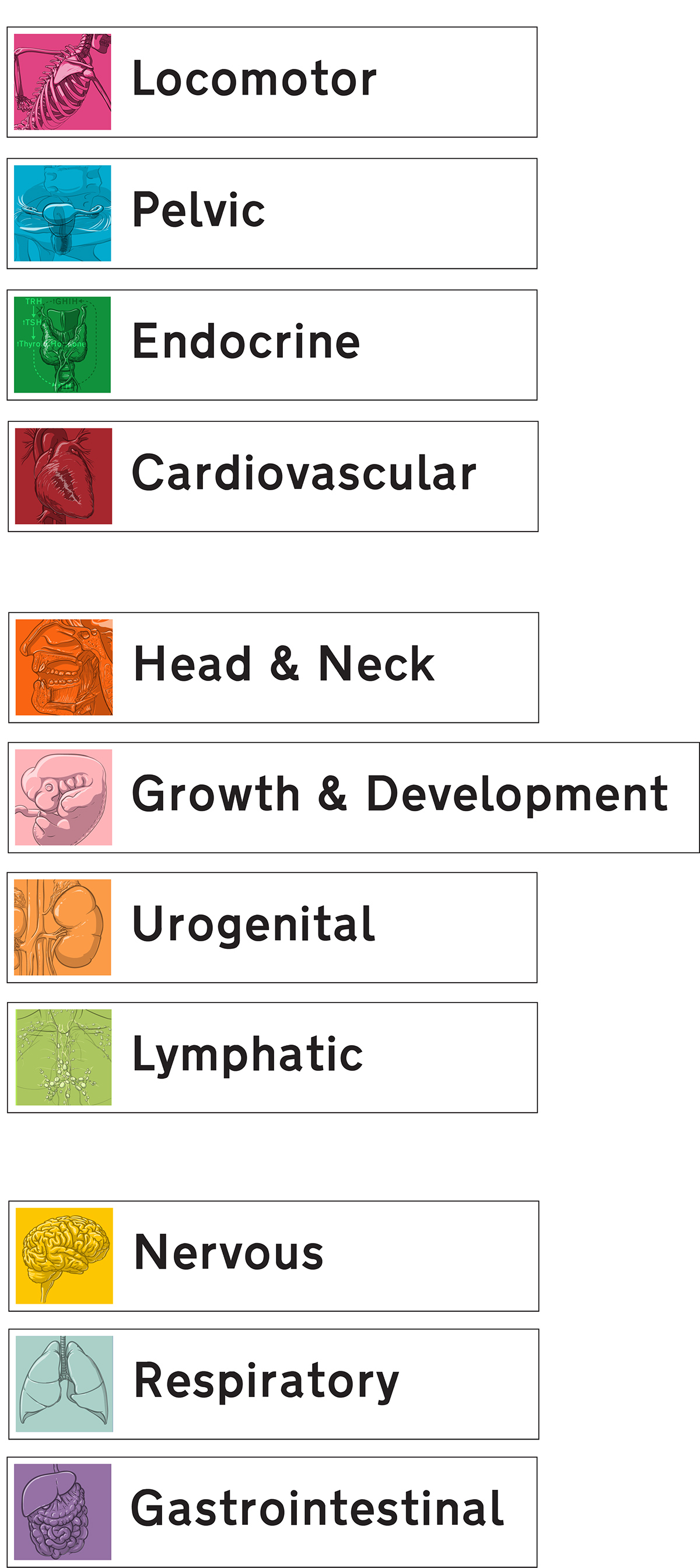
Previously it was very poorly signed if signed at all. We wanted signage that would be at eye height, that wouldn't neccessarily contribute to the clutter, and certainly would not darken the lab. I designed colour coded logos for each region of study. Some were easy, some not so much (*ahem* "Endocrine" and "Pelvic" anatomy). Each logo is printed on a vinyl decal. To keep them light - both literally and figuratively - we had a signage company mount them on frosted acrylic. This smudges the objects behind it, lets the light through and illuminates the sign while also helping the signs blend in. We weren't so concerned with the backwards text of the signs when viewed from the reverse. Once students get into the lab and find their way around, they get it. It's just question of getting them that far. The signs themselves are mounted on heavy aluminum bases to keep them from being knocked over.
In the end everyone was very pleased with them. They're perfect in that they seem to float over the benchwork and instantly organize what is a pretty noisy space. We also developed a large map for the front door of the lab, allowing students to figure out where everything is prior to entering.
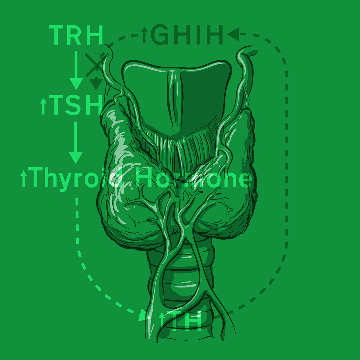
This is the logo for endocrine. How do you make a logo for a feedback loop and incorporate a gland?! One of the tougher logos - up there with Pelvic anatomy and the Lymphatic system.
Each logo shows something very typical about that region of study. Obviously Respiratory has lungs and Cardiovascualr has a heart. But Reanl shows some kidneys, Head & Neck anatomy shows dissection of a head through the midline. Anatomy isn't for everyone.

The signs in action. Heavy bases keep them from being tipped over and damaging the delicate specimens around them.
Lastly a large map was printed and mounted at the entrance to the lab so new students could get figure out what was in the lab and where they would find it. We also have several classrooms and teaching spaces for surgical skills so those users need to figure out where they're going.

The map shows where all the systems are in the main lab. It also contains some text information pertaining to the Anatomy Act, security, health and safety, and proper behaviour in the lab. This map was made out of simple geometry in Maya, rendered in Mentalray, and then composited in Illustrator.


