Design Challange & Solution
Many people often get caught up in the stresses of everyday like and do not have time to search the internet for local events in their area during the week or on their days off. There are often may events, especially during the holiday season, that are not well advertised around the community and only maintain a social media presence that not everyone has access to or chooses to use. Many people would like to attend markets and support local businesses but do not always have the information they need to do so.
Market Spot is a market finding app that allows its users explore and locate markets and vendors in their area. Its functions allow users to personalize their experience by narrowing their searches to things that they are interested and that accommodate their budget. It is designed for young adults and up who enjoy attending farmers markets and craft markets local to them with their families and friends. While Market Spot is focused on helping its users find markets, users can also browse through local vendors who each have their own page with their goals, social media, and website links if users prefer to support small business. Users can favorite markets and vendors that they like so they do not have to worry about not being able to find them again.
The design solution that accompanies the app is a clean design with legible type sizes that allows all ages to be able to easily find and read the information they need to know about the markets. The app logo is made up of a location type shape that is often seen on maps and is easily association to finding a specific location and a market graphic inside the location shape to indicate that markets are the thing being located. The navigation bar also offers commonly associated symbols, so the user has an easy time using the app. The profile button is on every page so users can easily locate and change their preferences.

Style Guide
The style guide features elements seen throughout the app such as the type hierarchy, color palette, iconography, and versions of the logo. Since the main font is rounded and gives an inviting appearance, the icons and buttons are also rounded to keep this theme going throughout the app. The colors were chosen because markets are often outdoors and the colors green blue, and brown are mostly commonly associated with the earth in mind.
Opening
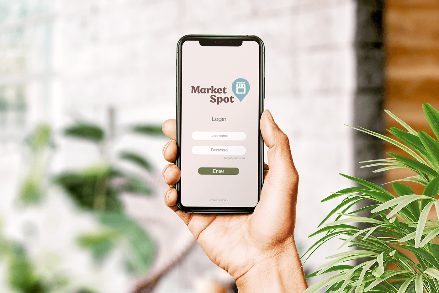
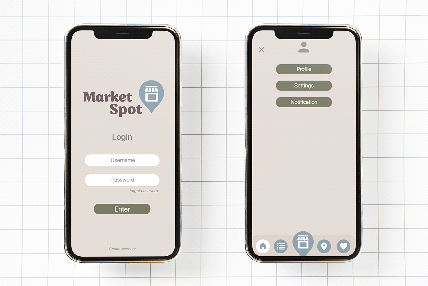
The screen on the left is the opening screen to the app which lets users login or create an account if they do not have one.
The screen on the right is the information screen where users can edit their profile and preferences, settings, and notification. Users can get to this screen from anywhere in the app.

Main Navigation: Home
This is the first thing the user will see after they login or create their account. From the home screen users can scroll through featured markets, suggested markets, and vendors.

Main Navigation: Vendor Categories
On this screen users can scroll through the various categories, select the one they are interested in, and then browse through the vendors that sell those types of products and see if what markets they are attending.

Main Navigation: Markets
Users can browse the markets in their area and learn everything they need to know about the market. They can also narrow down their search by category and price range or sort them alphabetically, by distance, or popularity.

Main Navigation: Market Map
Users can zoom in and out and see where markets around their location. Users can then click on the location icon and see the market information. Users can also narrow down the markets by selecting the distance they are willing to travel or days they can attend markets.

Main Navigation: Favorites
Users can easily locate all the markets and vendors that they have liked while using the app. They can filter their likes by vendor, category, or market and sort them to display alphabetically.

Detail Screens
The screen on the left is an example of what a market screen looks like. It includes the date, time, place, address, brief description, and vendors that users can scroll through. Users can also like the market with the heart icon on the picture at the top on the screen.
The screen on the right is an example of what a vendor screen looks like. It includes the vendors, website, Instagram, and Facebook links, a brief description, gallery of pictures, and markets that they are attending that users can scroll through. Users can also like the vendor with the heart icon at the top right of the screen by the logo.
Prototype link
